


I'm sure you've heard the single Take Me To Church a million times already like me, but believe me when I tell you that this Irish dude is a true songsmith. I wasn't entirely excited to see him at Wayhome, but his stuff is really good! It's got rock, blues, and a little country influence and it's very catchy. These sorts of things always make me wonder how the singles are getting chosen. This song is easily better than the infamous single. But maybe if I had heard it a million times, I wouldn't like it as much.
Accomplishment: That bike thing!
I actually managed to bike from my house to my friend's party! And oh boy, was I a sweaty mess by the end. My legs felt like jelly. I didn't realize how tiring it would be, so I didn't bike back home. Baby steps! See my experience map below.

Goal:
No Wolf Parade stuff last week, I was too busy. The shame! And it only continues; I won't be doing any this week either because I'm preparing for Wayhome. And I booked a driving lesson for tomorrow, too. So that's a thing! My G2 test is booked for early August, and if that's not a goal, I don't know what is.
Random Thought:
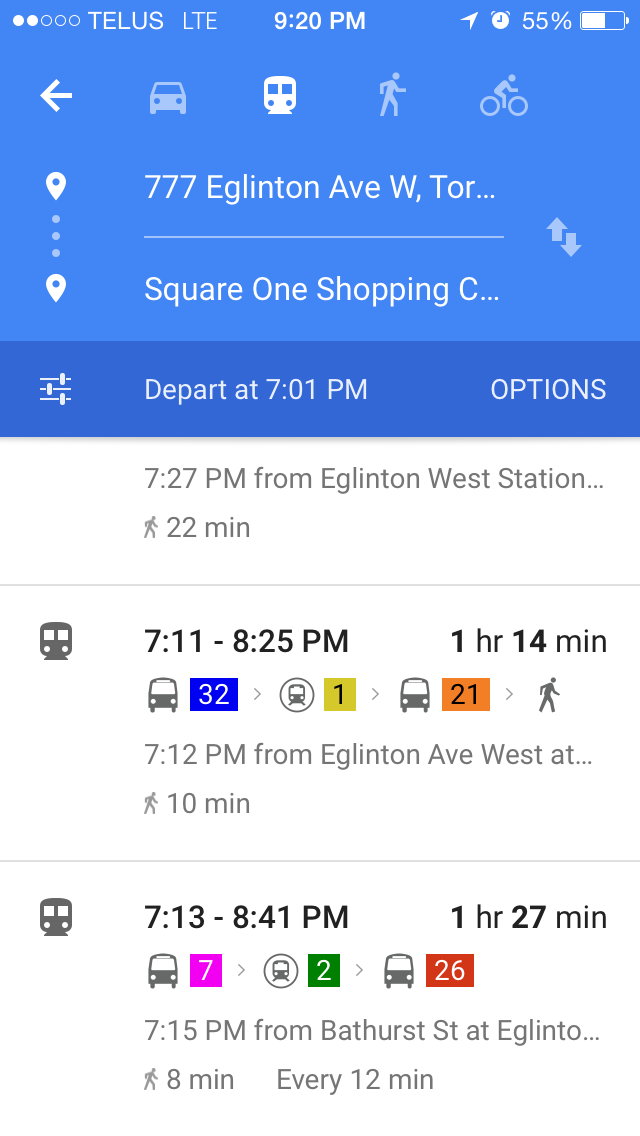
Maybe this is more of a gripe, but it's my blog, and I'll gripe when I want to! I consider myself pretty transit-savvy, especially since I've been travelling between Mississauga, downtown, and my home in Richmond Hill on a daily basis. Girl's gotta have a life, right? Google maps does a pretty spot-on job of planning my trips for me, and it rarely lets me down.
A friend was complaining to me about a design flaw in the app, and I was sure that they were simply overlooking something; there's no way that Google could miss something so important. And that design flaw is this: there are colour selections for each kind of transit, whether it be the difference between a YRT bus and a TTC bus, or even the TTC subway lines (which are now dutifully coloured and numbered for a slightly less painful travel experience). But, if you've never taken a certain bus before, and it travels across city lines (as I often do), you'll find that the type of transit is not actually listed anywhere in the app. And this is actually very important. It tells me whether or not I'll need a transfer when I get on a TTC bus, or how much change I'll need for two different cities' bus systems, or even whether I should pay with Presto or a ticket in YRT in order to prove that I have paid when I get on a non-Presto-operated TTC bus in YRT-land. It's kind of the most important thing, after when and where the bus will be.


And as if we couldn't make matters worse, there's more. I have never caught a bus at Islington station before, so I was happy to note that I would be looking out for platform D. Lo and behold, I got to the bus bay, and the platforms were NUMBERED, not LETTERED. The signage was so terrible, I would have missed my bus if it hadn't been ten minutes late. I found my lettered signpost (not platform) on the TTC platform 8, the last one down the line of platforms. This is surely a flawed system. I suppose my advice is for you to take note of where platform D lives in case you ever find yourself in a similar situation.
Inspiration: Spike Logo
I have fond memories of watching Spike in my friend's basement on summer evenings, marvelling at how quickly I could melt my brain with a few hours of shows like 1000 Ways to Die and Manswers. It was dude television and it was a really entertaining channel, especially considering I was never its target demographic (and never will be, without a sex change).
That said, I love this redesign of the network's logo. Honestly, the old one would have stayed fresh for another few years with its homage to an army badge (calling all Black Ops fans), but the new one is so tight and well-refined that I can't take my eyes off it. The angle is absolutely perfect.
Supposedly, the station is attempting to open its demographic to include programming for families and women, but I honestly think it's fine to be a men's television channel and do one thing really well. Now if they would only air episodes of Banzai again, my heart would be whole.
No comments:
Post a Comment
Note: Only a member of this blog may post a comment.