Monday, March 30, 2015

Weekly Update - Zoetropes!

Music: The Decemberists
Every music lover has that one favourite band whose discography they know by heart. And this one's mine. I've been listening to The Decemberists since 2007 (says iTunes), and I've been lucky enough to see them perform twice in Toronto. And this summer at Wayhome will make three! The lead singer Colin Meloy is a songwriting genius. I get the feeling he opens a dictionary to a random page and picks a word with his eyes closed to write the lyrics in their colourful, passionate, storytelling songs. Mix that with a bunch of orchestral instruments in the five-piece and you get six albums of wonderful, whimsical merriment. Check out one of their poppier songs (and one of my personal favourites) below:


Accomplishment:
The Favourite Things book is complete! I have finally bound it, and am currently waiting for the glue to dry. In addition to that, the website is fully coded as well! I will be fixing minor things between now and, well, the end of time, but I am confident enough to let you inside to see its gooey caramel center. So go look if you like.

Goal:
Lots still to do. With my grad show coming up fast, I would really like to have everything planned in terms of what I am going to show. I hope to have my board layout finished by next week, and the assets ready to print or be made. I wonder if seven projects is too many...
So far, I am thinking about this for the long list:

  • Expo 2025 - assets poster, motion, website on iPad
  • Favourite Things - book, poster, website on iPad
  • Hear & Now - small letter size showing the screens
  • Upfront Mag - book
  • Flora & Fauna - plant
  • Her - motion for monitor, some screens on board?
  • Causes of Death - poster, can Processing work on iPad


Random Thought:
This is another weird one. I've been going to a few interviews in the past month (tis the season) and I feel like the whole interview process is so played out. Interviewees go in knowing they're going to be asked specific questions like, what are your strengths and weaknesses, you know, the usual. These questions are so expected that they can easily be prepared for ahead of time. So here's my proposal. What if interviewees went into an interview and the interviewer decided to let them ask all the questions. You can really tell a lot about a person by the questions they ask you (or don't ask you). Of course, in a situation like mine, interviewees would have to show pieces of work, but all of the questions would be directed at the interviewer. It would make for an interesting challenge by forcing the interviewee to think of intelligent queries about their work, themselves, and the place of work for which they are interviewing.

Inspiration:
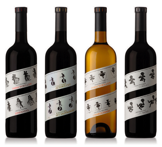
My parents are big fans of Coppola wines. I like the idea of a famous filmmaker, Francis Ford Coppola, branching out and deciding to try his hand at a new skill later in life. It really inspires me to know that it's never too late to try something new. On the other hand, while the wines are good, the labels leave something to be desired.


There's nothing wrong with them, but I've seen some pretty interesting wine labels in my life. And then came along Coppola's new set of wines, Director's Cut. Here's an interesting take on a wine label, complete with a nod to his background as a filmmaker. Just look at these labels!


According to the Coppola website:
In addition, every bottle of Director's Cut pays homage to the history of filmmaking with its wraparound label designed after a Zoetrope strip, one of the earliest moving picture devices. Each Director’s Cut label is a replica of a strip from Francis’s personal Zoetrope collection.
These are wine bottles worth collecting on your mantle. And I would! If I had a mantle!

Sunday, March 29, 2015

Crowdsourced Festival Control

Since I joined the festival circuit last year (count 'em, four festivals in one summer), I have noticed an interesting trend for summer festivals as time goes on. I knew that my wonderful experience at Osheaga last year would probably be beaten out by whatever those fine folks decided to do for 2015's ten-year anniversary, and I was sort of right.

You may have seen the digital mural created for 2014's Osheaga lineup that hid clues as to who the performers were going to be. If fans had the mental and musical prowess to solve the puzzle, or were really, really good at finding Waldo, they could guess at what the lineup would look like before it was announced. Check it out here, and the mural is below.

Well, someone decided that an interactive mural just wasn't awesome enough so this year, Osheaga released a third-person driving game available on iPhone. Developed by Behaviour Interactive, a Montreal firm and video game industry leader, the game will reveal the bands with every level unlocked. It's a pretty cool idea, gamifying the process of viewing the lineup. Screenshots below!


What about everyone's favourite festival (in North America, anyway), Bonnaroo? This year, the festival awarded artist announcements to its fans! How, you may ask? BLAM! Yep, the Bonnaroo Lineup Announcement Megathon. Fans were asked to call into the Bonnaroo hotline on January 13 between 6:00-9:00PM. They were given one artist each to announce through any social media platform they liked. The medium was handmade type experiments which were uploaded as photos. And boy were they cool. Check out the promo video and some of the BLAM posts below. You can check the rest out here.


I guess all of this power has allowed the fans to take their festivals quite seriously. Take this year's edition of England's Glastonbury for example. Its history, starting from small beginnings with 1,500 people on a farm in 1970, has hooked many followers throughout the years who have strong opinions about what the festival should look like. And these people have no problem voicing those opinions. Loudly. According to this article, many fans are upset by the fact that Kanye West has been invited to headline for 2015. They are used to seeing white rock bands, and Kanye is arguably neither of those things. On the other hand, he is incredibly famous and puts on amazing live shows. You can even check out the online petition to boot Kanye and bring in a rock band, which has almost reached its goal of 150,000 signatures. And here I thought music festivals were about being open-minded. But maybe that's just me.

This all reminds me of way back in 2009, when Rogers Picnics were still a thing. I think they were rebranded into Field Trip. But anyway, times were certainly simpler then. City and Colour had taken the stage to play the last set, and the jumbotrons were zoomed in on his precious bearded face. But then, all of a sudden, the jumbotrons flashed something of a different nature: I was being asked to vote (by text) from a choice of three songs for the encore. Shouldn't the artist get to decide that? Or at least the screaming fans within the artist's earshot? I thought it was very strange to say the least.

As technology allows us to micromanage more and more of our lives, I have to wonder if all this control is really a good thing. I love the idea of revealing information like lineups in creative ways, but I don't think that fans have the right to complain about who is headlining a festival. When they own the festival, sure. But if you don't like who's playing, don't go. That's true free will.

Monday, March 23, 2015

Weekly Update - The Perfect Shuffle

Music: Miike Snow
Yet another reason to love Sweden, Miike Snow is a Swedish indie pop band formed in 2007. This band is the epitome of what pop could be if we demanded artists to inject feeling into the otherwise flippant and airy genre. Each song explores a theme of human emotion that comes through so clearly, you'd think the songs were being performed on a stage in your ears. Their 2009 self-titled debut album is a prime example of this, from the bright yet eerie "Animal" through to the sulky and meandering tones of "Faker".

And don't even get me started on their second album, Happy To You. "Black Tin Box" features Lykke Li, another Swedish favourite, coming in with cool electronic drones and robot-sounding beeps to which you'll undoubtedly be bobbing your head. With each new layer of sound, the song becomes something unlike anything I've ever heard. Check it out below:


Accomplishment:
As per last week, I have created my icons and selected my variables for the infographic project I am working on, but I am slowly realizing that with such an intense (and emotionally heavy) dataset, the options are exponentially revealing themselves. I want to make a poster, a website, an app, an interactive data visualization, and a textile out of this project.

Goal:
Therefore, my goal by next week is to have a clear view of exactly what I want to do with this data. Say I limit myself to two outcomes. And then if there's time, textiles for everyone! Imagine wearing your most likely cause of death as a pattern on your socks. A little morbid, I know.

Random Thought:
Being the logical shrew that I was nurtured to be, I am quite the fan of Apple's theoristic approach to the shuffle. Specifically, I have always appreciated how the 'random song chooser' was made. As we all know, selecting a song from a list at true random would mean that the same song playing three, four, five, one hundred times in a row is a valid subset of 'random'. Apple actually does not shuffle songs like this, but in a more user-friendly way. Instead, you'll hear every song on the list once (albeit in a randomized order), and once each song has had its play, the list randomizes and begins again. Although, I have noticed one more rule, which is that if a predetermined randomized list ends with 'song X', that song will not be the first song of the next play-through. So basically, you'll hear every song equally, and you won't hear a song back-to-back. Beyond that, I suppose you might attach the word 'random' to the process, although it is really anything but.

And hey, in a simple google search, I found pretty much the same answer here.

Inspiration: Richard Perez
I am so intensely happy with the way design illustration is going these days. Having grown up with an unhealthy love of Hello Kitty (although it certainly could have been worse), I have always been a big fan of flat colour, rounded corners and bold outlines. I'm talking like 30% point size compared to the size of the document. That's some bold line. Anyway, this exact style is gaining heat on Dribbble, and Richard Perez is a bold-line-wonder.


His illustration just, makes me happy. Just look at the woman with her tongue sticking out in the top left corner. Hilarious.

Monday, March 16, 2015

Weekly Update - Good Vibrations

Music: Miracle Fortress
I am constantly reminded of the joy I once took in buying, collecting and playing CDs. It might have to do with the fact that my boyfriend's car doesn't have an auxiliary port or a cassette player, so we listen to a lot of CDs. I must have mentioned my undying love of Graham Van Pelt, the genius behind Miracle Fortress' dreamy waves of sound to said boyfriend at some point. Lo and behold I found myself transported back to 2005, listening to a copy of Five Roses (the first album) in the car on our way to some burrito restaurant or something.

Five Roses, 2005's dreamy, beachy wonder of synth pop was a masterpiece. One of the first indie albums upon which I stumbled, I was hooked by the second song. If you want an album to doze off to while swinging in your macraméd porch hammock by the bay, this is it.

At a harsh contrast, 2011's Was I The Wave? explores a slow-burner dance party at which you might have woken from your slumber and decided to wear that same macraméd hammock as some sort of hipster cloak. I definitely suggest starting with Five Roses, because hey, I am a slave to order, but get hooked on this song off Was I The Wave? first.


Accomplishment:
I have now successfully printed both my thesis book and a new (much better quality) version of Upfront Mag from last semester. I am at once excited and terrified for the binding process, because I am assuredly going to mess up these beautiful sheets of paper in some way or another. But as it stands, I am feeling pretty good about it. The website for my thesis is also coming along nicely. As per last week's goal, all of the D3 visualizations are finished, and the data pages are responsive as well! (Somewhat!) I also got the navigation working the way I want it, so self-induced pats on the back for everyone (or just me).

Goal:
Now that school is back on the front burner, I realized I have been neglecting my data visualization projects. By next week, I want to have this done:

  • beer data fully collected
  • start working on the skeleton of the D3
  • all ten icons for causes of death created
  • various colour schemes developed
  • select all possible variables and how they will be shown
Random Thought:
Since I got an iPad last year, I have been noticing some interesting things regarding notifications and user experience across my Apple device family (iPad, iPhone 5, and MacBook Pro). For example, I really enjoy the way notifications (mostly texts, emails and Facebook messages) are handled between my phone and tablet. A notification of a text will appear on both devices, but as soon as I swipe to view it one one of the devices, it disappears from the other device. Same goes with Facebook messages between my computer and my phone. All around, the phone is doing a good job. But there are some weird discrepancies, like when using Messages on my computer. There is definitely some room for improvement here. Why do I get a notification of three texts from the same person as separate events? Group them up, guys! And Messages runs so incredibly slow on my (forgiveably old) computer, which I just can't seem to understand. While I would of course prefer that my life not be run by the little ding of the notification bell, I can't deny that this is where an Apple watch would certainly shine, if you'll excuse the pun. I'll probably never get one unless it had previously fallen off the back of a truck, but I truly understand the desire to have a quick way to view notifications, and how having them at wrist's length would be useful.

That said, maybe all of these devices are connecting us and at the same time pushing us away from a real human connection. I know this argument is getting old, but as I sit in a restaurant and watch all of these people instagramming their food instead of eating it, it makes me a little sad. I sincerely hope that we learn to keep technology at arm's length in future as it develops further. Technology can make our lives easier and fuller, but it can also begin to do the opposite without our realization.

Inspiration: Hansje van Halem
My new favourite typographer, and based out of the beautiful Netherlands at that (which is no surprise to me – I love everything Dutch. She makes these wonderful letterforms out of optical illusions, perfectly placed lines, and that gorgeous play between light and dark we call notan. Check it out:


I absolutely love the way that the pieces seem to vibrate with energy, even in this watered down experience through my computer screen. Imagine one of these actually printed out and resting in your hands! I highly suggest you go to her website for more beautiful work. 


Sunday, March 15, 2015

Photorealistic Infographics

While the world contains a multitude of lovely pixel-perfect infographics and data visualizations, I have begun to dream in the form of infographics made from staged photography. There's something so tongue-in-cheek about the way we can try our best to shape real world items, although they seem to come out a little off, warm, and human-made. I find this intensely charming, in stark contrast with the way infographics usually feel cold and calculated (because they are).

Check out one of the first infographics I ever made, for a project back in second year university.


What you're seeing here is the amount of time it takes for a piece of fruit to go bad. I made the fruit into pie charts (which doesn't really make any sense when dealing with time, but that's not the point here). While the information is arguably factual and calculated, the way in which I designed the accompanying imagery gives it a whole new dimension. But enough about me, let me show you other examples that prove my point.

Ursus Wehrli has been working with organizing the objects around him into delightful little neat piles. Not infographics exactly, but beloved all the same.


How charming is that! He even organized the dots on the bowl. I could cry at the cuteness and attention to detail that is only found in the craziest of people. While I know this is only displaying how much fruit is in a bowl, you have to dig a little deeper to find the real meaning. Why not take this idea and display some sort of information that people need? Like nutrition facts: how much of my fruit salad is comprised of healthy, delicious kiwis and how much of it is comprised of terrible, tasteless honeydew (honestly, who likes honeydew)? You see what I mean. Not to mention, think about scale. This could also work at the macro level:


One of the interesting aspects of using photography for infographics is that the viewer is able to experience a context of the information that allows them to further understand the information. Take the next example for instance:

Laying the infographic right into or overtop of the subject matter makes for an arresting visual. It brings the cold facts and numbers to us on a plate that is warm and feeling. Check out more of this project here.

And of course, we know that life imitates art. So here's an example of a photorealistic infographic I found in my daily social media travels:


University students drink a lot of coffee. They also love any subject matter that relates to them. So, courtesy of my friend Garin, I present to you a bar chart of coffee drunk by OCAD students. Made by the students, of the students, and for the students. I wonder what they'll come up with next.

Sunday, March 8, 2015

Weekly Update - Shu Ha Ri

Music: Portishead - Dummy
Released way back in 1994, Portishead's first album remains a work of musical genius today (at least for me). The album feels like a theatrical piece from beginning to end, and paints a vividly sad story throughout. I also love the mix of different characteristics like scratching, marching band drumming techniques, theremin and other weird sounds. Of course, everyone knows Glory Box, one of the three singles off the album. Check it out below:


Accomplishment:
I am moving closer and closer to mastering D3 (to the beginner extent that I had originally challenged myself to accomplish). I found another wonderful resource, C3.JS, which is basically a stylesheet for wonderful interactive D3 data visualizations. I will still be making custom visualizations, but I have been using some of these and also using the library as a learning tool for D3. It even helped me to understand how to make my visualizations responsive. Check out a thing I made here.

Goal:
By the next weekly update, my goal is to have the Favourite Things book fully printed and bound, and have the D3 visualizations completed as well. I will still have to figure out the responsiveness and make all the story pages, but those are just grunt-work tasks. I'm most excited for the hand-binding of the book! It'll look so much better than the dumb saddle-stitching I did for the dummy version.


Hopefully I can make the book as clean as this mockup.


Random Thought:
My father is currently binge-watching Weeds on Netflix and I am dropping in and out from time to time. While I was watching a few episodes with him, I found it annoying that we had to sit through the "what happened on the last episode" sequence every time. I know they're not long, and you can use the picture-flip feature (that's what I've named it) to fast-forward, but this has got to be a common problem. Binge-watching television is a common activity (at least in Canada where it's too cold to do anything else), so there's got to be a better way. What if Netflix created an option to go into 'binge-watch mode'. In this mode, all of the little recap sequences would automatically disappear. I suppose that a similar argument could be made for title sequences, but I personally enjoy the good ones (see this previous post about them), and the title sequence for Weeds is different every time. On the other hand, if you've just watched seven episodes of a television show, there is no redeeming value ina recap sequence at the beginning of the eighth episode.

Inspiration:
This article about design and the Japanese theory of Shu Ha Ri. In a nutshell, the article describes the process of mastering a skill (any skill, but specifically here it discusses design).

Shu involves copying the work of masters in your chosen field. A lot of people don't appreciate this concept because we are pretty much told from birth that we must be original and that there is no value in reproducing the work of others (without saying that there are moral implications as well). Yet, there actually is a lot of value to be gained from copying the work of skilled people. In this process, it is possible to attain skill through recreation and learning about the creation process in itself. This allows a student to hone their craft and sharpen their skills without letting more advanced things get in the way. Of course, the material produced in this section should not be sold or used for personal gain; it is only a learning tool.

Once a person has mastered Shu, they can move on to Ha which involves gaining a detached understanding of the basic skills that were mastered. The student can now move on to gain an understanding of the theories that go hand-in-hand with the basic skills. They can begin to create original work (in the case of design) and use their skills to move closer to mastering the subject.

The final step is Ri, which is the stage of complete mastering of a subject. At this stage, the student has become the teacher and is encouraged to help students who are still in the Shu stage.

There you go, it's that simple! (But not easy.)

Tuesday, March 3, 2015

Skillshare - Joshua Davis

As I mentioned yesterday, I have finished my second skillshare! And it feels so nice. This one was about using Processing and a framework called Hype to create randomly generated art using code. I have always been interested in generative art - it's really very fascinating to be able to create visually pleasing pieces at random using a predefined set of parameters.

Joshua Davis is a designer with a very interesting background. He is the purest example of cutting your own path in this world, which is especially important in the field of design, considering the fact that the field is intensely saturated with people who all do the same thing. (Bitter, much? Haha...) Coming from the world of Flash, Joshua wanted to have the ability to design animations that could develop with whatever software was becoming prevalent. As Flash began to peter out in its popularity (for a number of reasons), he noticed that Processing was becoming popular (and that it did some very similar things to Flash). The only problem was that as Joshua began to tinker with Processing, he found that it wasn't as straightforward for image manipulation and creation as he would have liked. Especially because Processing is marketed primarily to designers, Joshua knew there must be a better way.

Through this channel, he and a man named James Cruz created Hype. Hype is a framework for Processing through which designers can create things much more quickly and easily than in Processing alone. There are lots of examples, and with some previous knowledge of Processing, you can get going with Hype in under a day.

Long story short, Joshua's skillshare explains the full process of using Hype from how to set it up on your computer, all the way to exporting. I found it extremely intuitive and fun that I spent hours just playing around to see what I could create. See some of the stuff I created with just a few lines of code and not very much time:


In terms of the skillshare, I always learn something interesting about the teacher's workflow. As I mentioned in the Aaron Draplin skillshare post, I love the fact that through screen-sharing, we can get a peek into how the teachers set up their computer workspaces. I am still working on creating the most effective workspace, and Joshua showed me a few tricks that will be intensely helpful:
  1. Writing Processing inside Sublime Text
    This is a matter of preference, but I highly prefer to write Processing inside Sublime Text. I can auto-complete things, I can select multiple things at once, copying and pasting is a dream, and you can even run a Processing sketch from Sublime Text. Really, really cool.
  2. SizeUp
    Windows computers already have this built in (you win this round) but I needed it for my silly old Mac. SizeUp will resize your window to any configuration you want using keyboard shortcuts. Left, right, top, bottom, center, full, any mixture of those, and even more. I am always resizing windows to tile them horizontally but now it takes me half of a second to do it. Simple, but fantastic.
  3. Color Picking Tool
    Joshua shared a very intense color picking tool that will give you an excellent swatch of colours based on an image. And the best part – it's meant to be used in conjunction with Hype. It can output hex codes in exactly the right format to copy and paste into your code, and it has a viewer that allows you to visualize your colours into not one, but TWO examples of a Hype layout. Now that's some forward thinking.
  4. Command + H
    Inside Illustrator, command + h will hide the outline of a selected object. This is super handy when you have a lot of things selected and you want to see how they layer using different blending modes. I love it.


In the skillshare, I made a number of pieces. The most beautiful of which is probably based on a grid layout, which will randomly assign any of the shapes you've previously made to a coordinate on the grid, using a randomly chosen size, rotation, and a set of colours (taken from the Color Picking Tool). Check it out:


I want to use the skills I have learned in a project that will really cement them in my mind. While I love randomly generated art, why not push the concept a little further by introducing statistics into the equation. Instead of randomly choosing a shape, why not assign the shapes a value and have their appearance mean something? In the piece above, each of the shapes is representative of a cause of death that is most prevalent in Canada. For example, a few would be malignant neoplasms, Alzheimers, or diabetes. The more times that a specific shape appears, the more common that type of death was in a specific set of time. Colour represents the province in which a death happened, and size relates to how many deaths occurred. So you can see that even though the piece feels random, it is actually driven by data and can tell a story of a bigger picture, while looking aesthetically pleasing at the same time.

Monday, March 2, 2015

Weekly Update - Striking It Up!

Music: Unknown Mortal Orchestra - Self Titled
I found out about this band while I was watching a video on Youtube about 3D printing. Oh, how far we've come. Anyway, I've been noticing that sixties psychedelic rock has been coming back into vogue lately, and while I love it as much as the next hippie, UMO takes the genre and really makes it their own. You'll just have to listen to understand what I'm saying. Oh, and they're coming to Toronto in June!


Accomplishment:
I finished my second Skillshare! Yep, Joshua Davis' Programming Graphics has been put to bed! Well, sort of. I will be writing a blog post about what I learned, as well as what I have made with it. Not to mention the severe change to my workflow. Which brings me to the next block of this weekly update...

Goal:
I will be using Hype for an upcoming data visualization project! I plan to use the skills I have been learning in Information Design 4 with Hype, Processing, and csv-based datasets to create generative art. But instead of the art being generated randomly, it's driven by data! Okay, there's a lot going on there, but you'll see. So far, I've created a set of ten shapes, all related to a cause of death. The colours relate to provinces in which each death happened, and shapes relate to number of deaths. I know it's a little morbid, but check out the cool design!


Random Thought:
Well, it's not so random. You may have heard by now, York is going on strike in under two hours. As we all know, the last strike lasted almost three months and was only ended because of a by-law forcing the strikers to go back to work (or something like that). And I have been told that this by-law is no longer in place because it was deemed unfair. Well, look who's getting the unfair treatment now. Anyway, it's not all bad; I have the ability to continue my work as if nothing happened. It's just the fact that for every week of the strike, there will be another week of school tacked onto my life. Adding that into the mix of finding a job is going to prove a little problematic, to say the least. Good thing the only classes I would have would be on Tuesdays. Only one day a week to worry about!

Until this dumb thing ends, I'll still be making fun stuff and writing silly blog posts. I can't see myself slacking even though there will definitely be less travel time in the bitter winter in my future. Hey – another bright side!

Inspiration: Panda for Chrome
Literally THE source for inspiration. Panda is a plugin for Chrome that changes your home page to what amounts to the god of all RSS feeds for designers. You can customize it to show anything and everything design related like a live feed of dribbble, hacker news, designer news and more. I love it. I like to read design news articles but am too lazy to go looking for them myself, and here they are, all numbered and shiny for me. I am addicted.


Sunday, March 1, 2015

Blacklight Love

Why is it that Canadian government documents always look so boring? Just thinking about the word government puts me to sleep. I mean, they have enough money to hire graphic designers for all of their humdrum papers and briefs and what-have-you, so why not show a little attention to detail? Just take our hideous passport for example:

That pattern is probably loaded with security features which is all well and good, but we can definitely do better. Check out Norway's passport redesign by a firm out of Oslo called Neue. It's beautiful on its own, not to mention the crazy attention to detail right down to the blacklight illustrations. It's simply wonderful to see a design that uses constraints (all those security features) as a benefit rather than a disadvantage.


Not to mention that the type is spot-on and the colours scream Norwegian design (and national pride, I suppose). I like the subtle nod to the Norwegian flag (which is red, blue and white). By tweaking the colour just a little, the passport can remain true to its heritage and feel like a modern item. It's something I'd be happy to show any border guard.


While we're at it, let's take a wee look at currency as well. Now that is a place where Canada can shine. I know Americans call it 'monopoly money' but to be honest, I really enjoy the illustration, colour, and even the security features used on the new(ish) polymer notes we have. If Americans think that using colour as a differentiator for denominations is childish, wait until they get a load of this (proposed) design of the Hungarian Euro.


They're hand carved into copper plates, just like how old banknotes were made. I love the nod to a process of a past time. And the blacklight skeleton is so humorous! The only negative thing I could possibly say is that there really aren't many security features. Beyond that blacklight and what I believe is a piece of foil striping down one side, the notes are pretty easy to forge. Unfortunately for us designers, we do need to keep things like that in mind when designing, and again, use them to our advantage rather than ignore them because they make a design look 'ugly'.

And back to Canada again, we have the wonderful redesign of our very own passport. Apparently, all of the designs below exist on every passport issued since July 2013. Check these out!

A normal passport page, until...


blacklight!


Simply stunning, albeit very similar to the Norway passport. But hey, design is all about taking ideas and running with them. The thing that really astounds me is the fact that these passports have been around for a year and a half, and this is only becoming newsworthy now! The Canadian government really should have promoted the beautiful work that was done, instead of letting us stumble upon it. Or maybe it wasn't publicized because it was an easter egg to find! I don't know what to believe.