


As you surely know, I am a huge fan of the now-defunct Montreal band Wolf Parade and all of its many side projects. As of last year, Dan Boeckner has sprung up a fresh new three-piece called Operators, in conjunction with Sam Brown of New Bomb Turks and fellow Divine Fits glory. They also add some female power to the group in the form of Devojka, a Macedonian singer with an interesting sound.
I originally stumbled upon the band while doing research for the ongoing Wolf Parade infographic, and then eventually saw a poster on the street promoting their show in Toronto on Thursday. What luck! And cover is $3. I have literally never seen such a cheap show (that wasn't free...but that doesn't count!) Check out their new single below, complete with a shiny new music video!
Accomplishment:
It's been a busy week, so no new faces. Sorry Arlen! I will credit myself to some degree, though, for finding this show before I lose the chance (reminiscent of Divine Fits in 2012) and deciding to add Sam Brown to the infographic. Seems I am adding heads faster than I can draw them.
One interesting thing I can attest is that I am now able to tell Dan Boeckner apart from Spencer Krug. I know they really don't look alike (at all!) but I was always confusing them because they were both so important to the band. Dan Boeckner has the longer face and sings the lower parts of the music, while Spencer has a heart-shaped face and sings the weird stuff. Oh yeah.
Goal:
Specifically this Friday, I will be drawing the deliciously hairy Arlen Thompson. Sunday will be for the plotting of where Arlen and Sam will fit into the mess of space that currently exists, and I am starting to think that a tabloid size piece of paper just ain't gonna cut it for this project. Can anyone say 18" x 24"?
Random Thought: Online Communities
The boon of the internet has given us access to more information than we can ever hope to absorb. One of my favourite things to do is compare prices of items I find 'on sale' in brick-and-mortar stores with their online counterparts. But even more important than that, the internet allows us to share information across great distances, and (debatably) without censorship. Of course, this can be considered as both a positive and a negative, but I try to steer clear of the negative stuff. Take the image below for example:
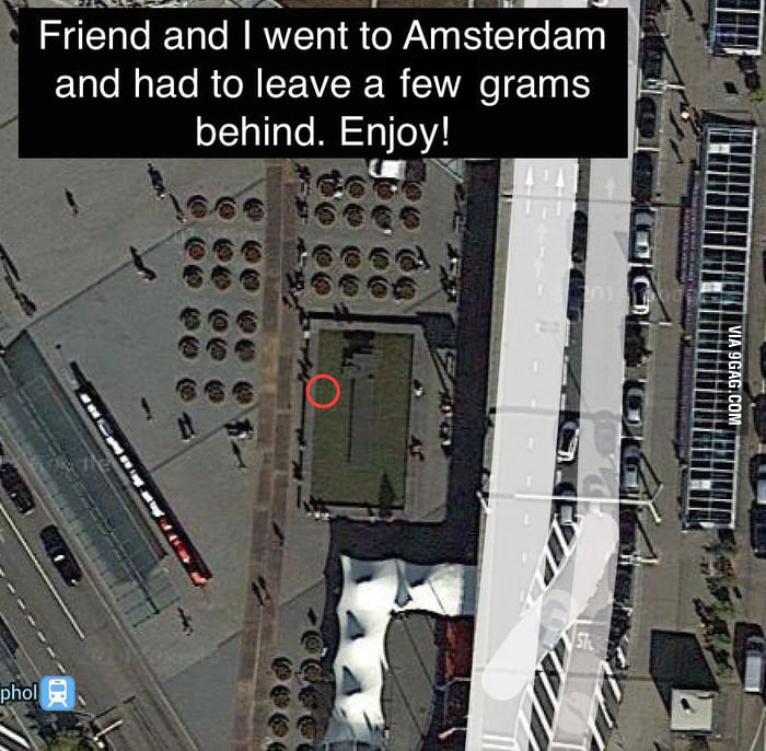
You might think that drugs are illegal and band and blah blah, but at the base of this image (posted on 9gag) is a simple human kindness. Someone had some 'stuff' they couldn't use, so they hid it and posted a map of its location to their fellow members of a community to which they belong. Personally, I only see positivity in that sentiment. Not to mention, it might be fun to try to find the place where it was left (even if it had already been claimed). I find novelty in visiting places where people I know have been before (kind of like geo-cacheing).
Not only that, but there is a sparkling community of people on the Wayhome subreddit sharing advice and making friends. Apparently they are planning an entire tenting community for people who are active on the subreddit to find each other on the fateful weekend. Again, all I see is a positive sense of community that comes alive with a shared interest.
Even on an early episode from the second season of Halt and Catch Fire (one of my current favourites), we see John Bosworth approaching a woman who is fed up with her son spending so much time online gaming and so little in the normalized sense of hanging out with friends in real life. John explains to her that online gaming is, in a social sense, essentially the same thing as spending time with others face-to-face and that her son has found friends in a community of people that simply happens to be through a computer connection. Strong stuff.
Inspiration: A new logo

One of the truest comments I've seen is that while it offers a similar yet more refined feel to the old logo, the 'face' part seems more tightly kerned than the 'book' part. I suppose this might be intentional, but most likely it isn't. I wonder if any tweaks will come out of the woodwork once the buzz dies down, like Google does once in a while.
No comments:
Post a Comment
Note: Only a member of this blog may post a comment.