Tuesday, September 29, 2015

Weekly Update: Startup Weekend

I had an intensely busy weekend this past weekend (which is why it took me an extra day to squeeze out a blog post). So much happened to me that I figured I would analyze it in a weekly update. So here goes.

Music: Thundercat
I know I already mentioned him in another update, but I saw the bass prodigy otherwise known as Steven Bruner do his thing at the Hoxton on Sunday night and it was too amazing not to share. After having missed Flying Lotus (a band in which he plays bass) back in October of last year, I was delighted that Thundercat played two or three Flying Lotus songs interspersed in his 90-minute set. I also really appreciated how much the crowd was dancing and loving the intricate solos that were peppered throughout, and the applause was more fervent than I am used to at other shows.

I can't believe this was a $15 show. His talent alone (not to mention the two musicians of his band) was amazing and it made me wonder why we pay so much money to see the likes of Taylor Swift when this was a more intense, joyful, and overall better experience than I could hope to find in Taylor Swift's music. But I guess that's just one person's opinion. Watch below:


Accomplishment:
I gave up my weekend to a hackathon called Startup Weekend. Together with an accountant and four marketers, I was able to make a pretty solid prototype of an app called 21 Days. The app uses social media and professional advice groups to help you form good habits, all in the span of 21 days.

And would you believe, even without a developer to code a real app for us, we won! First place! Check out the prototype below:
 

Goal:
This week, I am getting back to it. Tonight, I am going to start the second Joshua Davis skillshare class. I want to work at it at least twice a week, so I'll also be absorbing his wonderful lessons on Sunday afternoon (after some well-deserved sleep following Nuit Blanche).

I also really want to ride my bike sometime before the weather turns Canadian, but it's been raining a lot and I haven't been getting home until after dark lately. Being able to ride my bike to work once I move downtown will force me to learn some much needed skills (such as riding one-handed and standing on my bike). But I need to find a place to live first!

Random Thought:
Or rather, a random occurrence. I was waiting for a streetcar at Spadina and College, about to begin my long journey to York University where an even longer weekend at the hackathon would commence. I noticed a guy standing beside me with a leg cast on, which piqued my curiosity. I scanned up to his face to see if the leg was giving him any noticeable grief, when I realized that I was staring at the face of Mark Little! Now, in case you didn't know, he is undoubtedly the funniest member of the now-defunct comedy troupe Picnicface. I usually shy away from talking to celebrities because I say something stupid and can never forgive myself for it. But I took a chance and relied on the fact that I had something interesting to talk about (thanks, Startup Weekend). We had a lovely six-minute chat from College Street into Spadina station, where we parted ways forever. Nice to meet you, Mark!


I wonder if celebrities use their recognizability as a way to talk to random people. I really like starting conversations with strangers as long as there's a set time limit (i.e. parting ways at a subway station), so I decided to take a chance. If I were famous, I'd definitely do it more often.

Inspiration:
As if I didn't have a busy enough weekend, my week was pretty busy too. Product designers from Facebook in California came again to visit my (now past) university program on Wednesday, and I decided to make the trek to attend a very interesting talk on the evolution of photos. As we know, Facebook is all about photos, and it was interesting to hear about the shift of the medium itself with the rise of smartphones and the like. As you may know, Facebook acquired Instagram in 2012 after attempting to release a product that did much the same thing. If you can't beat 'em, join 'em!

Wednesday, September 23, 2015

Tell the Future

As you may have noticed, Google (or Alphabet) has been releasing new and interesting products all the time. From the announcement about Alphabet itself to a solar panel savings calculator, new stuff keeps on coming.

Yesterday, I was delighted to see this post in my Facebook newsfeed:

Google Fortune Telling? This reminded me of those old early 2000's websites that claimed they could tell your future or predict which button you would press. All a wonderful exercise in hilarity. But then, when has Google ever steered me wrong before? How could they take part in something so...well, hoaxy? So I took a leap. I clicked on the link. This is what I was presented with:


Nothing but a blank page, save for a very familiar search box. Inside, the text reads "Type here a question about your future". I began to type, and found that the searchbar began to type on its own! I was then provided with four "autofill" phrases to pick from, all relating to wartime and peril.

All of them lead to the same page:


Ah, now all is revealed. This was but a ploy to get people to donate to refugees from Syria. Honestly, I never would have clicked a link that was upfront about asking me to donate to a charity. The sad fact is that if people don't want to donate, they won't. On the other hand, if they do, they will probably be motivated enough to seek out a charity on their own.

Raising awareness is important, but Google using clickbait seems a little shady to me. I have never faltered in my trust of Google before, but now I am a tiny bit shaken. Especially considering the fact that they are constantly releasing projects that once seemed impossible, people may not be so quick to believe in all of their far-fetched projects in future.

In any case, hopefully this ploy has raised more money than would have been raised without its existence, and there's definitely some value in that.

Monday, September 21, 2015

Weekly Update: Motor Home Livin'

Music: Fidlar
I had an awesome weekend - from seeing Kaytranada on Friday to TURF Festival Saturday to Riot Fest on Sunday. One of the highlights, in true festival fashion, was when I stumbled into an acoustic set in a side tent at Riot Fest by surf-punk rockers Fidlar. I had the foresight (or rather, dumb luck) to stand on a bench by a side wall so I could see over everyone's heads in the packed tent. What was truly lucky was that I was able to watch the crowd surfing and general pit-moshing from pleasantly afar. Watch this video!


Accomplishment:
No Skillshares to be seen last week. I was having some trouble finding time while viewing so many apartments. I hope to have more attention to spend on personal work once I move. I have the time, but there's a lot distracting me at the moment, which makes me kind of useless!

I did go to (not one, but) two Brainstation workshops, one on product management and one on intermediate web development. In the former, I learned the difference between a product manager and a project manager (it's a lot more than two letters). In the latter, I coded a tip calculator with HTML and Javascript. Which only makes me want to use Skillshare to learn more code! I also noted that the project called for the tip to be calculated on top of tax (which is not correct), so I gave myself a little challenge to correct the final amount to add tax after tip has been calculated.

I also started to sketch a little custom type for a shadow box that will be filled with bottlecaps.


Work in progress, and very much so. I know it's going to be a lot of work to refine it digitally. But hey, gotta start somewhere!

Goal:
I am going to Startup Weekend this weekend, and attending a talk by Facebook product designers tomorrow night. Thursday is reserved for looking at possible apartments, so no goals for me this week. Aren't I nice to myself!

Random Thought:
You've probably seen those weird Lay's potato chip flavours that have cropped up in the last few years, as concocted by contest winners. What are the 'flavours of Canada'? Montreal Smoked Meat? Poutine? P.E.I. Scalloped Potatoes? Who can say. I really do love the fact that fans can create their own flavours, but I wonder if they have a hand in what the flavour will actually taste like, apart from the idea of the flavour. What should a Montreal Smoked Meat flavoured chip taste like?

I was grabbing a slice at Pizza Pizza the other day, which I rarely do for a couple of reasons. First of all, the slices have usually been sitting there a while. Heating them up in the oven doesn't really inject any freshness back into them. And the other reason is that I tend to like toppings on my pizza that might be generally considered 'weird'. Broccoli is hands-down the best pizza topping in my mind. It's crunchy but also crispy on top where the florets have been cooked slightly more than the rest, and it's a good foil to the greasiness of the pizza. So here's my idea: what if Pizza Pizza were to run a contest in which they would choose a fan-created topping combination and sell that as a slice for a month or so. That fan would get to be a spokesperson for the company, and it would bring more customers into the store to try a new combination each month. And as we've seen, customers can get very creative with flavours and toppings of customizable foods. It doesn't always work out, but when it does, we get something as delicious as Poutine flavoured chips.

Inspiration: Dave Meehan's Motor Home Blog
Dave Meehan is a wonderfully interesting man from the U.K. who has lived in a motor home for the past two years plus. He writes a witty blog and takes some breathtaking pictures. In my mind's eye I would love to lead a similar life, doing remote freelance design to make ends meet. He even has a section on using technology while travelling unplugged! Check out some images from his site below.


Sunday, September 13, 2015

Weekly Update: Digital Money

Music: Kaytranada
I'll be seeing this Haitian DJ/producer on Friday for the second time. I'll definitely be in a better state to enjoy him this time. I know more of his music this time around, but I am mostly excited to see him inside, away from the torrential rains that overtook Time Festival 2014 when I last saw him. Not only that, but it's at the Danforth Music Hall and we all know how much I love that place. Can't wait to dance it up. I hope he plays this song:


Accomplishment:
I have finally completed my case study on snooze buttons. I'm pretty proud of the outcome, too. Since it's pretty long, I wonder if I should turn it into a straight-up project on my portfolio. Or maybe just leave it where it is, but create a shorter version for Medium.

I also figured out how to add a truly custom header to this dang blog, so it looks more cohesive with my portfolio site. Fancy!

Goal:
This week, I want to change the fonts (and do a general code clean-up) of my portfolio. I am switching from Nexa to a serif/sans serif pairing of two fonts from Google Web Fonts. That way, I can use them on my blog as well.

I'll also be starting the Joshua Davis skillshare. I know I said I was going to do it yesterday, but the snooze button took over. So that will be happening on Tuesday evening.

Random Thought: Digital Age of Board Games
Did you know that new versions of Monopoly don't use paper money? I know, very shocking. Monetary transactions are now done with toy bank cards. The banker has access to a sort of toy bank terminal, and all of the money is digital.


Other than the obvious problem that no one can possibly keep track of their worth without bothering the banker and interrupting the flow of the game (which already causes so much anger and fighting between friends), I used to play Monopoly as a way to learn about money and the value of a dollar. Kids these days are already finding it hard to grasp the worth of goods in our society, and now we're condoning this terrible behaviour by starting them young in their toys.

I wonder if we can use technology to fix this problem. What if there was a free app that you could download on your smartphone for the game. You could check your card balance in the app (like a banking app), see your recent purchases, and learn about spending and saving that way. Maybe this will be a future project!

Inspiration: Aaron Draplin's Thick Lines Poster Series
Aaron Draplin is a master of line and colour. His never-ending series of bold, clean logos with so much inspiration from vintage finds of the 50s and 70s always inspire me. I came across this series of six posters that define the meaning of the word simple, without being boring at all. Check some of these out:


From his website:
I was doing a workshop up in Edmonton, and upon seeing the first design of this series, a kid asked me, “But, why’d you make it?” At first, I thought he didn’t like it. “No, no, I like it, it’s just…how’d you come up with this?” he said. He was puzzled by the simplicity. And, in that little moment, all I could say was, “Everything is so complex. Posters are more and more intricate and intense. I just wanted to try something really, really simple. You know, in the spirit of the old the old stretched fabric wall art stuff from the ’70s!” And of course, he had no idea what I was talking about. He wasn’t on the scene until the late, late ’80s, the little punk.
I wasn't on the scene until the early, early '90s (still a punk to be sure), but I actually grew up with old stretched fabric wall art "stuff" hanging on the walls of my home. Which is probably why I love textile design so much. And of course you remember my Marimekko post about this stuff, too. Sometimes it's the simplest things that bring us joy.

Saturday, September 12, 2015

Snooze Like A Champ

I have been an iPhone user for about three years now. It was my first smartphone, and I found it easy to learn how to use. While there are some wonderful details of the interface that I absolutely love, there are certain aspects that I have to use every day and hate with the power of a thousand burning suns.

In an effort to bring more positivity into the world and to flex my proverbial design muscle, I have decided to tackle some of these problems myself. And why not? Who better to redesign an interface flaw than the user who reports the problem?

The first design flaw I'd like to discuss is that of the snooze button. I like to think that there are two kinds of people in the world; those who hit snooze seventeen times, and those who detest its use. I can empathize with both parties. I never used to hit snooze as the alarm buzzed me awake for school as a child, although that may have been because the clock-radio (with a corded phone!) was all the way across the room from my bunk bed. I suppose that was a good habit to start young, since there are so many alarm clocks that roll away from the bed when they go off. No snooze for you!

Clocky: the alarm clock that starts your day with a fast-paced chase around your bedroom.

In more recent times, I have grown accustomed to setting my alarm a few minutes early because I do love to snooze. What can I say, I like being eased awake like a wee babe. And that's my right as a human!

There are a few truths that I want to lay out at the start of this case study. I think it's important to note that no matter the design of an alarm, there are some needs that must be met without question:

1) The action of turning off the alarm must be as quick as possible. The main reason for this is found with couples who share a bed. One person has to wake up before the other, and they want the fastest way to turn off the alarm before their partner is also woken by the sound.
2) Real, physical alarm clocks have huge snooze buttons for a reason. Their design employs muscle memory. The action of pressing a huge button that's hard to miss is the perfect answer to the grogginess the user feels when they are searching for the snooze button.

This is my personal interaction with the alarm on my phone:

1) Before I go to sleep, I set my alarm for ~20 minutes before I have to get out of bed
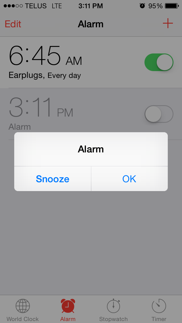
2) At the specified time, the alarm goes off. One of the following screens will appear:


The left screen appears when the phone is locked, and the right appears when it is unlocked.

3) Depending on how tired I am (and where I am in my sleep cycle), one of two things will happen.
            a) If I am not bewildered by being woken up in the middle of a dream about riding a unicorn to the grocery store, I will tap the left button to snooze for nine minutes.
            b) Or, much more likely, if I am totally dazed and out of it, I will accidentally dismiss the snooze and have to manually reset my alarm for nine minutes.
4) See step two.

There are three major flaws here:

1) The interface is completely different depending on whether the phone is unlocked or not.

Muscle memory dictates that repetition is best, and interface patterns will provide the user with hints about how to navigate the device. These two strikingly different user interfaces only serve to confuse the user in their groggy state. Especially if the user is familiar with the interface of the unlocked phone state (because the alarm is going off while the user is already interacting with the device), the interface of the locked state will confuse them by a completely different arrangement of the two actions: "Snooze" and "Dismiss". The best way to familiarize a user with an interface is the simplest: use the same interface in as many instances as possible.

2) The primary action is not visible enough.

The current design of the alarm (no matter which screen we're discussing) does not contain a primary action. The two actions (snooze and dismiss), sport too similar a design hierarchy. 

Unlocked Phone
I think we may be facing an identity crisis of what this interface's primary action is meant to be. The modal offers a weak addition of weight to the word "Snooze" on the left button, and I would be very generous to allow that to make the snooze button our primary action. It could be argued that the primary action is the right side button, because so many other iOS interfaces display the right side as a confirmation and the left side as a cancel.

Locked Phone
To snooze, I must tap the phrase "Tap to snooze", which is smaller and less contrasted from the background than "Alarm", which does not contain any functionality. While the interaction to snooze is clearly labelled on the button itself, the action to dismiss the alarm entirely is dangerously similar to that of the snooze. If I swipe my finger to the right anywhere on the screen, including over the text of "Tap to snooze", the alarm will be dismissed. There is no indication that the alarm has been dismissed after this action has been completed.

Therefore, I find it very difficult to confirm that I have actually snoozed my alarm. It is pertinent to note that this user interface would probably be fine for someone of a rested and sound mind, but you and I both know that a phone producing the sweet sound of Marimba in the morning is not going to find me in a rested and sound state.

3) The primary action is incorrect.

When it comes to an alarm, what is defined as a 'confirmation' and what is defined as a 'cancel'? In this interface, the dismissal of the alarm is the 'confirmation', while the snooze is the 'cancel'. I understand that confirming the alarm means confirming that the user is awake. Cancelling the alarm means that the user is not yet (fully) awake and needs more sleeping time. 

The more I think about it, that perception doesn't seem accurate. If repetition of interface pattern is going to help the user at all, they are going to want to choose the right side as a confirmation before they can even fathom what decision they are making. They've just woken up, and muscle memory is going to kick in before the synapses in their brain. The outcome of a mistakenly tapped 'snooze' will only mean that the user must manually turn their alarm off, but they already meant to get out of bed anyway. Imagine it as a brain exercise to wake up (the mental version of our friend Clocky). But the repercussions of a mistakenly tapped dismissal of the alarm will be much less favourable. The user will go back to sleep thinking that they will be woken up again in nine minutes, only to find that they have overslept and someone else got that sweet promotion, all thanks to a poorly designed alarm clock phone interface.

Outcomes:

1) The interface of the alarm should be the same no matter what state the phone is in.
2) The primary action must be bold, have a large amount of interaction space, and the interaction cannot interfere with that of the secondary action.
            2a) When either action has been completed, there should be an indicator of the action.
3) Snooze should be the primary action, not the alarm dismissal.

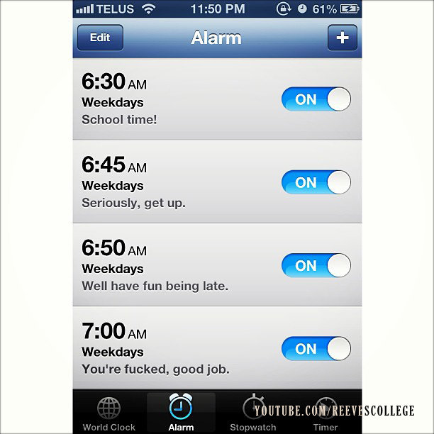
I already know that other people find this as confusing as me. For example, take the visual joke below. I know many people that set multiple alarms at different intervals, when they could theoretically reach the same outcome with the snooze button. The only conclusion I can come to from viewing this behaviour is that the alarm interface is unreliable (or the user is unreliable with the badly-designed interface – take your pick). 


This user doesn't rely on the snooze button. I can relate.

Further Research

I took a look at some third-party alarm apps to see what else is out there.

Wave App by Augmented Minds
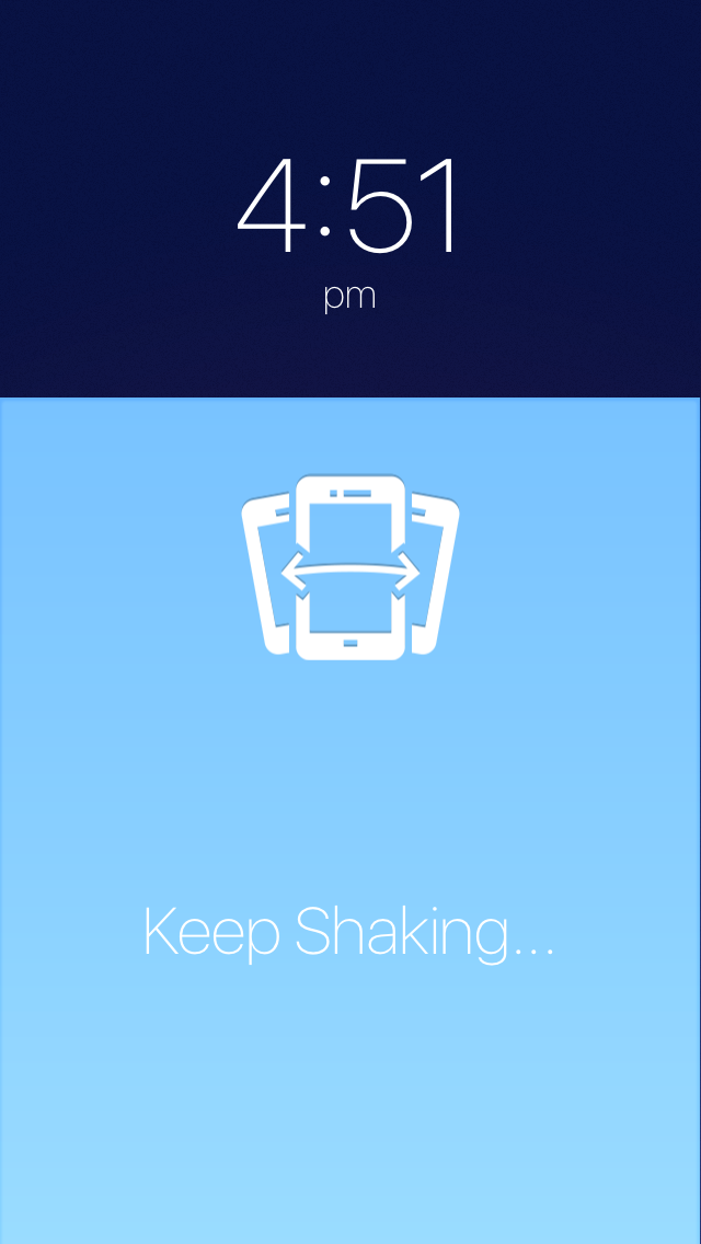
This app uses motion detection as an interaction for the user to customize. By waving their hand over the camera, the app will either dismiss the alarm or snooze depending on the user's selection. This seemed like good idea, until I realized that the app needs to be open and the phone can't go to sleep. This takes a toll on battery life, and even if I suppose most people keep their phones plugged in overnight, all kinds of fun notifications will appear in the middle of the night if the user forgets to set their phone to Do Not Disturb.

I attempted to customize the app by setting the wave of my hand to snooze the alarm, but that didn't work as well as I expected because turning off the alarm became almost impossible to do. This is a prime example of how the primary action's interaction interferes with that of the secondary action.

Wake Alarm Clock by Tiny Hearts Limited
This app allows you to set one of three interactions for snooze or alarm dismissal: slapping your phone screen; turning your phone over; or shaking it. There's also a 'challenge mode' that allows you to set how much interaction is necessary to turn off your alarm. But again, none of this will work unless you keep the app open and your phone unlocked while you sleep.


The app also boasts a 'night mode' of a reduced brightness that is easily accessible by swiping right.

Alarm Clock Free by iHandy
This app also allows you to shake your phone to snooze, but the colouring of the buttons also shows that alarm dismissal is the primary action. One winning feature is that it fully explains that the app will not work properly unless the app is open in the foreground.


And as a plus, it will use music from the user's Music app to wake them up. Although I have personally never been a fan of this because it just makes me hate whatever song is waking me up. But that's just me.

Outcomes

1) Broad interaction is more effective than precise interaction
Shaking the phone is a great example of big, broad interaction that is within the user's ability as they wake up and gather their senses. Trying to aim for a small button that is not contrastingly coloured is a difficult task for some at any time, not to mention the state the user is in when they wake up.

2) The apps do not work in the background
All of these apps must be left open during the night. Because of that, I am forced to set my brightness and turn on 'do not disturb' before I go to bed every night. That seems like a lot of steps.

I know that all third-party apps are not able to access anything on the lock screen beyond notifications (which bring us back to the problems with the iOS alarm), so my time would be better spent redesigning the existing Apple interface than creating a new app.

Sketches

Composites

I made sure to include a big shiny snooze button, but the user can also opt to shake their phone to snooze. I would also set some sort of 1-second sound effect to play when snooze starts, so that the user knows it has been set.

When the user is ready to get out of bed, they slide right at the bottom of the screen, and must also confirm a modal that they want to dismiss the alarm. This is to ensure that they meant to dismiss the alarm and not to snooze. As I mentioned in my research above, if the user accidentally taps to snooze, they will be taken back to the middle screen where they can simple swipe right again. Easy!

Thursday, September 10, 2015

Virtual Stores

With the semi-recent closure of Future Shops everywhere (guess I can't return those headphones I bought two years ago), I started to think about the way people view the act of shopping in our increasingly virtually-driven world. Where once, physically travelling to a store was the only way to find, understand, and purchase an item, we can now do all of that more easily online. And we can do it in our underwear (always a plus). So that only leaves one missing piece, the tactile experience.

Personally, I am still not very comfortable buying things online because the tactile experience of an object is very important to me. I have to know how something looks and feels up close, otherwise I won't feel comfortable making a purchase. I know a lot of people share my opinion when it comes to clothing (how will I really know that this monokini is true to size?), but I am even more picky than that. I happen to have a rather small head (it's good to know your body), which means I have a hard time finding a pair of glasses that fit without sliding down my nose.

Now enters Clearly Contacts, an online store for glasses. They allow you to upload a picture of yourself to see how your face will look with all of their many styles of frames, but how can I purchase something so important without knowing how it will feel on my face? You may know that Clearly Contacts once offered the famous 'first pair free' frames promotion for new customers. I was eager to get a stylish set of frames for just under $40 (with shipping and anti-glare – that's how they get you), but I simply wasn't comfortable making the purchase without trying them on.

And then, Clearly Contacts opened a brick-and-mortar store on Queen Street West. Among the hustle and bustle of record stores, tattoo shops, and vintage clothing basements, I could now walk into the store and try on all the glasses to my heart's content. Which I did. But the catch was this: the first pair free promotion was only available online. So I was forced to use the tactic that so many people these days use: I tried on the glasses, made a selection, and then went home and bought my chosen frames online. I used the store like a showroom.

These days, I have noticed that a lot of people shop that way. They go into a store to get a physical feel of the product they want to buy, maybe comparing some models if the store is well-stocked, and then go home to find a better deal online.

With the advent of the internet, so many of our daily routines have changed. I'd venture to say that some of these stores that have closed because of this change might have saved themselves if they had gone with the flow instead of resisting. For example, I get the feeling that Clearly Contacts opened brick-and-mortar stores simply to get people to feel more comfortable buying their glasses, through any means. I think their marketers knew that opening a store would drive sales, even if those sales were online. By making it possible for consumers to test out their product in a real store, they were able to create even more brand loyalty online.

I wonder if Future Shop would have survived if their marketers had tried a showroom approach. There are certainly more benefits to this kind of business model than meets the eye. The costs associated with shipping products to stores would reduce considerably, as all merchandise would be shipped from warehouses directly to the consumer (like Amazon). There would (hopefully) be less packaging in the products themselves, because that 'store model' is the only one that needs to look attractive to consumers. And while we're on the subject of the showroom itself, pretty much every store could stand to reduce its land area by at least half. With a quantity of only one for every product, there would be no need for a backroom, or even as many staff to man the huge showroom floor.

And if marketers are really smart, they would offer free WiFi to allow customers to make purchases from inside the store. So, although many processes are becoming more and more digital, the human need for tactile connection to the items we purchase will never die out. There will always be a need for physical storefronts, even if they don't actually sell anything.

Monday, September 7, 2015

Weekly Update: Brand New

Music: Home
Randy Goffe is a 19-year-old from Florida with some of the best electronic jams I have heard in a while. I stumbled upon one of his songs through a mixtape on SoundCloud, and have since been checking out the rest of his stuff. I really appreciate his attention to detail, especially the way he has been working so hard to get new music out after an eight-month hiatus.

This is my favourite song of his (so far). It sounds like a mix of Classixx, Anamanaguchi, and Com Truise all rolled into one.


Accomplishment:
I have finished the Jumbotron article, and will be sending it out on Tuesday. Cross your fingers! I have also been riding my bike quite a lot. I got a bell, and am learning to stand. Harder than it looks! I was able to stand while coasting for about five seconds (not bad!), but I can't pedal and stand at the same time yet. Soon!

I also really want to get back into a learning phase, so I took advantage of a $0.99 sale on Skillshare for three months, and have signed up for two Brainstation workshops in the coming weeks. September 17 is Intro to Product Management and September 21 is Intermediate Web Development Workshop. Can't wait!

Goal:
The first and foremost goal of the week is to get going on the "Brew Beer Drink Beer" project. I have been given the responsibility of creating some custom typography for a big wooden shadowbox window, the inside of which will be filled with beer bottle caps and the like. I want to get the first draft out by Saturday, so I'll have something to post here.

As I mentioned above, I'm going to get back into Skillshare. I want to check out the second Joshua Davis class (since the first one was awesome). I'll have some time this weekend to get back into it with a vengeance.

I'm also going to be checking out the Wearables Wednesday Meetup in a couple days at the MaRS building. I've always wanted to check the building out since my mother went there for Doors Open, and this meetup is all about wearable recording devices. Apart from the tech, I am interested to hear and discuss about the social and privacy ramifications of wearing recording devices (that may not be easily spotted because of their design or size). Should be fun! And if nothing else, it's a beer-and-pizza-fuelled way to get rid of some of my ~800 business cards. Great!

Random Thought:
Memory is a weird thing. And it's not really even a physical thing, but more of an abstract idea. We play back events that have happened to us in our heads like tiny projection rooms that only we can access. Often, the projection room starts up a film without our knowledge or consent. Sometimes it's a happy film, sometimes not. There you are, just peeling potatoes and thinking about something that happened at work today, when you suddenly remember that time you peeled potatoes with your late grandmother. The potato peeling endeavour became a lot more sad, pretty much for no reason at all.

I wonder if we can somehow control that center in our brain that holds our memories. Why is it that I can't remember something that happened to me before I turned five, but then I get hit with a certain smell or sight and it all comes back to me for a small moment. I suppose hypnosis might be a form of this, but I've always been skeptical. I wonder if there are any Skillshares about harnessing memory. Now that would be a good skill to share.

Inspiration: Brand New Conference 2013 Branding
Brand New is a website by Under Consideration that ruthlessly critiques rebrands of large corporations and organizations. They are known to be scathing and unforgiving in their reviews, a trait also found by their readers in the comments. Everyone has an opinion.

I recently came across their very own branding for their annual branding conference in 2013. Very meta; how does one create the branding for a brand design conference? The stakes were certainly raised.


The logo is based on a 'hardcore', which is an arrangement of four letters around a big X. I'm sure, like me, you've seen it everywhere. The abbreviation of the conference, B-N-C-13, was arranged around the X is various different formations, using a 10 x 10 pixel grid as a baseline. I'm going to assume that a lot of people did not like this logo at first, but I have to say that it grew on me.

The colours of the brand were a simple black and white with an accent of strong yellow that somehow worked very well. This feels like an effective example of pushing things so far into overbearing that they become pleasant again.

My favourite part of the brand was the attention to detail. Each of the covers of the program were hand-stitched. Can you imagine how long that took? And it didn't end there.


The handles of all the goodie-bags were hand-dipped in yellow paint, and the badges were all made by hand as well.


 Look at that laser-cutting! I love it.

And it seems that the scrutinous public liked it, too. Read more (and the very interesting comments section) here.

Saturday, September 5, 2015

Someone's Got Beef

We all know of the big retail rivalries in the world. Coke vs Pepsi, Starbucks vs Tim Hortons (or maybe that's a Canadian thing), and McDonalds vs Burger King. As with all of these examples, the former generally prevails quite completely over the latter. I think Coca Cola has something like 80% of the market share of sodas in the world, and we all know that joke about ordering a Coke in a Pepsi restaurant.


I'm all for the underdog trying to unseat the king from his throne, but sometimes, one company simply has the best product available. I would choose McDonalds over Burger King pretty much any day of the week, even if it is slightly more expensive. That said, it certainly shocked me that Burger King recently launched a huge, very expensive ad campaign asking McDonalds for a truce.

Burger King took out a full-age ad in The New York Times and The Chicago Tribune, all to ask McDonalds (very publicly) if they would put aside their differences to make a burger with mixed ingredients from both companies' signature burger, the Whopper and the Big Mac respectively.


They even went so far as to design packaging and employee uniforms with unified branding of both chains. Far be it from me to note that the brown of Burger King far overpowers the red of McDonalds. Red is a much stronger colour than brown, but even the name of the proposed burger, the "McWhopper" mainly sounds like a Burger King product.


This all seems very well orchestrated by the people at Burger King. By proposing this alliance of two 'fighting' chains, they are extending the olive branch to McDonalds and calling all the shots. The ad even went so far as to compare their rift to that of real, terrible events happening in war-torn parts of the world today.


So, no matter what McDonalds' response would be, they were pretty much backed into a corner. Pretty underhanded, right? Well, as I mentioned before, Burger King certainly likes to think that they are an equal of McDonalds, but McDonalds (and myself) certainly doesn't see it that way. Steve Easterbrook, the CEO of McDonalds, responded with an equally public (yet marginally less expensive) reply on Facebook.


That's exactly what I thought they would say. McDonalds has much more clout and business in the world than Burger King, and certainly a lot more reach, which they are already utilizing in various charitable efforts. And why not? They are a multi-billion dollar corporation. And they certainly don't need help from Burger King in any of these endeavours.

My favourite part is that Steve called Burger King out about comparing their rift to that of real war, and of putting their company on the spot by making all of this public. So, in the end, Burger King just looks like an asshole, and McDonalds gets lots of free advertising (that they didn't even need in the first place...but you can't argue with the price tag).

What a terribly schemed advertising venture. Let it be known that risks are only worth taking if there is at least a small chance of payoff. You can check out the website proposal for yourself here.

And meanwhile, Burger King isn't really practicing what it preaches, anyway.


Classy.

Tuesday, September 1, 2015

Weekly Update: Efficient Binge-watching

Music: Thundercat
The amazing and musically extremely talented Thundercat is the bassist of Flying Lotus, and also a producer of note, having done work with Kendrick Lamar and crossing genres as it pleases him. I really feel like a change of pace from all this live electronic music, so I'm excited that he's coming at the end of September (on a chill Sunday, FYI). Check out his new song:


Accomplishment:
I posted a shot to draft.im, but no luck yet. We'll wait and see. I also added Google Analytics to all the pages of my website, and my blog. I'll be doing more research into what that's about this week. I've been riding my bike like crazy, and managed to play some tennis. Hopefully repeating that this weekend!

I've also bought a ticket for the York Region Startup Weekend. I can't believe that as soon as I leave York, we get a hackathon on campus. Where was this when I attended school regularly?! Anyway, very excited for the end of September. It's also the same weekend as Thundercat, so that'll be interesting

Goal:
I'd really like to get that jumbotron article done and sent, which I will be doing Saturday. Other than that, this week is getting ahead of me so I'll keep it light. Maybe some bike riding (standing up! My bottom is sore from all the bumps so this is a must).

Random Thought:
I don't binge watch a whole lot of television, but I recently started watching American Dad through my Wii's Netflix. Binge watching is quite different from regular television watching for a few reasons. Probably the most annoying difference is the opening and closing credits. If I am watching a large number of episodes at once, the theme song and end credits are going to get really repetitive and I'll definitely be less patient waiting for them to finish. Probably the only exception to the rule is Game of Thrones, whose opening titles change quite drastically and are important to the story of each episode. More on that here. So why can't Netflix have a setting in which you automatically skip the titles and end credits? I know my job is to think about end user experience with product design, but this isn't rocket science. Get on it, Netflix! If I'm going to binge watch television, let me do it as efficiently as possible.

Inspiration: Bowling Shirt Puns
For some reason or another, every sitcom seems to have an episode in which the main characters are part of a bowling team with an awfully amazing pun for a team name. I was recently watching an episode of The Simpsons in which Homer joins a bowling team called the Pin Pals. This episode only made me realize that my love of terrible puns reaches at least as far as bowling team names, which are almost always puns.


There's also an episode of American Dad in which a bowling team is named Lanes Addiction. Hilarious. I also love the style in which they are almost always designed, with 80s flair and scripty type. I want to develop my hand typography skills, so I was thinking of creating some possible bowling team logos. How about these:

The Bowler Cats (like bowler hats)
Splitting Pairs (splitting hairs)
Hare-Laned (hare-brained)
Firstie Alleys (Kirstie Alley)

I'm sure I'll think of some better ones as I start designing, but that's what I came up with in fifteen minutes. I'd be happy to hear some puns from the audience! :)