


Music: Nicolas Jaar
Born in New York but brought up with roots in Chile, you can taste the Latin elements in Jaar's amazing experimental electronic sounds. Using sound bites, sythesized beats and natural tones, he somehow makes even the simplest compositions into hypnotic tunes that I just can't seem to get enough of. I especially like the way he pares down songs, sometimes leaving large gaps of silence for dramatic effect. It works really well. Check out this song off one of his older EPs.
Accomplishment:
I took another page out of my book of being more open to things, and took a trip to Markham on Friday to see Balé Folclórico da Bahia, an amazing Brazilian Batucada from Bahia (just like my band). It was so inspirational. They had drumming (of course), dancing, some sort of acting-skits, singing, and even (tastefully) topless ladies! There was really something for everyone. I was actually caught a little off guard by the nudity, especially considering most of the people in the audience were old white people. But everyone seemed to enjoy it.
I also organized all my photos, but just need another hard drive or something to back them up twice. Gotta be careful since they're probably the only digital thing I own that is truly irreplaceable.
Goal:
I've been dragging my feet a while on the FriendCanoe colours, so I think for this week I'd like to take a step back and find some good colour/branding inspiration in other apps. Hopefully that'll be a good starting place to really get the cogs turning. I'll also be working on some original empty states for faces, because the original ones are actually placeholders created by someone else.
I'd also like to clean my main portable hard drive, as it has become a sort of dumping ground without much organization in the past while.
I'd also like to scan in some old typography projects I was working on and create an online resource of them. This is all in the process to get back into hand-lettering and bring some art/craft back into my increasingly digital world.
Random Thought:
I've been noticing lately that some bands have been spelling their names purposefully with all capital letters. I suppose I first noticed it with the onset of MGMT around 2005, but they had good reason because their name is the short form of a real word. Now you've got bands like BANKS, TOKiMONSTA, HOME, EZRA, and more. While I suppose the main benefit of these LOUD band names is that they stand out from others with more conservative use of upper/lowercase, it's really more detrimental than anything.
If all the letters of a name are capitalized, I actually find a word much harder to read. Lowercase letters allow for a more unique shape of a word, which makes it more legible. And now that so many bands are adopting this trend, none of them stand out. This follows the design rules that if everything is given priority, nothing has real priority.
That said, in these days of poor festival hierarchy to begin with, where all the band names are capitalized anyway, I suppose it doesn't matter.

MGMT didn't stand a chance of standing out.
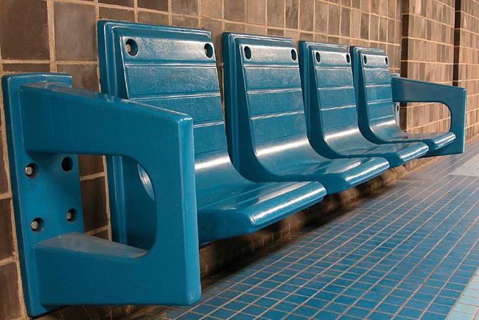
Inspiration: Montreal's Subway Benches
With the excitement of the Osheaga lineup, I began perusing the Montreal Blog website at length for no reason. It's a rabbit hole to the same degree that BlogTO is, and I found some lovely posts articling the culture and art that Montreal exhibits a little more than Toronto. For example, the subway benches at each stop are so individually unique and interesting that someone wrote a post about them. Just what I like to see.

Subway benches feel like a good design item to chronicle for a few reasons. They are easy to identify as successful or not from their image. It's easy to tell if a bench serves its purpose because we all know what a place to put our butts looks like. Of course we can't tell how comfortable a bench will be from a photo, but we can get a good idea. Also, since its one functional goal is somewhat simple, the bench is a great blank canvas upon which industrial designers can experiment and go a little crazy. On top of that, I would argue that designers SHOULD go a little crazy on subway benches because they should be as interesting as they are functional so that people can delight upon them while they wait for the train.


I know that sounds a little weird, but these benches make me feel happy. They're nice to look at, and from what I can see, they get the job done. I have been to some of these subway stations in my short life, and I can attest that my butt is still intact. Let that sentiment speak volumes, if you will.


View all the benches here.
No comments:
Post a Comment
Note: Only a member of this blog may post a comment.