


Check out one of the first infographics I ever made, for a project back in second year university.

What you're seeing here is the amount of time it takes for a piece of fruit to go bad. I made the fruit into pie charts (which doesn't really make any sense when dealing with time, but that's not the point here). While the information is arguably factual and calculated, the way in which I designed the accompanying imagery gives it a whole new dimension. But enough about me, let me show you other examples that prove my point.
Ursus Wehrli has been working with organizing the objects around him into delightful little neat piles. Not infographics exactly, but beloved all the same.


How charming is that! He even organized the dots on the bowl. I could cry at the cuteness and attention to detail that is only found in the craziest of people. While I know this is only displaying how much fruit is in a bowl, you have to dig a little deeper to find the real meaning. Why not take this idea and display some sort of information that people need? Like nutrition facts: how much of my fruit salad is comprised of healthy, delicious kiwis and how much of it is comprised of terrible, tasteless honeydew (honestly, who likes honeydew)? You see what I mean. Not to mention, think about scale. This could also work at the macro level:


Laying the infographic right into or overtop of the subject matter makes for an arresting visual. It brings the cold facts and numbers to us on a plate that is warm and feeling. Check out more of this project here.
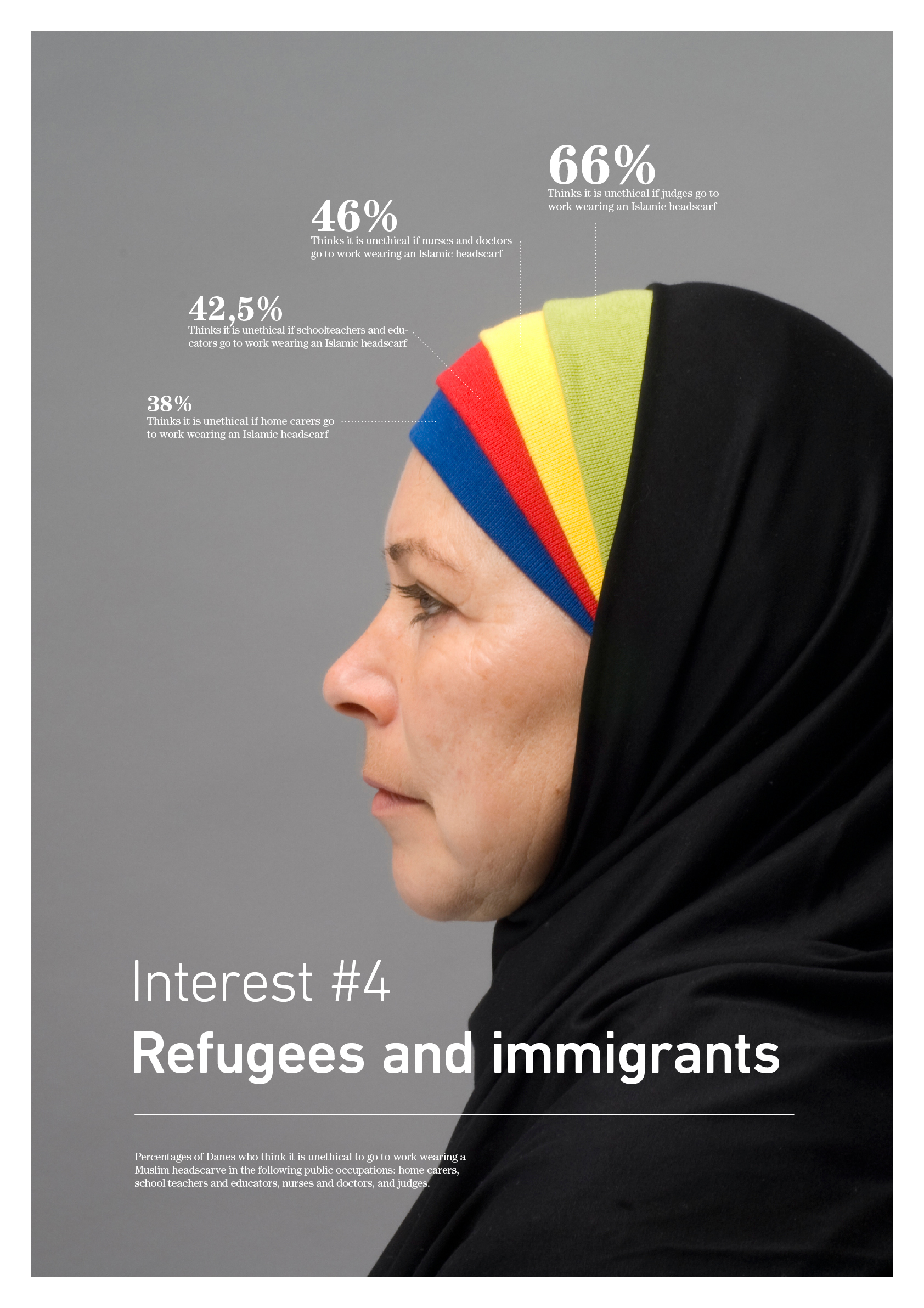
And of course, we know that life imitates art. So here's an example of a photorealistic infographic I found in my daily social media travels:

University students drink a lot of coffee. They also love any subject matter that relates to them. So, courtesy of my friend Garin, I present to you a bar chart of coffee drunk by OCAD students. Made by the students, of the students, and for the students. I wonder what they'll come up with next.
Beautiful infographics, thank you for sharing. It was necessary to present it all in a presentation with diagrams. It would have looked nice. I can advise templates for diagrams http://charts.poweredtemplate.com/powerpoint-diagrams-charts/ppt-pie-charts/0/index.html. It may come in handy in the future. Good luck.
ReplyDelete