


That pattern is probably loaded with security features which is all well and good, but we can definitely do better. Check out Norway's passport redesign by a firm out of Oslo called Neue. It's beautiful on its own, not to mention the crazy attention to detail right down to the blacklight illustrations. It's simply wonderful to see a design that uses constraints (all those security features) as a benefit rather than a disadvantage.
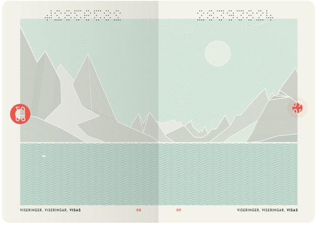
Not to mention that the type is spot-on and the colours scream Norwegian design (and national pride, I suppose). I like the subtle nod to the Norwegian flag (which is red, blue and white). By tweaking the colour just a little, the passport can remain true to its heritage and feel like a modern item. It's something I'd be happy to show any border guard.
While we're at it, let's take a wee look at currency as well. Now that is a place where Canada can shine. I know Americans call it 'monopoly money' but to be honest, I really enjoy the illustration, colour, and even the security features used on the new(ish) polymer notes we have. If Americans think that using colour as a differentiator for denominations is childish, wait until they get a load of this (proposed) design of the Hungarian Euro.


They're hand carved into copper plates, just like how old banknotes were made. I love the nod to a process of a past time. And the blacklight skeleton is so humorous! The only negative thing I could possibly say is that there really aren't many security features. Beyond that blacklight and what I believe is a piece of foil striping down one side, the notes are pretty easy to forge. Unfortunately for us designers, we do need to keep things like that in mind when designing, and again, use them to our advantage rather than ignore them because they make a design look 'ugly'.
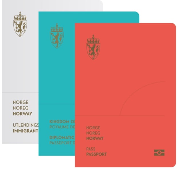
And back to Canada again, we have the wonderful redesign of our very own passport. Apparently, all of the designs below exist on every passport issued since July 2013. Check these out!

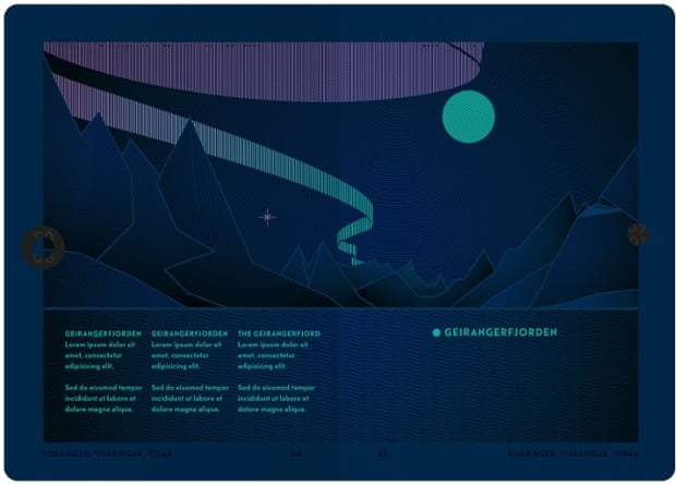
A normal passport page, until...

blacklight!


Simply stunning, albeit very similar to the Norway passport. But hey, design is all about taking ideas and running with them. The thing that really astounds me is the fact that these passports have been around for a year and a half, and this is only becoming newsworthy now! The Canadian government really should have promoted the beautiful work that was done, instead of letting us stumble upon it. Or maybe it wasn't publicized because it was an easter egg to find! I don't know what to believe.
No comments:
Post a Comment
Note: Only a member of this blog may post a comment.