


Music: Real Estate
After attending an amazing concert opened by Frankie Cosmos at the Danforth Music Hall last week, I am smitten with this band. I had heard most of their discography in passing, and was more excited to see Frankie Cosmos if I'm being honest, but the band honestly killed it live. Their easy listening tunes had the crowd mesmerized, and there must have been something about the lighting, the way the members were illuminated from the side, that glued my eyes to the stage. It was just one of those shows that exceeded my expectations and made me an even bigger fan than I had been before. Listen below:
Accomplishment:
I have created a Trello Board for my blog, which I hope will keep me organized and on track. You can view my updates live here. Each of the white cards is a task, while the grey surrounding cards is the status. Tasks start on the far left, and move toward the right as they are completed. As you can see at the moment, I'm focusing on the second of four phases (denoted by colour). Breaking things down into manageable chunks is the key to keep this train rolling.

Goal:
This week, I'd like to finish the three items in the "In Progress" card - selecting fonts, finding a good responsive template so I don't have to start from scratch, and finalizing the visual comps that I designed a few months ago.
Random Thought:
I've been noticing that a lot of products do provide accessibility for colourblind users, which is awesome, but that accessibility is hidden behind switches that are hard to locate. Take Trello (mentioned above) for example:
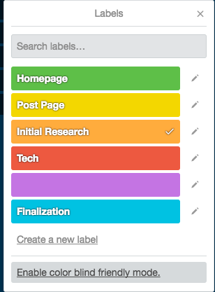

A user must find this mode and turn it on, but perhaps the originally chosen label colours could have been colourblind-friendly from the start instead.
Another example that comes to mind is the setting in a popular mobile game called Two Dots. While I am not colourblind (to the best of my knowledge), I actually find that the colourblind mode makes the game easier to play. Instead of relying on colour alone, the colourblind mode allows me to rely on shape in addition to colour to make my next move.
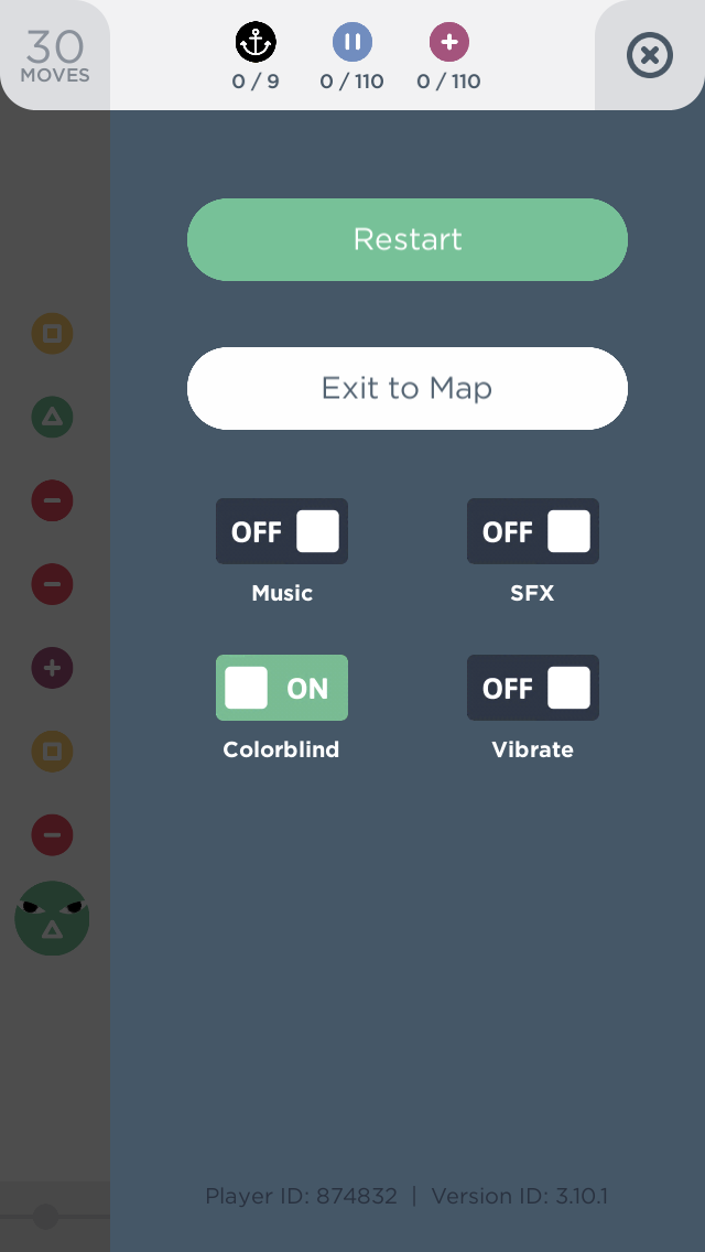
The setting, found in the side menu (not terrible).


I find the right side much easier for noticing patterns that will help me play the game.
While ensuring an interface is always accessible to colourblind people can be a challenge and creates visual tradeoffs that have to be determined by the designer, it's arguably a better way to go than forcing colourblind users to locate the settings that work best for them, often having to trudge through interfaces that are especially difficult for them to navigate.
Inspiration: Vice Creators
Always a fan of the weird and creative, it's not often that I come across a news source that scratches my personal itch for art-related news stories. I came across Creators by chance on Facebook and, after looking through about four of their posts, I knew this was a great new addition to my daily creative inspiration.
I actually used one of their stories, on sushi shoes, in a blog post last week, and the interesting content keeps on coming.

A random screenshot from today's selection of articles. The Mickey Mouse is especially disturbing.
While I realize that Vice doesn't have the greatest rap in the media and/or fact-based worlds, I imagine that if one takes everything with a grain of salt, there really can't be much harm in spreading art-related news. As with all content on the internet, readers have to know how to separate fact from opinion and draw their own conclusions. So go ahead and keep doing that :)
No comments:
Post a Comment