


I won't lie; I woke up on the second day of the conference a little worn out. I had enjoyed myself a little too much the previous day, probably somewhere between visiting the beautiful IXDS office and time-lapsing through the old cemetery (see the last post in the series for context on that one). Ah well, there was time to get hydrated as I chose another walking route to the conference, this time along the northern part of the oval of land that is the Oktoberfest grounds. I also walked through a neighbourhood that felt somewhat scholarly, with antique-looking buildings that just looked like they were places of study. I can't say why.


"Anatomy Collection"

"Psychiatric clinic of the university"
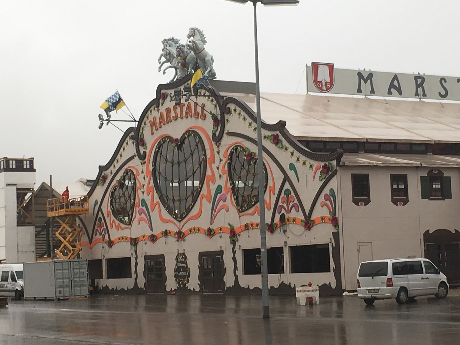
A building at Oktoberfest! I think this one might be permanent.

More interesting stuff in the business park I mentioned in the last post.

The tradeshow floor was alive and well on the second day!
I entered the hall, obtained my habitual Bavarian pretzel, and took a seat on the upper deck of the conference hall for the talk to which I was looking most forward, Gert Franke's talk on interactive data visualizations.
TALK #1 Gert Franke


The weather poster.
Gert discussed the three ingredients for good data visualization:
- Acquire data
Cellphones, for example, gather TONS of data without the user having to do much of anything. The same thing goes with working on a desktop computer or even buying something at the supermarket. Big organizations have access to this data, and it is becoming increasingly more open-source for access by everyone. - Process data
Visualize it. There are tons of programs that you can feed data into, which will spit out visualizations. Finding the right one for your data and what you want to create is the trick. With extremely large data sets, one can rent space in servers quite cheaply these days. - Present data
Display it. Everyone carries phones around with them wherever they go, so being able to interact with a visualization on your phone is a good option. We also have the advent of smartwatches and VR, but we have to be mindful of the choices we make for the user.

Some challenges that go with data visualizations.
Gert also discussed the advent of smartwatches. We have this technology, but many people (and businesses) still didn't understand the true value of a smartwatch over a phone (which we have to carry anyway). A smaller interface means less ability to get things done, but the device is always accessible (right on your arm). How can that be harnessed for something useful to the user?
Gert explained how cities have been installing sensors on telephone poles that track data, some of it relating to air quality. So, if your phone is in your pocket while you're walking around, but your smartwatch is right there, it seems like the perfect candidate to read the sensors and let you know what the air quality is like in your immediate area.

The image above is obviously static, but they tried to design the interface with animations that let the user 'feel' the data. I find this remarkable.
In his final notes, Gert explained that since all users have a biased view based on their own experience, data visualization can take advantage of this by allowing the user to define their own outcomes based on the data they see. He also suggested that journalists can assist designers by helping them to turn the data into something meaningful. Yet another reason for cross-industry collaboration!
TALK #2 Adrian Zumbrunnen
Adrian spoke about animation in an extremely inspiring way: animation is the personality and soul of a product, and has the power to create a holistic experience in an equal, and perhaps stronger way, than visual design. I had always known this in my heart but never really thought about it.

Adrian showed a website he had visited that overused animation in an annoying and distracting way, peppered around an article he was trying to read. He displayed that the animations were so distracting, that we hadn't even noticed the fact that he was holding a bar of swiss chocolate in his hand during the entire runthrough of the website. (I looked at his hand – it was true!)
You may have heard of the Disney's Twelve Basic Principles of Animation, basically a guide on how to animate objects to look like they are alive. The guide is excellent and can truly teach someone how to animate something to life, if you want that object to look and feel like a Disney movie. Adrian showed us the principles applied to a checkout modal in which the user is asked to enter their credit card number. Imagine a box, asking for an important and private piece of information, bouncing into the screen from the bottom like Winnie the Pooh. Doesn't inspire much confidence, does it? Adrian showed the same box again with a different sort of entrance animation, gliding in from the bottom with the grace of someone who was born with skates on their feet. Adrian explained that animation is subtle, yet strong like body language.
Adrian gave us a handy list of the elements of meaningful transitions:
- Orientation
The relationship between items. A good example of this is the animation of navigation (sliding left to right) to understand the way a website is laid out. - Responsiveness
Adjusting layout based on the user's input. This is done in the example of scrolling down and hiding the navigation (and the navigation appearing again when you scroll back up) - Time
A good average duration for a transition is 100-300ms. Any longer and it seems excessive. If animation slows down an experience, you're doing it wrong. - Easing
The key takeaway - "If the motion isn't right, the animation won't delight". This was a big hit. Everyone 'oohed' and 'ahhed'. - Personality
As mentioned above in the example about Disney's animation guidelines, animation can be styled to match the personality you want to get across to users. You can use empty states and loading states (which are necessary but have a lot of room for customization) to showcase personality
And Adrian's final gem: motion personality can be derived from the way the client might describe the product if it were human, or by the purpose for which the user wants to interact with the product. This makes a lot of sense.
Then came lunch. I had an interesting talk with another attendee about why I hadn't seen many people walking around wearing headphones like they do in Toronto, and podcasts in Germany versus Canada. All too soon, the afternoon talks began.
TALK #3 Mike Alger
As an interaction designer working on user experience for VR at Google, Mike had many gems to share from his extensive research. While it seems like anything can go in this new world of design and engineering, Mike wanted to share some of the possible standards that Google is trying to set. Even at the most basic level of typography choices, it can be good to start from a basic understanding of how users interact with type in VR.

So what do people want from VR?
- VR is seen as a gateway to enable new experiences, perspectives and abilities
- we can adapt from genres of 2D gaming, but we can make new genres too
- games are only one part, alongside watching movies, increasing productivity, etc
- it is NOT 2D gaming
- sessions are 30+ mins (not a snacking experience)
- this is interesting, why don’t we try to make it less? maybe it will be
- used in the home, comfortably seated (standing gets tiring quickly)
- not so easy to turn 360 degrees when seated
Mike also explained that in utilitarian tools, we have the ability (and should strive) to use 3D to do things that 2D cannot do. For example, maybe a calendar works best as a series of layers, which could never have been done before.
Where do you put stuff? If the world is 3D, how do designers work with all that space, ensuring that users don't miss anything?
- further than 80 degrees to each side will hurt the user’s neck, no more than 70 degrees down
- stuff shouldn’t be too close to your face (less than 0.5 metres)
- anything past 20 metres the depth of field is harder to understand
- visual noise helps to show a solid item, otherwise it will look like a void
- type has to be of a certain size to be readable
Mike ventured a guess that eventually, VR will move away from home-use to industrial applications, as the VR-improved way of doing work will become necessary to doing best work. So, it will be standard to work in VR like it used to be standard to work in, say, Microsoft Office.
One audience member asked an excellent question at the end of the talk: how do we combat motion sickness in VR? As someone who experiences motion sickness, I was inspired to hear Mike's answer: motion sickness in VR is caused by designers not understanding the medium in which they are working. As we begin to understand the best practices in designing for VR, we can remove the possibility of it affecting anyone in such an extreme way. I wonder if that can be applied to cars. Perhaps self-driving cars will be so well designed that I won't feel sick in them! What a glorious time that would be.

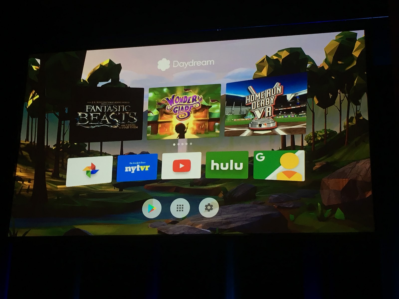
An example of a finished product that Google has designed for Daydream: a sort of home screen menu interface for VR.
Next came the lightning talks - in the same format as yesterday.
Lightning Talks
- Tank Thunderbird, whom I had met the night before at IXDS, spoke on using VR for Product Testing at the aforementioned firm where she works. As soon as I heard about VR, I wondered why designers were not more forthcoming about using VR for this purpose exactly. Speaking as someone who is in love with rapid prototyping (especially with the advent of the 3D printer), why don't more designers see VR as the MOST rapid form of prototyping? I suppose we'll see where this goes. Tank also mentioned that VR will (hopefully) become more common in industries such as architecture, where homes can be modelled in VR before any expensive mistakes are made.
- Lauren Robertson spoke on prototyping an interface for future forestry vehicles. Her presentation was extremely inspiring, having worked out a problem definition and therein a good solution for interfaces to assist loggers with the collection and organization of felled trees in the snow-covered forests of Scotland.

- Kate Fischer spoke on the future of the self-driving car. At the moment, before many people have been exposed to actually being a passenger in a self-driving car, many have little trust for the system. Kate suggested that as technology improves and people get more used to the interface, designers of the self-driving car experience will be given the challenge of entertaining passengers (both as a way of killing time during the drive, and as method of shifting their focus to remove anxiety and build trust).
- The last lightning talk was a duo – Hans and Christian, from a startup called ProGlove. They had developed a special glove for car manufacturer assembly line workers to scan auto parts as they move them. This saved the workers an enormous amount of time during production, and also displayed the challenges a designer faces when developing products for industrial use. If something doesn't fit or work quite right, the worker will adjust it to adapt to their work flow. There is no room for users to correct the errors of the designer.

TALK #4 Luke Thompson

Luke started off by explaining that Kin is very physical-focused, no matter the project. They even have a 'things table' at work, where they store a little museum of physical prototypes of past projects. Luke spoke about kinaesthetic learning (learning through physical experience such as touching), and how we learn best through multi sensory experiences. In the slide below, they created a set of wooden blocks to be assembled into different sorts of boats that could be 'sailed' on the digital water of a touch surface in a museum. I would love to play with this, and I'm not even a kid!

Something I've definitely come across while working at the Royal Ontario Museum, is that museums have these enormous digital catalogs of objects they own. The better museums make these catalogs available online to the public, which is of course a good thing. But a lot of information is lost when viewing these objects on a screen. For example, Luke mentioned a collection of old flags in the catalog. Since all the images are the same size, the flags all look the same size. But one particular flag was the size of the width of a football field. That information couldn't be done justice in the non-tactile nature of a digital catalog.
Similarly, Kin also worked on a project involving comparing the style and length of numerous bridges. The project contained of a table that split in half on wheels, revealing a screen underneath and depicting an image of the land around each bridge. Context helps people understand the scale of the bridges, and the communities who interact with them.

I liked this slide a lot. On the left, we have a rectangle. But what can we remove and still depict the same division of space?
In closing, Luke professed that he didn't think physical would ever be overtaken by digital, even as we progress into a more digital-focused world. People will always gravitate toward the physical, the tactile. Screen technology will fade, but the internet of things and our need for touch will keep designers creating with the physical in mind.
TALK #5 David Sjunnesson

David is quite a character. One of the newest additions to the IDEO team of geniuses, I was excited to hear him speak on the future of designers in a world 'eaten by technology' (also the final talk of the conference).
The question he posed to the audience: "Will your job be taken over by a machine?" This is a question we continually ask ourselves with every technological advancement. Many articles have been written on the subject, and the proof may just be in the pudding.
David brought up lots of examples of 'machines doing it better', such as that of the movie Sunspring, the screenplay for which having being written entirely by artificial intelligence (and of questionable quality in its infancy), the creation of the extremely popular Netflix series House of Cards, while based on the U.K. series of the same name, arguably made what it was, and when it was from an algorithm and data scraped from Netflix viewers. Basically, a machine told Netflix producers to make the show. And bam, success.
Well, if we know that machines can take over the humdrum job of factory workers and creative unicorns alike, who is safe? And here is where the talk started to make sense. There are things humans can do that machines cannot, and we need to double down on these skills because machines cannot do them. If a machine can generate twenty compositions in a matter of seconds, that gives me free time to work on my overall design strategy. Machines can't actually do the job of creatives, they only exist to make our lives easier.
We can leave the boring work to machines while we struggle with the big questions. We have to do the understanding. We do the research, the testing, the evaluation, the important stuff. David brought up the subject of supercomputers beating humans at chess. Well, sure, a computer can beat a human. But you know what can beat a computer at chess? The combined power of a computer and a human. As mentioned in the post from yesterday's portion of the conference, this only solidifies my theory that the movie Her is a foreshadow of humans developing relationships with operating systems. It's not as far away as you may think.

The tasks of the machine versus those of the human.

Throughout the presentation, David returned to the subject/scare-of-the-time of the ATM replacing the human bank teller. But all it did was allow humans to work more interesting jobs in the direct influx of branches that banks were now able to afford to open. Because of ATMs, actually MORE jobs were created.
Rest assured, the job of the designer is safe as long as we remain adaptable and open to the value of technology in speeding up the creative process (I'd argue that this is true of all creative professions).


Beer!

Some delicious roast pork with crackling and potato balls.

I also watched all the speakers participate in what I gather is a customary Bavarian contest, holding out glass beer steins and seeing who can hold theirs for the longest.

As you can expect, the prize was beer. I took that as my sign to leave, since I had to be up early the next day to get on a train to Tegernsee. More of that in the next Munich post.
And just like that, the conference was over. I still can't believe how fast it went by. There was not a single talk that wasn't at least a little interesting to me. The conference really seemed to suit a large amount of varying interests, and I strongly cherish the experience. All I can do for next year is present the organizers with the chance to have an event app made by EventMobi!
No comments:
Post a Comment
Note: Only a member of this blog may post a comment.