A11yTO is Toronto's accessibility hub for all topics of digital and physical accessibility in the tech space in Toronto and beyond. They run a yearly conference that I just love. Topics are widespread, loosely based around technology but I love the non-tech talks just as much. Let's dive in! Please note I did not include notes for all the talks here, only the ones I especially wanted to share.
Annotating Designs for Accessibility
Kicking off the conference was Anna E. Cook, a senior designer, speaker, and writer dedicated to building inclusive and accessible digital products. I had seen her speak before, with a wonderful riff on the cartoon show Adventure Time as a memorable part of her slides.
A riff on the popular character Lemongrab.
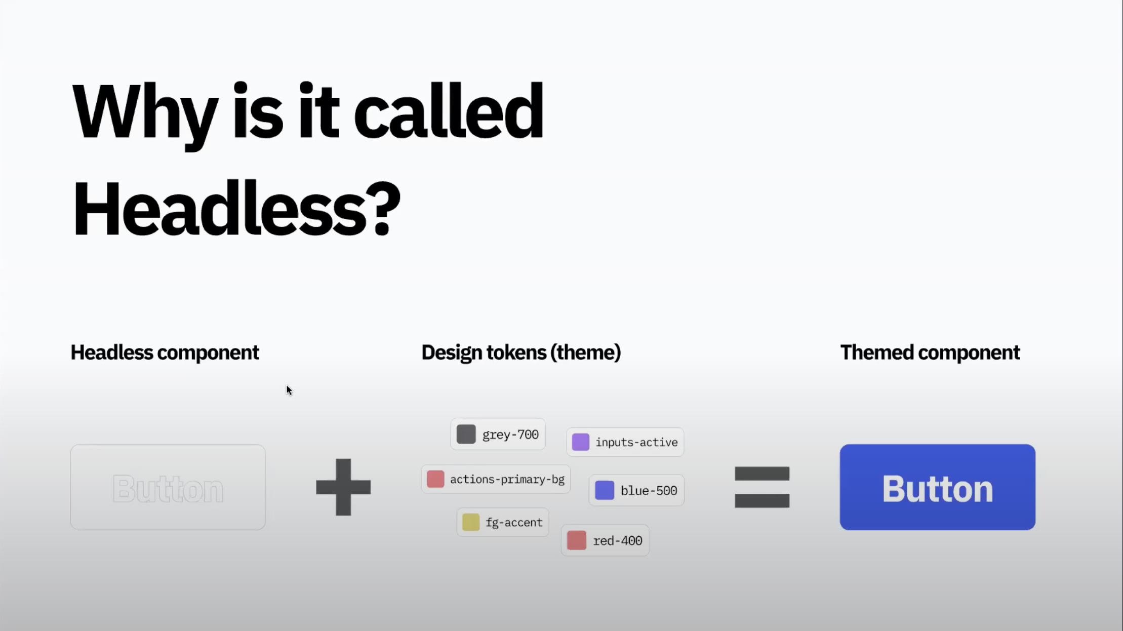
Anna's talk this time around was about annotating designs for accessibility. This is an important step in ensuring developers have all the details they need to make our designs accessible. They already have a lot on their plate regarding development accessibility, so I definitely want to make sure the design part is as straight-forward for them as possible. Of course, annotations are not going to solve the whole problem as we need to be discussing details live with each other, but it's a great reference piece. In fact, designers and developers should be discussing accessibility as early as possible in the agile process.
There are lots of kits to use and some have existed for years. Though the concept of annotations has been popularized in only the past few years.
These kits can be used or designers can create custom kits within their existing design systems. At Vena we use a separate library for our annotations and another for our components, so I think we are already on this track. Once we have a set of annotations, there is still the concept of how to apply them to mocks or screens. Usually this is done with some kind of connecting line between the annotation and the "annotated" item, or with an overlay that can be turned on and off.
Common details to annotate for developers include:
- Alt text (for images)
- Button labels (may be different from the label shown with the button)
- Focus order
- Form labels and legends (may be different from the label shown with the field)
- Input feedback (like error or success messages)
- Heading structure
- Keyboard interactions
- Components in use (we already have an annotation for this on our design system 🎉)
Slightly less common annotation ideas:
- ARIA specifications
- Autocomplete
- Different interaction states
- Landmarks (usually derived from heading structure)
- Page titles
- Prefers reduced motion (a less jarring animation effect for users who choose it)
- Provided captions and transcripts (for audio/video content)
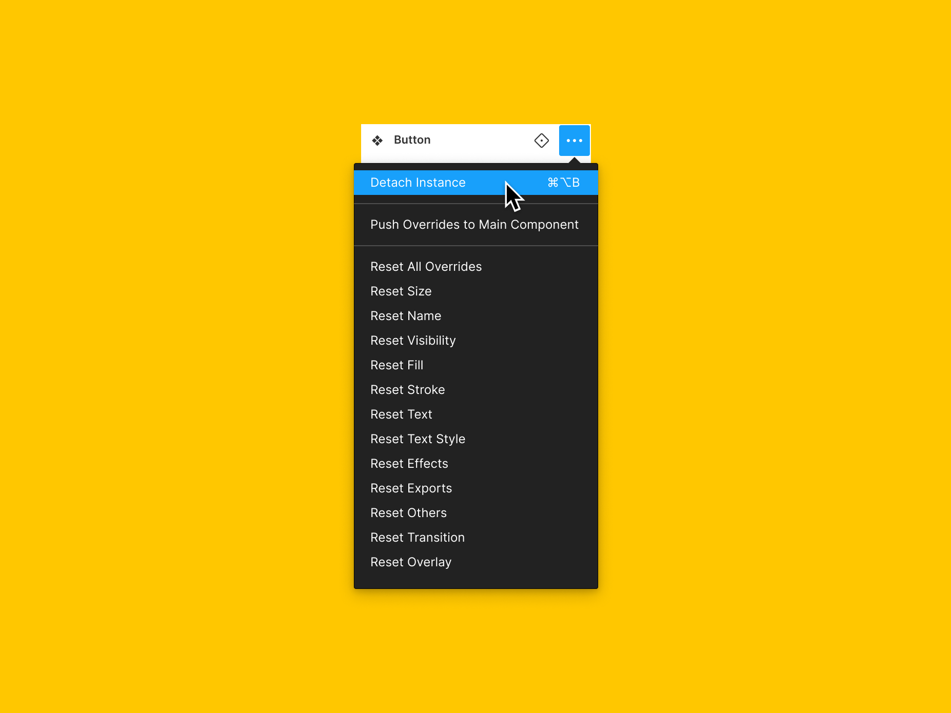
But wait! Remember that someone has to be able to navigate this file after you add your annotations. You may need to separate them or summarize them so they don't get out of hand. Don't run into something like this:
And finally, make sure you discuss the process and format of your annotations with your developers and fellow designers to ensure it works for everyone.
A Web of Anxiety
David Swallow gave a talk that was music to my ears - uncovering the various ways that interfaces cause users anxiety. Especially for users who experience anxiety or panic disorders, some experiences can be triggering and cause them distress, much less cause them to be unable to complete the experience (otherwise known as a big fail for the original intent).
Have you ever come across any of these messages while doing some online booking? I sure have.
Some other examples of anxiety-inducing interfaces:
- Read receipts on texts (I lump this in with online indicators for profiles) - showing you way too much information to deduct whether someone actually cares enough about you to reply to your message. But maybe they're just busy right now! I feel this one a lot.
- This also works backwards, in that if I read someone's message I feel compelled to answer them right away with urgency because I know they'll see my read receipt.
- Unpredictability within interfaces - especially seen when Facebook changes its layout. People freak out and get very vocally upset...on Facebook.
- Even though Facebook and Instagram are both owned by Meta, double-tapping an image does drastically different things on the two apps. On Facebook it zooms into the photo, and on Instagram it "likes" the photo - this is a recipe for absolute disaster.
- Shaming users when cancelling a subscription (I see this a lot on meal kit subscription websites - you have to click through several steps to cancel and even when you finally do, the next button to re-activate looks just like the previous cancel button so you could click to the end and land back on being subscribed again)
- Powerlessness - such as not being able to skip past an ad on Youtube
- Sensationalism - News websites will often purport their news as "breaking news" or create dramatic headlines as clickbait. This is really the last thing we need in the world right now with all the stress going around. There is a fine line between responsible reporting and sensationalism.
There is an online resource for these examples - the
Deceptive Design Hall of Shame will show you all kinds of examples like this, in the hopes that they will not be repeated by other products.
I especially find online booking countdowns anxiety-inducing when I am trying to enter all of my personal information for the transaction. Guess what - someone found out that sometimes the counter is coded to show a random number!! So this information is stress-inducing AND lying to you. I am appalled.
How to make the web a less stressful place - some options that David suggests:
- Do nothing and encourage users to confront their fears?
- Follow established accessibility resources to create less stressful experiences
- Tackle deceptive patterns on a case-by-case basis through browser extensions and plugins (like Reading Mode)
- Outlaw the most egregious examples of anxiety-inducing patterns through tightly-defined laws
- Encourage companies to behave ethically and treat users fairly and with respect
I know which one I'd choose!
Stakeholders Agree That Accessibility Is Important But Still May Not Invest
What then? David Dame, Director of Accessibility at Microsoft discusses what to do when you find yourself in this position - you've gotten the "yes" from management to pursue accessibility but nothing happens after that.
Main reasons to invest in accessibility (depending on your motivations):
- responsibility (as a person who makes things, to others as well as yourself to do the right thing)
- equity (to make the world a place where everyone can achieve their goals)
- return on investment (automatic opening of a whole new market when you make your products accessible to everyone)
When it comes to accessibility, stakeholders generally always say they believe the issues and are aligned to fixing them, but they won't always take responsibility or apply budget to the issues. At that moment, we need to apply what designers are good at: storytelling. The best is a mix between human stories and data to back up the stories with tangible numbers.
When telling stories about accessibility, we should explain the "why" to connect on a personal level (usually the best way to make an idea stick in someone's head). For example David, who has cerebral palsy, once had to ask a stranger in line for coffee to open David's bag for him and pull out his phone to open his digital wallet. This reduced David's ability to be out and participating in the world as an independent individual.
Another storytelling tip is to try describing the situation in the negative rather than the positive. Try stating, "we are excluding customers" rather than "we should be including everyone" - this small tweak sometimes drives the point in a more urgent way.
With his way of living, David was able to innovate on a process in his workplace. A paperwork-heavy job can take extremely varied amounts of time to complete depending on the situation:
Remember, it's not about what accessible technology can do, it's about what it can enable people to do. Stay human-centered.
We Suck At Hiring Accessible Designers & How To Fix It
Shell Little is one of my all-time favourite presenters. I had seen her at a previous A11yTO event as well, and her talks are very real, honest, and funny. She started this talk with an admission that she is currently on burnout leave - a very common condition amongst accessibility professionals for a few reasons.
She described the jumble of non-standardized titles available on the job market such as
- Accessibility specialist with a focus in design
- Inclusive designer
- Human whose job is to care about a11y in designs
She defines accessibility as compliance (meeting the criteria set online so as not to incur lawsuits) but inclusivity is something that goes beyond compliance to meet actual needs of humans. It also include other factors of identity like race, sexuality, class, etc. This is an interesting concept.
An accessible designer is not a user experience designer. They work alongside "classic" designers, straddling many teams to complete the tasks in Shell's slide above. This is a job role I wish my company had. I could see myself fitting into a role like this - though sadly the flavour of Shell's talk was around burnout (which she is currently experiencing) and how this role currently takes on way too much of the work that should be done by several people. I feel that one.
In terms of proper pay, Shell feels this is a specialist role and should be compensated in kind. She suggests finding a benchmark within the pay of developers or even developer specialists at the same level. She further suggested that there is a wage gap between the work of development (classically "men's work" - currently reflected in the gender gap in the profession) and the work of design (classically "women's work - also reflected in the profession's gender gap). I really could never put this into words before but I absolutely feel this. Design and development work both require the same amount of work, but one is "logical" and one is "creative". I honestly think both professions involve a good mix of logic and creativity when you really experience them. I will also give voice to another topic of wage gap in these professions - which is that for every designer on a team you'll need 3-7 developers. So the demand is higher as well.
When interviewing accessibility designers, the focus should be on examples of having worked in a collaborative space with cross-functional people. The focus should not be on any kind of visual portfolio, as their work doesn't revolve around visual work in the same way as classic designers. Some fun interview questions:
- Why do you get up every day and work in accessibility? (The answer should come from the heart)
- If you could get rid of one accessibility problem, what would it be?
- I spent some time thinking about this and I want closed captions for everything in life.
- Tell us about a time where you had to take the L (failed at doing something)
- This question looks for tact under pressure, conflict skills and an ability to see the forest for the trees
Shell has employed what she calls a "Cursed Wireframe" activity in interviews. She created a hellish wireframe design with many, many accessibility issues. She asks candidates to go through this wireframe and identify issues and solutions. As with any designer interview or critique, she listens to language used to answer these questions. User-focused answers like "XYZ users will have issues with this" will always win over "I don't like this".
Now I don't know if I want to hire this role or become this role. 🤯
Accessibility In Action: Indigenous Communities
I so rarely hear about indigenous perspectives at tech conferences (beyond the land acknowledgement) so this talk was extremely refreshing. Meggan Van Harten gave several examples of the ways Indigenous communities are currently excluded from design and accessibility in tech spaces.
Accessibility has been part of the Indigenous culture long before compliance legislation. Meggan described the various dialects of "hand talk" (like sign langauge) used for communication and commerce. This was used even before settlers arrived on Turtle Island.
Apologies for the title - don't look at it. I'll rename this image Indigenous Hand Talk.
Did you know that screen reader software has no option for any Indigenous languages? Additionally, they are set up monolingually, or with the ability to interact with only one language at a time. Often more than one Indigenous language is used at a time, or perhaps an Indigenous language alongside English. I think this is also a missed opportunity in the ability to bring together two languages for better understanding. I know this kind of communication is done in switching between Hebrew and Yiddish, or really any two languages that the user wants to use.
English doesn't do an amazing job of translating many Indigenous languages, Meggan explains with the Anishnaabe term "maamwizing" which English translates as "people collaborating together".
That doesn't quite cover it, though.
- the two m's - things coming together in relation to what we do (our actions)
- the two a's - essence of how we do things (reinforce our actions)
- wi - how we communicate with each other. Put hearts and minds together. Making the statement living.
- z - internalizing
- ing - Nature of who we are as humans. How we understand how to do things together.
In examples of "universal imagery" like icons, "medicine" might be conveyed by a pill icon 💊. This icon does not represent health in an Indigenous context, it would instead be something more holistic in nature like sweetgrass. In Meggan's words "You can't just use FontAwesome for this". Wouldn't it be great if FontAwesome had a set of icons related to Indigenous culture. With the correct and appropriate input from Indigenous people, of course.
Audio is also very important as a communication tool, as much of Indigenous history is passed down orally. Internet speeds and bandwidth must be considered (as for everyone) because some folks will live in places with limited internet access.
Finally, Meggan recommends obtaining community input when writing alt text for images of Indigenous media. Alt text auto-writing tools called a Jingle Dress a "costume" which is extremely offensive. I personally believe that alt text can be useful to everyone including folks who can view images. It's a bonus way to provide extra content on an image and to explain to the user why the image has been chosen (or what the user should understand about it). Therein you can see that alt text can be used here as a learning tool for people who want to learn more about Indigenous culture.
An Inclusive Design Workflow For Teams
If we're going to spend time and effort making our products accessible, our processes should be inclusive. Scott Vinkle, an in-house accessibility consultant at Shopify, explains how he does this.
Previously, Scott had been working reactively and asking about accessibility towards the end of a project. Obviously we all know there is a better way, thinking about it as early in the process as possible and preferably starting at the planning stage.
- Planning
Detail the steps involved
For Design: Designer notifies the specialist that an accessibility review is needed before handoff to development. Accessibility specialist uses Figma to implement an annotation kit. Then, create a summary of visual design and produce an accessibility specification document.
For Development: Designer hands off work to developer (specialist is present for this). Developer implements the accessibility specification document, then asks specialist for review. Specialist signs off on PR before it is merged.
- Communicate intent
Set up meetings with each group to ensure buy-in on this process change
- The workflow in action
Work closely with others on the team. Be proactive as a specialist in asking if anyone needs review.
Scott also suggests gathering quantifiable accessibility data to share with leadership. There are two methods:
- automated accessibility testing
- take note of the URL of each page, as well as the total number of defects and issues found
- add them all to a spreadsheet, and watch them (hopefully) go down
- less than ten issues = green
- 10-50 = yellow
- greater than 50 = red
- this is a great way to decide where to focus first but with any automated test you also need human intervention
- usability testing score
- they use Fable to obtain this number
- for each session, note device type, assistive tech, AUS score, and download the session for team review
With these two metrics, communicate the improvements to your leadership team.
- Be clear and precise
- Provide links or data to back up your claim (so they can consume info on their time)
- Provide details on how you're solving the problem (and share this context often)
Scott leaves us with an inspiring quote on the mindset "Prioritize progress over perfection".
Designing For Accessibility, Equality, Equity And Fun In Kids Digital Content
Olena Sullivan works at CBC Kids Digital Media. I personally don't have much experience in kids content so it was great to see how they differ from adults as users. There are so many aspects of freedom, fun and simplicity that society asks us to leave behind when we become adults, I can tell this would be a good angle to inspect all designs from.
You could have guessed that colour is an important aspect of designing for kids as well. This brings up to the importance of the colour contrast checker, as well as ensuring text on top of images can be read easily. Speaking of images, they can help with the learning process and draw a link between what kids read, see, and experience. Representation in images is especially important: gender parity, nationalities, Indigenous, different kinds of families, and kids with disabilities.
.png)
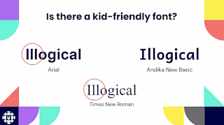
Serif fonts can be hard to read, since we don't handwrite with serifs, kids are not used to them. Also note the style of the a in the word "Illogical" above, and that Andika has a single-storey a. This is similar to how it's handwritten, so it's easier to understand.
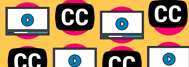
Captions help with literacy and even learning new languages - this is relevant to everyone. As mentioned above, I wish life had captions sometimes.
When writing content we want to use smaller words and write for the reading level we are aiming for. Readable.com is similar to Hemingway App for checking grammar and reading level. Tap and click targets also need to be bigger to account for lowered dexterity in kids.
Overall I find a lot of these considerations to be similar to designing for accessibility in general - I guess it underlines the point that designing for accessibility improves the experience for all.
Accessibility Research As A Space For Tech Innovation
This was a very cool talk about conducting research for accessibility - often this research is primary because the field just doesn't have as much research to draw from. The speaker Anna Tendera says, "If you will create new solutions for users with accessibility needs, you need to conduct proper foundational research including speaking to subject matter experts." Nothing about us, without us.
She also mentions Microsoft's Inclusive Tech Lab in Redmond. This is where most of the research happens, creating and testing products for people with disabilities.
How to get started in accessibility research:
- Determine priorities and engage cross-collaboration
- Involve the community as early as possible
- Show impact in short and long term
- Deliver insights in different formats (consider games, planning sessions, 3-page slides, in-person meetings, meet them where they are)
- Build in time for reflection on how things went
No Coding Required: Writing Tips For Accessible Content
There are lots of details to writing content in an accessible way. Writing shorter content for a grade eight reading level has always been my go-to, but there are lots more tips to consider in this talk by Ann Mayer.
Plain Language Principles:
- short sentences
- straightforward grammar
- active vs. passive voice
- one instruction per sentence
- simple, everyday words
- elimination of jargon
- bullet points
- grade eight reading level or lower
Concerning button and link copy, lead with a verb. This is exactly my approach for buttons, such as "Add to Cart" or "View Full Article". The button should clearly explain what the user can do by selecting it.
Mayer suggests stripping out all visuals from the page or design and reading the content out loud. Ask yourself:
- Is there enough content? Is there too much?
- Is it in the right place?
- Is it easy to understand?
- Can I remember it? Can I act on it?
Front load your sentences with the key words at the start. To do x, do y. "To complete your registration, call 1-800-555-1234." This can also be done with lists of items or headings. Add a title to your list of Departments so you don't have to repeat that word with every bullet in the list.
Make inline links descriptive and unique. They are best seen at the end of an idea because that is when the user will interact with them; after having read all the content.
Not great: Click here for more information about program offerings and deadlines.
Okay: See the programs section for more information about the course offerings and deadlines.
Better (and with non-ableist content): For more information about course offerings and deadlines, visit the programs section.
Focus People, Focus! Focusing On Focus States For Designers
Karen Hawkins gets deep into the weeds of designing focus states. She sees focus states as a sibling of hover states.
Hover is for mouse users, while focus is for keyboard users. They are similar, but different in some ways. Both tell the user "this is where you are".
Usually the focus state is displaying with a thick outline or ring around interactive content. Only ONE focus ring will display at a time, with the user usually pressing tab on their keyboard to move the focus to the next interactive element. Contrast and size are the two visual factors seen here. Since we usually already have a hover state for many interactable elements,
Hawkins suggests that we include the hover state in the focus state to keep some consistency.
There is a colour contrast issue within focus states that I had never realized before. Contrast must be considered in a three-way check between the text colour, the background colour, and the focus ring. More complexity could occur depending if the element is a button, a link, a checkbox or something else. The focus ring colour should remain consistent, but the other two colours may change. It's an interesting problem to solve, and I see why this magenta colour was chosen here as a strong contrast from the blue, black and white.
Focus interactivity needs to be considered as well, like revealing a tooltip on focus whenever it is revealed on hover. DO NOT submit when focusing on a submit button. Instead allow the user to focus their attention on the button, and then they will press enter to submit when they are ready.
Setting Accessibility Specialists Up For Success In Organizations
Like many others, Devon Persing explained that she had been on burnout leave from being overworked in accessibility tech. She noticed that so many job roles include way too many responsibilities which show an obvious path to burnout for others as well. She created and shared a survey to ask about this topic to others, and she received hundreds of responses.
- 51% of respondents said their scope has become bigger since they started their role
- 45% said they don't have the resources and support they need (only 36% said they did have them)
- 56% said they are lacking the time to do the work they need to do
- 47% said they don't have proper workflow and process in place
- 45% said they don't have the budget or staff to complete the work
Devon suggests this is all caused by ableism.
She says we can combat this in a number of ways:
- use paid time off
- use professional development budget
- step back from work when you need to
- go to your medical appointments
- drink water, eat snacks, take naps
- spend time with the people you love
That's a wrap on A11yTO Conf 2022. I appreciated that they offered both in-person and online options, hopefully next year I will attend in the real world!


.png)

.png)
.png)
.png)
.png)
.png)
.png)
.png)
.png)
.png)
.png)


.png)

.png)
.png)
.png)
.png)
.png)

.png)
.png)
.png)
.png)

.png)
.png)
.png)
.png)
.png)
.png)
.png)
.png)