Tuesday, July 28, 2015

Weekly Update: Wayhome!

A little dustier than usual, and with an unusual 0% functionality of my vocal cords, I arrived home from Oro Medonte's first Bonnaroo-style festival yesterday. And now begins my very special Wayhome-themed version of this weekly update.

Music: Bear Mountain
The first concert of the festival was a truly awesome experience. This Vancouver indie pop piece was a great way to kick off the weekend at the Wayaway stage (the smallest one). We easily got right to the front and danced like crazy. I realized quickly that there was no way I was going to spend the whole weekend with that balloon, so I quickly let it go. Goodbye! Check out my little video snippet below:

Accomplishment:
As I predicted, no Wolf Parade work this week. But I did get in another driving lesson yesterday (pretty much right after I got home from Wayhome, dusty and all). I also...went to Wayhome! So that's kind of an accomplishment!

Goal: I can't believe I'm saying this, but Sam Smith is so cute. I wasn't even planning to see him, but since he was the last performer of the festival and nothing else was going on, I decided to check him out. And he honestly stole my heart. He talked a bit about his personal life and how it related to his music, and was honestly such a cute little puppy dog. And he did a cover of Le Freak by Chic!


Anyway, we were talking about goals. So I really want to draw his face. His cheeks are so cute! So I'm taking a break from Wolf Parade and drawing a little portrait of him. Nothing fancy, just a little thing. Maybe do some hand-lettering. Haven't done that in a while. :)

Random Thought:
I was thinking about the nature of these festivals to sell VIP tickets. What's up with that? I totally understand that more money will get you better stuff/experiences, as in other areas of life, but for festivals and concerts that are general admission, it seems so wrong. You can have your better bathrooms and special artisanal bars, but I really think that VIP shouldn't have a better stage area. WayBright, the second-biggest stage at the festival, had gated off the first 20 rows of people on the entire right side of the stage, so that VIP could get a close spot without having to fight crowds or get there early. Just seems like they should put in the efforts like the rest of us. But hey, that's what you get for $500.

Inspiration: ART!
Wayhome had some great artsy stuff, like the following weird things...


Flags that dotted the entire area of the main stage. Beautiful colours and patterns.


Some weird tree covered in scarves. Supposed to be a human heart (?)


A plywood statue of the word 'soon'. Being made throughout the weekend. I like the idea of working on something that changes throughout the weekend. I wish there was more work-in-progress type stuff.


"Let's meet at hashtag nature after Kendrick!" My meeting spot. (Not pictured: E)


A sign reading "One Night Only" (although, yes, it was up for three nights). Meant to signify the fleeting time of the festival...I think?


This might be hard to see, but every single bar area had a different pattern created by an artist. Very awesome way to represent artists who work in the 2-D form (arguably harder to display at a festival than 3-D). Here's one up close:


Coming soon to this blog (right here!): My top five favourite shows of the weekend (with videos, of course).

Monday, July 20, 2015

Weekly Update: Turning in Circles

Music: Hozier
I'm sure you've heard the single Take Me To Church a million times already like me, but believe me when I tell you that this Irish dude is a true songsmith. I wasn't entirely excited to see him at Wayhome, but his stuff is really good! It's got rock, blues, and a little country influence and it's very catchy. These sorts of things always make me wonder how the singles are getting chosen. This song is easily better than the infamous single. But maybe if I had heard it a million times, I wouldn't like it as much.


Accomplishment: That bike thing!
I actually managed to bike from my house to my friend's party! And oh boy, was I a sweaty mess by the end. My legs felt like jelly. I didn't realize how tiring it would be, so I didn't bike back home. Baby steps! See my experience map below.


Goal:
No Wolf Parade stuff last week, I was too busy. The shame! And it only continues; I won't be doing any this week either because I'm preparing for Wayhome. And I booked a driving lesson for tomorrow, too. So that's a thing! My G2 test is booked for early August, and if that's not a goal, I don't know what is.

Random Thought:
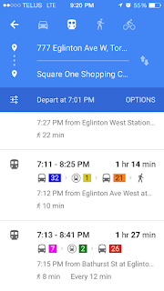
Maybe this is more of a gripe, but it's my blog, and I'll gripe when I want to! I consider myself pretty transit-savvy, especially since I've been travelling between Mississauga, downtown, and my home in Richmond Hill on a daily basis. Girl's gotta have a life, right? Google maps does a pretty spot-on job of planning my trips for me, and it rarely lets me down.

A friend was complaining to me about a design flaw in the app, and I was sure that they were simply overlooking something; there's no way that Google could miss something so important. And that design flaw is this: there are colour selections for each kind of transit, whether it be the difference between a YRT bus and a TTC bus, or even the TTC subway lines (which are now dutifully coloured and numbered for a slightly less painful travel experience). But, if you've never taken a certain bus before, and it travels across city lines (as I often do), you'll find that the type of transit is not actually listed anywhere in the app. And this is actually very important. It tells me whether or not I'll need a transfer when I get on a TTC bus, or how much change I'll need for two different cities' bus systems, or even whether I should pay with Presto or a ticket in YRT in order to prove that I have paid when I get on a non-Presto-operated TTC bus in YRT-land. It's kind of the most important thing, after when and where the bus will be.


If I really tried to give Google Maps the benefit of the doubt, I might say that the colours of the lines shown above are denotative of the bus systems, but that simply isn't true either. There doesn't seem to be any rhyme or reason to these colours at all. TTC, as we all know, is red (not this ghastly magenta), and Mississauga miWay (yes, that's what the number 26 bus ended up being) is actually very well-branded to be orange for local routes and blue for express routes (not this weird red).

And as if we couldn't make matters worse, there's more. I have never caught a bus at Islington station before, so I was happy to note that I would be looking out for platform D. Lo and behold, I got to the bus bay, and the platforms were NUMBERED, not LETTERED. The signage was so terrible, I would have missed my bus if it hadn't been ten minutes late. I found my lettered signpost (not platform) on the TTC platform 8, the last one down the line of platforms. This is surely a flawed system. I suppose my advice is for you to take note of where platform D lives in case you ever find yourself in a similar situation.

Inspiration: Spike Logo

I have fond memories of watching Spike in my friend's basement on summer evenings, marvelling at how quickly I could melt my brain with a few hours of shows like 1000 Ways to Die and Manswers. It was dude television and it was a really entertaining channel, especially considering I was never its target demographic (and never will be, without a sex change).

That said, I love this redesign of the network's logo. Honestly, the old one would have stayed fresh for another few years with its homage to an army badge (calling all Black Ops fans), but the new one is so tight and well-refined that I can't take my eyes off it. The angle is absolutely perfect.
Supposedly, the station is attempting to open its demographic to include programming for families and women, but I honestly think it's fine to be a men's television channel and do one thing really well. Now if they would only air episodes of Banzai again, my heart would be whole.

Sunday, July 12, 2015

Weekly Update: Blind Dates

Music: BADBADNOTGOOD
Nothing but three Humber music students and a whole lot of talent make up this band. With a blend of experimental jazz and hip hop, these guys definitely keep your ears on their toes. They're playing a free show tonight with Death From Above 1979 at Nathan Phillips Square as part of the pandemonious Panamania that is filling our streets for the next little while, so I thought I would try them out as I don my DFA shirt for the fourth time.

Below is their full first album, complete with a cover of Flying Lotus' Camel (my favourite!).


Accomplishment: Arlen Thompson
Yes, indeedy-do, I did make a lovely face for our Arlen. And his beard is glorious.


Such hair he has. 

Goal:

This week, I'll be drawing Dan DeCaro's face (second last one!) on Wednesday or Thursday. But there's another goal I've been meaning to accomplish as well...riding my bike this summer! My friend is having a house party on Wednesday, and it's exactly the right distance for me attempt some bike riding skills. I've mapped my route below, using side streets and all of the bike lanes we have in my dumb town (which is not many). It's just over 4 kilometres one way, which should be doable!


Random Thought: Facebook and Gender Identity

I found this on the interwebs:


The left is the old Facebook Friends icon, and the right is the new one. You can plainly see that the male icon has been moved behind the female one, and they are both now the same size. I think this is pretty cool in terms of gender equality, but I really have to admit that I never noticed/thought about the fact that the man was in front of the woman. They didn't represent anything separately to me, just the fact that I have friends of both genders. Still though, it's a nice change. It reminds me of the hubbub about the gender selection options when creating a Facebook account.

One negative thing I did notice is that the icon is not implemented everywhere on the website. 


This is the text above a post on Newsfeed. The icon on the right (which you can see has NOT been changed) shows you who the post has been shared with. The options are: everyone (with a world icon), friends (the above icon), and 'only you' (a lock icon). I wonder why it wasn't implemented everywhere. Seems like an oversight.

Inspiration: Blind Date with a Book
This is especially interesting if you're forever indecisive like me. In an age where everything is digital and we have a smaller need for the printed word, books still seem to be hanging on. Novels especially are still somewhat popular, as they are portable and still have a nice tactile feel to them. I'd argue that the only draw bookstores still have is the recommendations of their employees to guide you to the right read (easily the hardest part of reading books).

Enter the new phenomenon of Blind Date with a Book.


Bookstores have wrapped books in paper and written some descriptors on the paper to allow patrons to choose books based on what's inside them, not by their covers (as society would have us do). This really streamlines the process of finding a good read, and promotes well-written books that may not have had the luck of being graced with a great cover.

And if you still don't like the read, it was only $8.00. You can just throw it in a drawer and never call it again, right?

Friday, July 10, 2015

A Colourful World

You haven't heard of Owen Davey? Are you sure? Maybe you've played the game Two Dots (probably the most addictive and well-made mobile app game). Owen Davey is a British-born illustrator, whose lovely images and iconography grace the screens of Two Dots. Every time you finish a set of levels, you are awarded with a postcard depicting an illustration of a mini-world. The drawings are just darling, and even the typography is wonderful to look at.


I especially love the borders around the images, they remind me of old postcards. Is it weird that I always wonder why a cute little raven-haired dot would always hang around a withered old coot of  a a dot? Doesn't he slow her down? What's their story? Maybe he is apprenticing her to become the world explorer that he is. I think this game needs more cutscenes.

This one is a little interesting for another reason:


He posted it to Dribbble after it had been shipped for the game, and someone told him that his Chinese script was...below par. It's interesting to think about how we view letterforms that we don't understand. Knowing that I can't understand the type's meaning, I think it looks good as a visual image. It seems like it should be clear enough to read, but to someone who can actually understand the characters, it doesn't meet legibility standards. Very interesting.

Anyway, that's how I found this guy. But he also makes illustrations for children's books and lots of other stuff.


His use of pattern, line and shape is so satisfying. I want to eat that fig! I suppose his style kind of reminds me of cut paper illustration, cutting out pieces of patterned paper to make recognizable images. I loved how Eric Carle did it in this classic:


You can check out more of his stuff below, or on his website.


Monday, July 6, 2015

Weekly Update: Dan Boeckner Strikes Again

Music: Operators
As you surely know, I am a huge fan of the now-defunct Montreal band Wolf Parade and all of its many side projects. As of last year, Dan Boeckner has sprung up a fresh new three-piece called Operators, in conjunction with Sam Brown of New Bomb Turks and fellow Divine Fits glory. They also add some female power to the group in the form of Devojka, a Macedonian singer with an interesting sound.

I originally stumbled upon the band while doing research for the ongoing Wolf Parade infographic, and then eventually saw a poster on the street promoting their show in Toronto on Thursday. What luck! And cover is $3. I have literally never seen such a cheap show (that wasn't free...but that doesn't count!) Check out their new single below, complete with a shiny new music video!


Accomplishment:
It's been a busy week, so no new faces. Sorry Arlen! I will credit myself to some degree, though, for finding this show before I lose the chance (reminiscent of Divine Fits in 2012) and deciding to add Sam Brown to the infographic. Seems I am adding heads faster than I can draw them.

One interesting thing I can attest is that I am now able to tell Dan Boeckner apart from Spencer Krug. I know they really don't look alike (at all!) but I was always confusing them because they were both so important to the band. Dan Boeckner has the longer face and sings the lower parts of the music, while Spencer has a heart-shaped face and sings the weird stuff. Oh yeah.

Goal:
Specifically this Friday, I will be drawing the deliciously hairy Arlen Thompson. Sunday will be for the plotting of where Arlen and Sam will fit into the mess of space that currently exists, and I am starting to think that a tabloid size piece of paper just ain't gonna cut it for this project. Can anyone say 18" x 24"?

Random Thought: Online Communities
The boon of the internet has given us access to more information than we can ever hope to absorb. One of my favourite things to do is compare prices of items I find 'on sale' in brick-and-mortar stores with their online counterparts. But even more important than that, the internet allows us to share information across great distances, and (debatably) without censorship. Of course, this can be considered as both a positive and a negative, but I try to steer clear of the negative stuff. Take the image below for example:


You might think that drugs are illegal and band and blah blah, but at the base of this image (posted on 9gag) is a simple human kindness. Someone had some 'stuff' they couldn't use, so they hid it and posted a map of its location to their fellow members of a community to which they belong. Personally, I only see positivity in that sentiment. Not to mention, it might be fun to try to find the place where it was left (even if it had already been claimed). I find novelty in visiting places where people I know have been before (kind of like geo-cacheing).

Not only that, but there is a sparkling community of people on the Wayhome subreddit sharing advice and making friends. Apparently they are planning an entire tenting community for people who are active on the subreddit to find each other on the fateful weekend. Again, all I see is a positive sense of community that comes alive with a shared interest.

Even on an early episode from the second season of Halt and Catch Fire (one of my current favourites), we see John Bosworth approaching a woman who is fed up with her son spending so much time online gaming and so little in the normalized sense of hanging out with friends in real life. John explains to her that online gaming is, in a social sense, essentially the same thing as spending time with others face-to-face and that her son has found friends in a community of people that simply happens to be through a computer connection. Strong stuff.

Inspiration: A new logo


So, Facebook has come out with a new wordmark. The world is abuzz about it, and as always, is not happy with the outcome. It seems that every redesign of a major brand brings about the naysayers, everyone yammering that the new logo just doesn't "feel right".

One of the truest comments I've seen is that while it offers a similar yet more refined feel to the old logo, the 'face' part seems more tightly kerned than the 'book' part. I suppose this might be intentional, but most likely it isn't. I wonder if any tweaks will come out of the woodwork once the buzz dies down, like Google does once in a while.