Monday, June 29, 2015

Weekly Update: Overhead View

Music: DIIV
Yet another bit of research, this one into Time Festival happening in August. A friend gave me some of their music twoish years ago, and I never really took the time to get into it until I remembered that I'm going to see them soon, and they have a new album coming out. I am really into this dream pop, sounds of summer type of music lately (must be the weather), so this is hitting me at just the right time. Make a mojito and listen to this one:


Accomplishment:
Hadji Bakara lives! And he joins his bandmates with his wonderful facial hair. Which was really fun to draw.


Goal: Only two more faces to go. We've got Dan Decaro and Arlen Thompson, and then the tricky bit of slotting Arlen into the diagram somewhere. Baby steps!

Random Thought
As is the norm across most of the clothing stores I frequent, you'll find that clothing items are usually grouped by style, colour and pattern, and rarely by size. For example, if I liked a pair of pink pants and wanted to find them in blue, I'd have a tough time finding them. For each colour option, I'd have to search through all the sizes to find the one that fits me. Imagine my annoyance at searching through several patterns of a pant and coming up empty handed when I find that my size is not available. And to be perfectly honest, I never thought about a possible improvement to that process until recently.

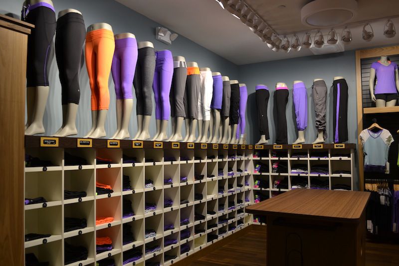
I was shopping in Lululemon, which we all know has had its faults in past. That said, I like their clothing because it never lacks in quality and some of the fits of the pants work for me. So I, like many others, fit the use of case of coming into the store knowing what sort of pant I want (and obviously the size), but wanting to know the various options of style and pattern. Lululemon is (as far as I have experienced) the only retail store to group its clothing by size before pattern. If you think about it, this is actually one of the most ingenious marketing ideas ever created.


So here I am, looking for the cubbyhole that houses my particular style of size six leggings. Once I have located that (easy enough), I can peruse all of the available patterns of that one style and size pant. I am not subject to the disappointment of finding a favourable pattern, only to find that it is not available in my size. And as a bonus, I can easily see new styles that are guaranteed to fit, that I may have otherwise overlooked.

This sort of arrangement works really well for the aesthetic that Lululemon carries, making the store seem cozy and more like your own closet (different patterns of the same size pant all in one place), but I noted that only the pants (and some sweaters) are arranged this way. Everything that hangs on a clothes hanger is arranged by style, then pattern, and lastly by size. While I wish the hanging articles would take some cues from the pants, I can understand why this is the case. It's one thing to see a shelf full of neatly folded pants (and there are always at least two employees folding pants all day long), but I suppose the effect is not as pleasant when you're hit in the face with a wall of mismatched patterns of shirts hanging from racks. The visual appeal just doesn't work.


And with all of that said, the visual appeal of seeing a colour-matched collection of clothing all hanging in one place is really satisfying. Whether or not it's easier to find clothing this way, is probably up to the kind of shopper a person chooses to be. I am a goal-driven shopper and usually like to get in-and-out as fast as possible. I wonder if shopper-types match up with certain stores and if any marketer has picked up on that fact, as opposed to the catch-all goal of trying to retain shoppers in their stores as long as possible – at any cost (see Honest Ed's, you can get lost in there).


Inspiration: Daily Overview
Being the curious creatures that we are, humans have always had a fascination with what's out there beyond our wee blue marble. This photo blog turns that lust on its head and displays beautiful pictures of the earth from a high-flying bird's eye view. I find this sort of thing just as wondrous as images of space, yet perhaps with an interesting twist that shows something familiar in an abstract and unexpected way.


Why not show some shipping containers from South Korea from on-high? It certainly displays the vastness that is their sheer quantity. A few more for your perusal:


But you should really check them out on the website. Nothing says larger than life like an image that doesn't fit on your desktop screen (in a good way).

Saturday, June 27, 2015

Good Enough To Eat


Good photography is always a joy to behold, and you may well know that my love of food remains unparalleled. So it's no surprise that I have become addicted to the wonderful and whimsical food photography of Claudia Ficca.


I suppose it's residual from a childhood instinct to play with my food, but I love the way she styles edibles with which we are so familiar, making them seem abstracted, magical, sometimes just totally messed up. Where I would usually feel the urge to cringe at (even pictures of) huge messes, here I find joy in analyzing every detail down to the smallest strewn pea. Maybe I am living vicariously through the haphazard life of whatever being is implied to have made these wondrous messes. Whatever it is, I am hooked.


I do wonder if a lot of this food is real, or crafted of some other material. I heard that photographs of ice cream actually feature mashed potatoes (with food colouring!) and those artful splashes of liquid are actually plastic statues. Take the jam above for example. I've never seen such scrumptious-looking raspberry preserves...but then, maybe I'm not eating the right jam. I might have to look into that.


It'd be hard to make bacon look bad, surely. But this image is so sultry that it makes the bacon seem personified; with a personality and mystery all its own. Did you know it was possible to shoot mood photography with bacon?!

Underneath my known love of food, I guess what I really like about Ficca's work is the way she can make something so mundane and everyday (such as a pan full of bacon – that's my everyday) look so mysterious and beautiful. My bacon pans don't look half as good as hers, and that's probably a good thing. Lord knows if I came across food that looked as good as this, I'd have a hard time eating it.

Here's the same link as above; I urge you to check out her website. But maybe not on an empty stomach.

Monday, June 22, 2015

Weekly Update - Upside Down

Music: Eagles of Death Metal
My teenage crush Josh Homme is back with new music from his wondrously not-Queens-of-the-Stone-Age band Eagles of Death Metal and I am so excited. If you haven't heard of the band before, think of 80's cheesy rock and roll...but with a hilariously self-aware spin. Homme and Jesse Hughes are back for a new EoDM album after seven long years since 2008's Heart On (one of my favourites) and they have a new song out to promote the upcoming album. Can't wait to see them at Riot Fest this year! While you're listening (no video yet) I urge you to notice the amazing imagery they've also released. Seems to me like two confused dudes who found some old Star Trek uniforms and attempted to pay some homage. Note the devil horn patches that replace the usual insignia.


Accomplishment:
Another face is complete! Actually, two faces. As promised, I also doodled a likeness of my beautiful father for his birth-of-a-father's day yesterday. And oh, what a face he has. Dan Boeckner also has an interesting face, complete with some very lustrous hair that I tried to recreate through the magic of vector and gradient. I wonder if I should add in some stubble?


I have also begun my research into festival stuff as of late. I am brewing some awesome playlists for both, but I realized that the set times for Wayhome haven't been announced yet! Grr. I wait with baited breath.

Goal:
It appears that Arlen Thompson's musical history has become too intertwined in the diddies of Wolf Parade for me to continue to overlook his cowboy-mustachioed face. So, in addition to the excitement of drawing his excellent scruffs, I will be adding him to the timeline along with the other six fellows. Just how and where, that will all be decided in time.


Random Thought: Product Design vs. Video Games
For all the great video games out there, no matter the platform, there are inherently as many instructional introductions that show the player how to play the game. I know that the average person moves through this period of the game as quickly as possible – it's decidedly the 'boring' part of the game. But still, it is all too necessary. Without these processes, how would we know how to switch dimensions in Fez, or to control that dang ball in Super Monkey Ball? The really well-made ones will be fun for the player, and may not even have to divulge that they are teaching the player anything at all.

In product design, user onboarding is a similar process. For every app, there is a different set of controls that we expect the user to learn. You might think this is a simple process, but it is actually the opposite. I find that if an interface is simple and easy for a user to learn, the amount of time and skill that went into creating the user onboarding flow was inversely proportionate. It takes skill to create something so simple that it's idiot-proof. That's definitely a teachable lesson I have learned since I started working.

Inspiration: Kazbrella
One of my favourite things in life is when someone decides to take an existing design that is considered the be-all and end-all of its niche. These objects are often hard to use but we don't consider changing them, for whatever reason. It may seem impossible to improve, or nobody would adopt a new improvement over the tried-and-true. So the instance of improvement on a design that's been around since before I was born, something that everyone has in their home, is quite a rare one. And yet it's happened.

In many stores and public buildings, you'll find an umbrella stand or a repository of plastic sleeves, all to keep the water on your umbrella from dripping all over the floor and blurring the lines between indoors and the wet damp mess that currently exists outside. Sometimes literally.

Or, maybe you're opting to stay outside and the wind is picking up. It's the only thing that makes rain worse. You're holding onto your umbrella for dear life, until the wind catches hold of it and flips it inside out. 

I'm sure this scenario played out for the inventor of the Kazbrella, an umbrella whose closed position is 'inside-out' as we would view an umbrella now. All of the water is contained inside, with the dry part facing out. Now it won't leak all over the pant leg of the man standing next to you on the subway (hooray!) and if the rain flips it, it's only closed! Feel free to easily pop it back open again and you're right as rain (sorry).


I really believe that even though a product seems like the best possible solution to a problem, there's always room for improvement. Sometimes, you just have to flip an idea upside down to see its potential.

Friday, June 19, 2015

TTC and Me

Spending so much of my life on public transit lately has been quite eye-opening. I can remember way back to last year, when I was interning in four-week stints downtown. I knew there was an expiry date to all of that commuting, which was the sanity I clung to as I rubbed shoulders with the stressed and sweaty. And now I am one of them. Oh, how the times have changed. I spend around four hours of every weekday in transit, and it really gets those brain-cogs turning. I am all about a great user experience in the digital realm, but of course a lot of those ideas spill over into this physical world. For example, check these babies out.

The Perfect Location
I am a big lover of stations in which there are arrows that point to which direction the train will be travelling. I know you could figure this out with a good sense of direction, but being underground gets disorienting, ok! Especially if you travel past Union, you can't really feel the train turning.

The better (but less achievable) method would be to incorporate compass roses into the floor at ground level (so you know which exit to take) and at train level. I know I've felt the scramble to remember which side my train is on, especially if I hear the chimes as I am rushing down the escalator. Problems of a girl who never catches the on-time bus.

I'm sure you've spotted those little shapes on the walls of the subway, right? They've surely got some kind of message to impart to us.


According to The Torontoist, they allow the train operators to align the train perfectly with the station. Harder than it seems, I guess! I know that not all of the subway stations in New York are perfectly shaped for the trains; in fact, some of the trains are too long to be able to allow all of their doors access to the platform! Imagine struggling to the middle of the train to get to a door that will allow you off the train. Anyway, circular markers are for old trains and triangular ones are for the shiny new Bombardier trains. As I gather, orange markers reside at the front of the train (closest to where it's going) and green markers are at the opposite end. So that can be a sort of compass for you! As long as you know which way you're going and which way you're facing. Okay, so, not really that useful.

Presto and the Constant Struggle
I use Presto wherever I can on the TTC (which is not in a lot of places) because it's much easier at the point of fare deposit. All I do is tap my card and go through the turnstile. You wouldn't believe how many times I've seen people holding up the line because their token was rejected (for literally no reason) or because they are struggling to find a token/change in their wallets. I only wish that the *one* presto machine in each station would be solely for Presto. I often have to wait behind people with tokens who could easily have gone into any other turnstile.

Lately, Presto cards have been added to the token vending machines in some major stations, and there is some floor branding that points travellers to the presto machine turnstiles. I was tickled to see that these were installed just at the time that the Presto machine was out of order at Queen's Park station. I couldn't make this up if I wanted to!

Best Seats
Us veterans of the subway will remember the train cars of two generations ago. Yellow and wood panelling was a seventies dream, and each car had but one (count 'em, one) seat that was sandwiched between a door panel and the conductor's compartment. This was the seat that dreams were made of. You could sit by yourself for the whole ride, even on a full train at rush hour. Obviously, that seat was done away with forever after, either because it didn't make good use of space or because too many fistfights broke out over whose butt would receive the intense pleasure of placing itself in that holy grail of seats.

Nowadays, we are not so lucky. But there is still good sittin' to be got, I assure you. I suppose I should first outline the goals I have in mind when searching for a seat.

The first is that I want to have as little contact with other humans as possible. Easy enough. The second is that I want to be able to sleep (or feign sleep) in the most comfortable method. Beyond that, I suppose a seat by a door would be good, but you'll see that that generally goes in hand with number two.

On either side of most of the doors, there is a wonderful seat with a plexiglass panel beside it. This panel is wonderful for leaning, let me tell you. There are also good leaning places on either side of car separators. But the best seat, hands-down, is the specific seat on one side of the car separator. While you can lean to one side in many seats, leaning backward AND to the side is the name of the game. And the only seat that gives regularly-shaped humans the ability to lean their heads backward without causing irreversible damage is that of the seat with the weird square panel jutting forward. I assume this panel encases some kind of emergency kit, but it is also the most comfortable seat on the train. Seems fitting, right?

Baby Strollers
There are so many people with strollers on public transit. I know they've gotta get places too, totally understandable. But have you ever noticed how much space a stroller takes up on a bus, a streetcar, a subway car? Like, a lot. Maybe four or five people's-worth. And that's if the stroller-er knows how to get themselves as out-of-the-way as possible. So here's my idea. What if the crib part (where the baby hangs out) of the stroller could be adjusted up and down on a vertical post. That way, you could tuck the wheel portion of the stroller under a seat, and the crib on top. It would tuck right in, and the stroller-er would only have to stand beside the seat. This would minimize the space that a stroller takes up by at least half. As I see it now, the only place on a streetcar where a stroller can tuck itself in is at the front, where there are three seats that would be blocked. Not to mention, locking a stroller into a seat in this way would be marginally safer for the precious cargo, because I've definitely seen strollers go rolling down the aisle of the bus because someone thought it was locked when it wasn't. Just saying.

Monday, June 15, 2015

Weekly Update: XOXO

Music: Modest Mouse
Strangers to Ourselves, the sixth studio album from Isaac Brock and his merry band of Washington misfits is just as wonderful and eclectic as you might imagine. One of my favourite things about the album and perhaps the band in general is that each song utilizes a different set of themes, tempo and instruments, and yet the album flows seamlessly. That's Isaac Brock for you. Not to mention that voice of his sounds like no other. I was lucky enough to see them play a short set in the middle of Saturday at last year's Osheaga, and to be honest I wasn't really feeling it. But this year at Wayhome will be superb. They're headlining, and the album has received amazing reviews all around (obviously myself included). Check out this dancy diddy below.


Accomplishment
I have switched out the carousel on my website to showcase death by numbers. Feels nice to have a change! While I was at it, I made use of some advice I was given a few years ago; tuck in your periods! Seeing a period beside a lowercase r is kind of a weird typography scenario because there is so much space between them on the baseline. Same thing with lowercase y. So you can now check out some prime examples of tucked in periods on my website. They're so tucked in, they went right to bed without a fuss! Ha-ha, I am so punny.

Goal
I've fallen behind on my band illustrations. I'll be doing three of them this week. Really putting on that face-drawing hat! One tonight, one Thursday or Friday, and one on the weekend. Scratch that, I'm going to draw a face for my dad for Father's day on the weekend! I'm on a roll. I did complete a beautiful Spencer Krug, though. Wanna see?


I also want to start listening to the Wayhome and Riot Fest music. Wayhome especially has put out a ton of information in the past few days and I have to catch up! The late night electronic sets seem especially exciting, what's not to love about dancing under the moon in Oro Medonte!? Energy drinks will be consumed by the gallon by this concert-goer.

Random Thought
I find it really interesting how people use products in different ways. Often, the main use of the product can be changed depending on the needs of people. It's really magical when a use case has been overlooked but the product still fits the need perfectly. If the product designers aren't too stubborn to change the product to match the newfound needs, they can pivot and create something entirely different. Simple enough.

On the other hand, let's look at a fringe scenario. YouTube is incredibly successful in its main purpose, which to me is to bring crowd-sourced video content to as many viewers as possible. As you may know, there is a secondary use case in which users want to listen to music. YouTube also happens to be the leader in this area (at least in my experience), but I find the functionality severely lacking for users who are only interested in audio. I'd venture to say that the audio-users mainly inhabit the mobile app, and the main complaint is that the audio will only play when the app is open. I find it interesting that YouTube hasn't fixed this issue. It's most likely because they are only paying attention to users that fit their use cases, and all of those users want video content along with audio. So, to YouTube, pausing the audio (and video) when you can't see the video is akin to pausing music when your headphones unplug from your phone. It just makes good sense for the main use cases.

YouTube recently added a feature that will auto play the next video in a recommended playlist after a video is finished. I want to say that this feels like a step towards the needs of audio-only users, but the truth is that it benefits video users just as much.

And with Grooveshark out of commission, there is no current bigwig in the Internet free-audio market. I suppose you could award that merit to Spotify or Rdio, but are they truly free? Me thinks not.

Inspiration: XOXO Festival
Ah, Portland. My home away from home, I am certain that I was born there in a past life. I recently found out about a design and tech festival happening in September, and I applied for the *opportunity* to buy a $500 ticket. No, I'm not bitter! It's just very exclusive. It would be amazing to get a chance to visit again soon, and the networking would be excellent. But there are so many design conferences happening all the time that I'm sure I could find something else. Either way, I'll know by Thursday. Wish me luck!


Friday, June 12, 2015

New Things

Having been at my new job for three weeks, I feel marginally pleased with what I have learned so far. Especially considering the wonderful gift of a cold that’s been going around the fourth floor of the office, it’s been surprising and exciting that I’ve learned as much as I have in such a short time. Just to name a few:

Github
Github has always been a scary place to me. I’ve used it in past to download plugins and occasionally to read through documentation (or rather, pretend I know what I’m doing). I’d always been confused by what ‘clone in desktop’ meant, whatever all of those 543 ‘commits’ were, and let’s not even talk about rebasing or pull requests.

Now, I am somewhat fluent in the lingo, using the Github app, and committing and merging pull requests like a pro. ...Well, like a person who knows a little more about Github than she did three weeks ago, anyway. It’s so nice to have the veil lifted.

I even posted a picture of my first commit to instagram! I don’t usually use hashtags, but I did decide to tag it with #github, and even got some new followers. So popular.


Bower.json
Okay, I still don’t really know what these files do, but I gather they’re some kind of packaging tool for files. I’ve always waved at them as I downloaded plugins, swiftly throwing them into the trash. But yesterday I actually taught myself how to open them with terminal! These are exciting times.

Terminal
Probably the scariest thing on your computer that 90% of people don’t know how to access, much less to use. And now I am running commands and doing all sorts of fun things. I know that the stuff I am doing is really basic, like running a local host to see live changes in my code, but it really feels like magic. Did you know that the act of typing three words into terminal can do a million different things? I even feel smarter when I watch episodes of Halt and Catch Fire and see them typing into the black abyss on their screens. Okay, the next step is to make a computer game!


Omg it's me!

Janky
Okay, this isn’t a developing thing, but more of a design term that I am realizing to be some kind of secret industry garbage word. Whenever I see a design that looks a little odd and makes me think that perhaps that the creator thought they could open up a pirated copy of Photoshop and call themselves a designer, the word janky is never far behind. Urban Dictionary defines it as:


I’ve been reading a lot of design articles online where designers will use the term to describe a project that just doesn’t give them that warm and fuzzy feeling. I guess it’s kind of the opposite of the way we might feel when we look at a piece of design that is simply universally good. Maybe it’s the way so many people felt when the iPhone was first revealed. You look at it, and you know it’s good. Janky is the deep, dark anti-version of that feeling. And now you know.

Monday, June 8, 2015

Weekly Update - Britt's Beautiful Face

Well how about that, I passed 100 blog posts and didn't even realize it! Boy, time flies. I remember starting this blog way back in 2011, when I was nothing but a bright eyed digital media student (an English elective at the time), writing posts about the seven deadly sins in media and what top ten CDs I would take to a deserted island (the answer: an iPod and a solar-powered charger – duh). I have become incredibly driven and writing this blog and can't wait to share the next 100 posts with you (starting with this one!)

Music: Timber Timbre
It's not very often that I find music to match my mood. I do try, but it often ends up being that I fall asleep on the subway listening to shuffle, and am rudely awoken by some sort of trap remix or other. This morning was not the case. I ended up waiting almost an hour in the rain for a TTC bus (yes, I know your hearts bleed for me) and happened to not feel so terrible about the whole situation because I had found the most perfect soundtrack for waiting for a bus in the rain. And that soundtrack is comprised of the musical stylings of Timber Timbre. Four men out of Bobcaygeon, Ontario come together to create a somewhat melancholy, weird at times, and overall very interesting form of music. Wikipedia describes their sound as "freak folk," but I'll let you decide what you think. And if that's not enough, the song below was featured on an episode of Breaking Bad.


Not to mention, they're part of my ongoing research for Wayhome.

Accomplishment:
I have been working away on the Wolf Parade infographic, and I'll have you know that a very lovely version of Britt Daniel's face now exists on my hard drive (tomorrow, the world!) If you really want to see it for yourself, take a gander at those full lips.


I've also taken some time to make a logo for a family friend's upcoming bat mitzvah. Can you tell she's really into sports? My biggest accomplishment was probably finding a free font that looks similar enough to the Blue Jays font without infringing on any copyrights.

Pretty festive, am I right?

Goal:
Now that I've started in on the cultivation of these beautiful faces, I feel like I have the ball rolling. I'd like to get another one done tomorrow, and a third on Wednesday night. I'll be on a company retreat all weekend (lucky me) so there won't be any precious Sunday space like there has been in the past two weekends. Oh, how I already miss my sleep-ins!

While I'm already sitting at a computer tomorrow, I'd also like to refresh my carousel images. Right now, I have these four:

  • What's Your Beef
  • rEVOLution
  • Objects of Desire
  • Expo
I think I'm going to swap out rEVOLution for Death by Numbers. My only concern is whether the image itself is eye-catching enough to work statically in the way the images work now (underlaid with type). In any case, rEVOLution's photo is really low-res and I probably shouldn't have used it in the first place. Out with the old, in with the new!


Random Thought:
Time. We're all pretty much slaves to time, which is the least tangible concept I can think of. And what is our physical representation of time? Well, obviously it's a clock. Everyone has one in their home (except for really, really smart people), and most of us check the time an infinite amount of times per day. As someone raised in the 1990s, I find that while I am an indisputably visual person, I am more comforted by the digital readout of a clock in numbers (##:##) than by an analog clock, which is decidedly more visual. Why is that? Shouldn't I be drawn to visual representation because I am a visual learner? I know I was raised on the digital clock, but surely that can't be the entire reason for my love of its blinking colon and seven-lined figures? There must be something else at play here. Could it be possible that the analog clock, in all its glory and history, is not an ideal visual representation of time? And on that note, since time is only a theory and not a tangible substance, is it even possible to create a visual representation of something so abstract? I maintain that the appearance of an analog clock and its little ticks moving around a circle are actually not a perfect visual representation of time. Now, you may ask me, then what is? Well, I haven't gotten that far yet. I know a lot of people have tried to improve the visual structure of the clock as teller of time, and I don't think anyone has quite succeeded yet. And now a clean segue into...

Inspiration: Analog Water Clock
We are constantly attempting to take time, an abstract concept, and fit it into the realm of the visual. Of sight. But we don't see time, I'd venture to say that the human sense most related to time is that of touch. We feel time, we experience it. Therefore, I bring you the tactile (and audial) alternative to visualizing time.


As the water pours from one vessel into the other, the two sound-making pieces come closer and closer together until they chime musically to awaken the sleeper. No snooze button on this one. I think my favourite part of the entire thing is that the ritual of filling the vessel with water before sleep is a natural way to ready your body for sleep. Over time, I imagine that the process itself may begin to induce sleep. As long as your body doesn't react to the sound of water flowing with a little flowing of its own (if you know what I mean) then this is a pretty interesting alternative to our little time conundrum.

Friday, June 5, 2015

Skrekkøgle

I think I’ve found my favourite thing in the entire world. I was just stumbling around the web as I am wont to do, and I bumped into a tiny studio based in Oslo called Skrekkøgle. They make really beautiful products that are truly ingenious and seem really authentic to me. The reason behind the creation of all of their products is charmingly transparent. Take an analog activity sensor wristwatch, or an original piece of art that is created through the damage of sending it through snail mail.

Lars and Theo are two creative dudes, and from what I gather, they have a very healthy sense of humour (which they are not shy about instilling into their work, something I feel very strongly about). And they come together to make Skrekkøgle, a tiny product and digital design studio in Oslo. They do both consultancy and independent projects, some of which can be bought in their shop.

 Check this one out. Called Post Post, for the low price of 200 pounds, you can own a beautiful original, limited edition artworks generatively sculpted by reckless mailmen. The hexagonal piece, beautiful already at the start of the process, is mailed out to anywhere in the world, packaged in the lightest of plastic envelopes. As it makes its way to your address (the father the better, I gather), the damage caused through transport will shape the piece into the original artwork that it becomes.


Even the labels are hilarious! And did you notice the mailing address on that package?


The guys also created a blog where you can send your own 'after' photos of your custom art. Oddly enough, a man received his in Seattle pretty much unchanged. I guess he had a caring postman. See more about Post Post here.

Alright, moving on. I promised you an analog activity monitor, and oh boy are you gonna get one. Emulsion is a prototype for a wearable technology (or rather, lack thereof?) that shows you how much you're moving around with the help of two immiscible liquids. Basically, they don't mix. When the piece is shaken around by rigorous activity, the coloured liquid will particulate down into small dots, showing you that you're doing a good job of moving around. I love the simplicity of it!


In the words of the website: 
sitting still: baaaaad


moving around: goooooood

See more about Emulsion here. While you're at it, they need interest and funding to make the project real, so why not put in a good word?

And lastly, what is probably my favourite of them all. Remember playing Solitaire on your Windows computer (what's that?) for hours on end? Well, I do. I have no shame in declaring that there was once a point in my life when I played so much Solitaire that I would have dreams about it and click the mouse in my sleep. For real. It seems that I was not alone in my strange obsession, because our two fellows have created a real, precise 52-card sculpture of the winning animation for Solitaire. You know, when all the cards jump at you and bounce all over the window? Otherwise known as the most satisfying visual representation of anything, ever?


Imagine making all of those tiny pixelated cards?


Some of the stacks had to be cut to fit in with the others.


And the catalyst for the project: the original win screen.

I urge you to check out all of their other equally wondrous, hilarious, and necessary projects. I think the thing I admire most about them is that their work is so obviously made as a labour of love. These are two guys who figured out a way to do what they love, and make things that they want to see made. Not only is that the goal of life (at least to me), but they have provided themselves with the tools to be able to make things the way they want to make them. 

I can't tell you how many times I have used something as basic as a spatula or pair of scissors and wished that they were a little more this or that. I was just thinking about how the world of industrial design is rapidly becoming more accessible as the associated technologies become more developed and cheaper to produce. I can't wait until the day when we all have 3D printers in our homes.

Thursday, June 4, 2015

User Experience Design

User experience design is an interesting term. Wikipedia defines it as the following:
User experience design (UXD or UED) is the process of enhancing user satisfaction by improving the usability, accessibility, and pleasure provided in the interaction between the user and the product.

I like this definition, and I want to expand on it a little. Many people mistakenly believe that interaction between the user and the product must exist through specific inputs (from the user) and outputs (from the product). Think of it as a digital conversation between you and your phone.

Me: “Hey Phone! Can we check my email inbox?”

Phone: “Hey User! Sure, just let me load that for you...okay, here you go! One new message!”

One prime example of this interaction is Apple’s Siri. I personally never use Siri because I find her answers more frustrating than correct, and because I feel like a doofus talking to my phone (especially in public).

So, we have UX design, which is the way people feel when they interact with a product. And we have UI design, which is the conversation had between a user and a product. This is all well and good, but I have begun to believe that this interaction can happen without any input on the user’s behalf. First of all, watch this really great music video:


That song is hella catchy, right? If not for the awesome music and equally fun graphics, there is one thing that is profoundly interesting to me. The whole video allows the user to interact with the screen without actually inputting any information. It’s just a fake trick, to be honest. Not that there’s anything wrong with that; I find it refreshing and really cool. I can imagine little kids getting their grimy fingerprints all over their parents’ televisions when this song comes on.

So what’s my point? I’m getting there! The video made me stop and think for a minute about the preconceived notions we carry about UX/UI design and how those notions would do well to be put aside. Even taking the most tired example of Google Material Design, whose design guidelines have been lovingly ripped off pretty much every day since they were released, has some wonderful examples of interaction animations to go along with the concept of layers of paper between the user’s finger and whatever magic is behind that millimeter-thick glass screen. Instead of pretending to push the button inward (like a real-life button), the interaction actually acts as though the button is coming forward at the user. This animation decidedly does not follow the notions we have about what a physical button would do when pushed, because the buttons on a phone screen are decidedly not physical.


As I settle into my new position as a Product Designer, I am really excited to try out some new, weird stuff that might not work out so well. I guess my goal here is to think more outside of the box (or screen, if you will) and try to find solutions to problems that don’t already bore everyone to sleep. I am lucky to be entering the company at a point where a lot of stuff is being questioned and redesigned, so there’ll be a lot of opportunity to do that!

For example, right now I am designing a sort of alert notification for the setup of an external account within a CMS. Obviously, that alert could pop up in the top right corner of the screen, just where everyone would expect to find an alert. And there’s definitely something to be said about placing things where people expect/want them to be. We’re all humans with natural human tendencies. But what about this. You’re going along, entering information, and maybe the notice gets typed in (in mock-human typing speed) underneath where you’re entering information. It’s sort of like a personal communication from the CMS, politely reminding you that you missed something.

I know it’s crazy, but we live in a world of a constant need for feedback. Just take the way Facebook has developed the Messenger app over the past little while. It used to just say “Chloe is typing a message” or whatever. Now, you also get a different notice for each of message delivered, message received, and message read. It’s the same thing with What’sApp, which, if I am not mistaken, actually adopted this process first.

It creates a little bit of tension when we know someone has read our message and chooses not to respond. But that’s just life, right? As technology advances and removes the barrier of privacy between our lives, we can’t go blaming it for revealing the uglier side of things.


Side note: whenever I iMessage someone who has left “Send Read Receipts” on, I shake my head in disbelief that they could be so careless with their private information. Why don’t they care that I can see when they’ve read my texts? Silly, I know!