Friday, September 19, 2014

Emoji Mania

I've had a smartphone for almost two years now, and I've used emojis on a regular basis for about three months. I was just never really that into them. I like the good old fashioned :) and if I am feeling really saucy, there's always room to spill over into C: and the like. We've got a whole 26-character alphabet of options! But of course, I did eventually give in to the magic that is the world of emoji. There are just so many options! I started to pay more attention to the way people use them, and I think Instagram is where they thrive the most.


One crazy phenomenon I have noticed: people try really hard to find emojis that match the visual style of an instagram post. For example, see above. Those nail decals are pretty darn cute. But hey oh my gosh, there were the perfect emojis to copy the theme perfectly in the comments! It must be related to my undying love of miniature versions of things.


This one is kind of funny. The emojis aren't copying the theme of the photograph, they're actually an exact replication of the photo as translated into emojis. This is getting pretty deep.

And here we can see art imitating life, which in turn is imitating life. Look, ma! I found a leaf that looks just like my iPhone 6 Plus! I didn't know these things grew on trees. I wonder if it's rare. Oh wait, there's an emoji for it! Must be common, then.


And I loved the idea so much, I did it myself. Don't go thinking I didn't put any thought into this either, I went through almost every menu and chose from at least five triangular-shaped emojis, ok. I put the time in. Not to mention the metaphorical meaning. Tess loves Oatcakes more than diamonds. They are both precious and rare.

As with any new language, there is some discrepancy over meaning of certain emojis. I really enjoyed the little debate that happened over whether a certain emoji was representative of a pair of hands praying, or two different people's high-fiving hands. You know the one I mean.


I love asking people what they think it is, because everyone has a different take and everyone is flabbergasted when you offer the theory that it might be the meaning they didn't mention. Some funny ones I have heard
  • "Definitely praying. If it were two different people high-fiving, their sleeves would be different colours!"
  • "High fives for sure. Why would there be religious emojis? That's just wrong."
  • "It's a person praying! There is another religious-themed emoji (see below left), so would it be so far-fetched to have two?
  • "It's ambiguous. There's another emoji (see below right) that could also be either praying or high-fiving. I choose to believe it's both."

Personally, I think the one on the right is clapping hands. But I guess the meaning is whatever you want it to be. That's called free speech, kids! If you want to see the article debating the whole thing, you can find it here.

I think the reason I really like to use emojis now is because they remind me of MSN Messenger. That thing let you make your own emoticons! I used to make a lot of pixel art, so that sort of thing wasn't a far stretch for me. I remember that I used to customise the existing ones with hair that resembled my friends and surprise them by sprinkling my creations into our chat windows. I get nostalgic just thinking about it!


Communication is a funny thing. I've heard a few people say that emojis are on their way to replacing texting language completely, and I'm really trying to resist that for myself. Much as they are expressive, I appreciate a well-written, well-thought out text. If I ask you how your day was, I really hope that it was something that just simply can't be described through emoji. Otherwise you might realize that you are really boring! Not to mention, our language could go the way of hieroglyphics and become completely misunderstood by future humanity. If that happened, how would we keep the important ideas alive, like "Girl, Becky got so fat over the summer" or "That cute guy in my math class asked me to borrow a pen!"

It's some hard-hitting stuff.

------------- Update!

While wasting time on the interwebs, I found this:
Now I KNOW that life is also imitating art. It's indisputable proof, people!

Thursday, September 11, 2014

Curating Your Own Museum

Labour day is a very special day for many people. While the holiday's exact origins are unclear and unimportant (at least to me), I love labour day because it denotes at once both the last free day of summer and the threshold into the new school year (albeit this is my last one!).

This year, I used my very special labour day to go to the Power Plant Art Gallery at the Harbourfront. I have been meaning to go for some time now, and finally motivated myself at the suggestion of a friend. She saw Pedro Reyes' Sanatorium and gave it a shining review. Labour day happened to be the last day of the show, so I adorned my final all-white outfit of the summer and went downtown.

The Sanatorium, according to the Power Plant's website, is a curated exhibition that aims to cure the psychological ills of its visitors which occur when living in an urban environment. Multiple trained receptionists in white lab coats roam the exhibit offering guidance in its different 'treatment options' to the 'patients' (visitors). Before the patient is allowed to enter, they are given a short survey to fill out regarding their current emotional state. Then, they choose a treatment to undergo and the exhibit unfolds for them.

Along with my mother, I chose to take part in the Museum of Hypothetical Lifetimes. In this treatment, we were taken to a long wall with two shelves housing various small trinkets and items of different styles. There must have been more than 200 of them. My guide told me that the selection of items changes depending on where the Sanatorium currently exists in the world, and many of them have been collected from the previous exhibitions of the Sanatorium.


There was also a table housing what looked like a whitewashed laboratory rat maze, with all different kinds of 'rooms' which would house the objects of our personal museum. Each room in the museum is related to a specific part of the human life.


As my mother and I chose items to place into the rooms of our personal museums, we learned a lot about each other. We did not disclose our reasons for each selection to each other until after we had selected each item in all 22 rooms. After each room was filled, we shared the stories of our lives, as follows below:


Of course, I am not going to tell you the meaning behind all of the objects; what would be the fun in that? I will give you a few snippets, though. The most interesting part of the museum was to find an object that relates to one's mother and father. Since my mother was standing right beside me, it was slightly strange to have to find a small figure to represent her. I think I did well in the end:


I chose to represent her as a small dog. She laughed and was confused because we both know she is no animal lover. My reason for the little dog is that she can be yippy and annoying at times but she is mostly cute and very caring. She was also confused at first as to why I chose a caricature of the Queen of England for my father, but if you knew him you would understand.


A three-headed dog represents my legacy. I want to be remembered...and feared!


The snail represents my current love life. My mother chose glasses for her love life because they remind her of my father.


The mother's parents and the father's parents. Another overlap, it was interesting to compare my item for my grandfather to my mother's item for her father (who is obviously the same person).

Personally, I really love the concept of the interactive art installation. It really focuses the visitor on finding the meaning behind the piece, whether that meaning is shared with others or perhaps just a personal one. I strongly believe that main point of public art and creation of creative product in general is to draw out emotion and thought in the viewer of the piece. This experience definitely brought out emotion and thought in me.

Speaking of which, when the patient finishes their treatment, they are asked to fill out the second half of their form. This is the point at which they can compare their emotional state from before and after they have experienced the treatment. I felt happier and more focused.

As an aside, I didn't realize that the Power Plant Gallery is completely free of admission charge (at least for this year) and subsists on donations. The Sanatorium, along with two other exhibits, was a very interesting way to spend my afternoon and I will definitely return when the next exhibits are installed.


Tuesday, August 19, 2014

Street Treats

We all know street art/graffiti is not a new concept. It remains an underlying strain on many urban centres around the world, with people always debating on whether it is a real form of art or vandalism of public/private property. Personally, I think that most forms of street art are positive influences on their surroundings, often turning ugliness into beauty and expressiveness.

This summer in particular, I can't seem to get it off the brain. There have been a few wonderful movements in the way of street art which I feel the need to compile into a nice little area here. Both Toronto, where I live, and Montreal, where I just visited, have excellent examples of street art that improve their cities and make life a little more creative.

Guerilla knitting is one of my favourite kinds of street art. People literally knit pieces of cloth right onto fences, hydrants, bicycle stands, trees, whatever. One of the reasons that this kind of street art is wonderful is that the process takes rather longer than spraying a tag onto a concrete wall. You really have to commit to the work you are doing, and give off an "I don't give a crap!" attitude while you work. I was extremely excited to see an example of this near Sherbrooke subway station in Montreal. Some of them (such as the examples below) are politically driven and serve as a form of peaceful protest for various issues.


To see more about this phenomenon in Montreal, check out this link. I also saw this done at the Melk Abbey in Austria (see below) this summer, but it was in a secluded area and there were other art pieces nearby so I think it was probably commissioned rather than just made for the sake of itself.


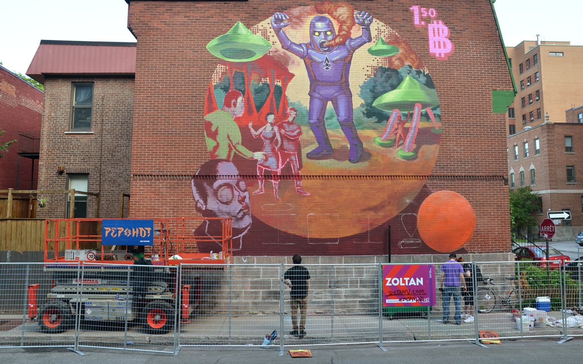
Also in Montreal was an ALARMING amount of murals. I stayed at a friend's apartment in Plateau Mont Royal, and there was a mural in sight no matter which direction you were facing. And all of them were beautiful. Montreal is a very art-forward city, and even holds a Mural Festival every year in June. Unfortunately I was there in the beginning of August, but the murals are (semi)permanent and can be viewed at any time. I get the feeling that the area I stayed in was particularly mural-esque, but who can say.


See? Beautiful! The website for the Mural festival is particularly interesting in and of itself. Check out the map page in particular. It's a little buggy but really cool to interact with.

While I do believe that Montreal is way more creative as a city than Toronto, we all know that Toronto has some interesting public art. Take the Graffiti Alley for example. Located on Rush Lane between Richmond and Queen (East of Portland), the Alley is an envelopment of culture and colour.


While the alley is wonderful, I need to note that the murals around Montreal are EVERYWHERE. Many of the beautiful murals painted around Toronto are eventually covered over for various reasons, so having a dedicated place for them makes sense. But on the other hand, why are we holding back a driving force of creativity when we could be changing our way of thinking to allow murals and graffiti and street art into every nook and cranny of the city? Toronto is cracking at the seams in some neighbourhoods, and some nice public art would rejuvenate those cracks tenfold.

Let's look at another city similar to Toronto: Seattle. You may have heard of the Bridge Troll or the Gum Wall, both of which are amazing examples of public art. Seattle is also home to a sprawling landscape of intriguing graffiti.


I like the way that the culture and creativity of Seattle's citizens isn't limited to any specific area (or even medium). The art and beauty simply exist everywhere. Speaking of existing everywhere, have you heard about site-specific street art? Circling back to those oh-so-specific cracks in the pavement: why not paint a pair of eyes peeking out of the crack? In that fashion, some very cheeky street art is popping up all over. The following examples come from UK street artist JPS.


While I find it painfully obvious that Toronto isn't the hugest fan of street art, it does not even need to be mentioned that suburban GTA has no place for such tomfoolery. Except in a beautiful ravine close to my house. I have often visited the ravine and greenway since we moved into the house around fifteen years ago, and use it for a serene running path away from noisy traffic. The most beautiful part of the ravine has been under construction and therefore blocked from pedestrians for the better part of the summer. This happens every once in a while, usually in short stints to remove graffiti from the underpass that connects the ravine under a main street. You can walk through this underpass, but I sense it as more of a coincidence than a real pedestrian walkway. Even though this round of construction lasted longer than any other to which I have borne witness, I was delighted to find that all of the graffiti was still there (with some new additions), and that the concrete floor of the walkway had been reset to a beautifully flat surface. Perfect for running! See images below (before they decide to cover over the graffiti again):


And a bonus: a picture from my angsty teen years. The graffiti underpass circa 2009. I will have you know that this picture was a very popular profile photo on Facebook for a solid three months.

While I am sure that there are beautiful examples of street art in and around Toronto that are just waiting to be discovered, I must take issue with the fact that these places are hard to find. The artisans of Toronto must come together and assert their power!

And as a bonus, my last example of interesting street art isn't really street art at all. It just happens to be art found on the street. Designers Isla Bell Murray and Jessica Saia have taken a delightful spin on your average public art piece by literally dressing various different objects found on the street. Examples: a mail box, an orange pylon, and a tree. And their puns are maybe (probably) the best part of it all. View more of the collection here.


“I don’t think my style is anything to write home about. Hawaiian prints are on all my male friends this season.”


“I’m really inspired by clothing from the ’60s; I feel like I would have fit in much better back then. The silhouette of this dress does wonders for my butt.”


“Yeah, I know I look good. I’ve already stopped like 30 cars today.” 

I told you this last post was a bonus. Those puns just slay me. So if I were to wrap up this post with a nice neat bow, I would urge you to take a piece of your neighbourhood in need of some TLC, and use your creative prowess (or lack thereof) to beautify it into something everyone can enjoy. Although I think it might be best to leave the orange pylons unclothed, since they have an important job to do. You know, keeping cars from crashing. That sort of thing.

Wednesday, August 13, 2014

Waiting For The Bus

Having lived in the suburbs for pretty much all of my life, I am an avid user of public transportation. If you've read any of my other posts on this subject, you'll know that my penchant for pleasant user experience leaves me feeling more than a little overlooked by the urban planners of my city. Many of the bus facilities are not well designed at all, and some of the design choices seem to have been made without any thought towards how they would actually be used.

The VIVA shelters are an obvious example of this, designed with a theme of uncomfortable angular lines, glass and metal. The benches angle downwards at a 30 degree slope, giving your behind a nice slow slide to the floor, and they are made of metal which feels colder than ice during the winter. The shelters themselves, while very interesting to look at, fail to block wind or rain from coming in. I should not need to point out that blocking out weather is a bus shelter's main purpose.

While many YRT shelters have been recently redesigned (progress!), the choices again make me scratch my head in confusion. They look (and perform) more angular like the VIVA shelters. While mostly made of transparent glass, the obvious choice for bus shelters, they do contain one opaque beam that unfortunately situates itself right in front of the view of where the buses come from. Plainly, if a person were sitting in either of the two bench-seats in the shelter, they would be able to see all around themselves, EXCEPT in the direction of where their bus will come from. I think you can understand the head-scratching behaviour now.

I could go on all day, but this blog is not meant for my ranting (usually). I prefer to direct attention away from the negative and onto the positive. So without further ado, I bring you an amazing look at the bus shelter:


Currently located in Baltimore, this beautiful structure looks like a fine mix of form and function. There are more than two (!) places to sit, two overhead coverings for rain, and it looks more comfortable than any bus shelter I have had the displeasure to waste my time within. Learn more about the origins of the structure here.

Breakdown of all three letters:

B - You can stand in the lower counter, sheltered from the rain. It's probably not the best place for sitting, since it's so low to the ground, but it would do in a pinch. Bonus: as long as you're not a forgetful person, you can leave your briefcase (or baby?) in the top counter while you wait. Personally, I could never do this because that briefcase and/or baby would not be remembered when the bus came.

U - A very comfortable place to sit (probably the best of the three) with a nice view of the sky. No rain protection, but I feel like the high walls on two sides would block out a lot of the city sounds for a peaceful bus-wait. Bonus: It's the perfect impromptu loveseat for a first date. Just look at it! Imagine holding hands with a sweetie all up in that U.

S - Another comfortable sitting place (unfortunately looks like it can only seat one person where strangers rubbing shoulders are concerned). This one also has a covered ceiling for rain, but I wouldn't put any belongings in the top curve. It looks too open and angled to be a good place for that birthday cake or freshly dry-cleaned pantsuit. Bonus: imagine hanging your legs off of the open left side and reclining back into the curve. I may have to change my mind about which one is the comfiest.


In light of the recent redesign of the YRT shelters, I do have to shed some light on the fact that most of the resting places made available within this structure make it impossible to check for an oncoming bus. Therein I would hope that bus drivers would at least slow down as they pass and check for possible riders in and amongst the letterforms.


And as for weatherproofing, I've done my research on that one, too. According to this forum, Baltimore winters are very mild and needn't be worried about, as far as waiting for a bus. I can see that the wind would be pretty well blocked (except for the obvious open side), although there is one missed opportunity here: why not space out the letters to approximately double the current amount of room, and make the connecting bars at the top into full overhead coverings. That way, at least two more people would be able to stand in the shade or be protected from the rain. This is a solution that would bring more usability to riders, while at the same time not deter the visual quality of the shelter itself.

Thursday, July 31, 2014

High Emotion

Since the day I first discovered that there was music in the world beyond Top 40's radio, I have been in pereptual search of music that speaks to me on an emotional level. I enjoy a good beat and a catchy melody as much as the next person, but the music that really resonates with me must display a high amount of emotion.

On the other end of the spectrum, I really enjoy cheesy club anthems. Dance music circa 2009 was a golden moment for me, although I was a little late to the party and can only appreciate retroactively.

Ministry of Sound's 'Mashed' collections were, without a doubt, the best compilations ever made. I own all five of them, with this song having earned the highest play count in my iTunes library:


Since electronic music tends to follow the trends of other genres, what with DJs and the like, it is forever changing. Those sounds I loved in 2009 have now turned to a dubstep sort of feel, and electronic music seems to have shifted into something I cannot hang my hat on.

And then I found trap music. I really did not like it when I first listened to it. It sounded too much like dubstep. You can't tap your foot to trap music. It's very erratic and strange, but the experimentation and off-beat patterns have become refreshing to my ear and I can't get enough. I started listening to Flume a few weeks ago and I can't listen to anything else. His music is so choc-ful of emotion that I can't help mouthing the words or humming along on the subway in rush hour (which I'm sure is very annoying to other passengers). Over the past two-ish years, Flume has exploded in popularity in Australia (where he is from) and all over the world. Tomorrow, I will be seeing him for the second time in under two weeks and his performance might just be the highlight of the entire Osheaga weekend for me.


Wikipedia defines Trap music as follows:
Trap music incorporates an extensive use of multi-layered hard-lined and melodic synthesizers, crisp, grimy and rhythmic snares, deep 808 sub-bass kick drums, pitched down vocals, double-time, triple-time and similarly divided hi-hats, and a cinematic and symphonic utilization of string and keyboard instruments creating an overall dark, harsh, grim and bleak background feeling for the listener.
This sounds about right to me, with the addition that a lot of trap music features rap overtop of these grimy beats. I wasn't the biggest fan of rap before I found trap music, but I have found that I am starting to enjoy some rap as well. What a great segue into a new genre!

In time with Osheaga this weekend, I made sure to familiarize myself with a lot of new music. Shlohmo, a native of Los Angeles, is equally talented and has a very interesting sound. I listened to a lot of his stuff on Soundcloud, where I realized that there are a lot of people who feel the same way about this music as me. Watch the comment section as you play this song:


First of all, those comments completely confirm my thoughts about trap music being highly emotionally charged and wonderful to listen to. This kind of music brings something out in people that other music doesn't do (or perhaps does in a different way).

I also absolutely love the experience that Soundcloud creates for its listeners. You can add a comment at any point in a song, and each comment pops up for subsequent listeners as they reach the part of the song where the comment is located. It's like listening to a song in a room with a bunch of other people who love the music as much as you. If we're going to talk about excellent user experience, here is your shining example.

From Flume and Shlohmo I landed on ODESZA. Originally based in Seattle (near to my heart!), the duo has been coming out with amazing songs that really hit you where it hurts. Have a listen to this:


To wrap a bow on this one, I guess I just don't see a point in listening to music that doesn't make you feel anything. It would be like eating food that didn't have any taste or nutritional value. I should state that music is probably one of my main sources of pleasure in life, as it is for many of the people with whom I surround myself. And is that so bad? All we're looking for in life is meaning and the pursuit of happiness, right? Why shouldn't it come from an art form that dates back to the beginning of man?

One thing I would like to reiterate is the fact that I never thought I could get into trap music, until I did. Opening oneself up to new things (both inside music and outside) is so important to becoming a well-rounded and satisfied person. Let's chalk this up to my summer motto of "just say yes", shall we?

Monday, July 21, 2014

New Uses For Old Things

As you may or may not know about me, I am an avid researcher in the world of animated inanimate objects. By this I refer to the way that many people attach meaningful sentiment to the possessions that they hold dear (or perhaps detest). I enjoy coming across attached meanings of everyday objects, which raises their value in some way.

I came across a very interesting instance of this phenomenon through an unexpected channel. I happen also to be interested in Dan Savage’s love and sex column. Having followed his writings in local newspapers and online for about four years now, I can honestly say that he is the most levelheaded advice columnist I have ever experienced. I agree with almost everything he advises, and even if I didn’t, he is very modest and makes sure to state that his advice is only meant to act as a guide for readers. He insists again and again that they should do as they feel is best, especially for the reason that they are the ones living these experiences. But of course, this is not the subject of my post. If you want to read his column, click the link above.

My post is more about a couple of specific instances in which Dan solves various relationship problems through inanimate object association. For example, in this post, a woman explains that her feminist beliefs outside the home conflict with her kinks towards being a ‘perfect housewife’ role with her boyfriend at home. She wants to be able to live both of these lives at once, while also setting some kind of boundary so that everyone feels safe and un-marginalized. Obviously, the problem with submission-related kinks is that having to break role and tell your partner that things are escalating too quickly will kill the libido instantly.

That said, I was scratching my head trying to guess what Dan would recommend. The best thing I could think of was to discuss everything beforehand, or have pre-arranged times of day or week where these ‘housewife’ scenes would occur. But that’s not very romantic, is it? Dan brilliantly suggested the writer wear a specific necklace every time she wanted to put on this role. When she was bored, tired, or otherwise finished with it, she would simply take off the necklace. My interests here lie in the way that a simple item is transformed into the visualization of all the happiness this writer will now be able to experience with her boyfriend, and become an essential tool in their life together. What an elegant solution.

If you weren’t overly impressed by that one, I have another for you. A woman wrote in to discuss the fact that both she and her boyfriend had kinks that the other was not so keen to perform. It boiled down to the fact that he wanted her to be submissive and she wanted to be on top (obviously, both partners’ kinks are almost impossible to carry out at once). Dan proposed something slightly elaborate:

“Take the average number of times you have sex in a month and divide that number in half, then divide it in half again. You each get a stack of red poker chips equal to whatever the third number is plus one blue poker chip. So let’s say you guys have sex 12 times in a month on average. Half of 12 is six, half of six is three—you each get four chips: three red, one blue. (You still with me? Good. Man, I could use some chips right now, myself.) You keep your chips on your nightstand, and your boyfriend keeps his chips on his. On nights when you want to top your boyfriend, you hand him one of your red chips. On nights when he wants you to be submissive, he hands you one of his red chips. If he doesn’t want to bottom for you on a night when you hand him a chip, he can veto your red chip by surrendering one of his. Likewise, you can veto one of his red chips by surrendering one of yours. When a veto is played, you default to the sex you have most of the time, i.e., your “regular” sexual routine (which seems to entail you bottoming for him as his equal), and the chip used to veto is forfeit. You each have to use your three red chips in one calendar month—an unused chip doesn’t carry over to the next month.

…And what’s the blue chip for? It’s a “free veto,” a chip you can sacrifice without giving up one of your chances to f*** or dominate the other.”

There’s a little more to the story, which you can read by (again) clicking the link above. Again here, a sexual problem between what I can see as an otherwise very compatible couple, is elegantly solved by applying new use or (if you will allow) identity to an object whose original use had nothing to do with the current situation. I love these sorts of things. I assume my love of practicality and logic are hiding in here somewhere, as well.


A slightly less ‘cool’ example of this tactic is a little something known as the “talking stick.” In a group setting, whoever holds the talking stick is the only one with the right to speak at that moment. Of course, these sorts of things can get out of hand as their new identities are taken too seriously. I only refer to these examples as possible solutions to common problems in our everyday lives. They are not mean to control numerous aspects or, stepping back even further, cause unhappiness. I merely mean to draw attention to the fact that taking a step outside of the box can bring wonderful changes to the status quo.

Wednesday, May 21, 2014

Great Art in Ugly Rooms

I am all for the advancement of art history education in any way possible. The newest (and arguably most hilarious) method is this tumblr which displays famous pieces of art found in ugly, abnormal, tiny or otherwise unsuitable rooms. I honestly can't tell whether these are photoshopped (probably) or sent in by multiple people (don't think so). I'd like to offer the opinion that they are photoshopped because that means that someone put some intelligent thought into where and how these pieces might be displayed, and for any number of reasons.


Shown above is an interesting one by Eric Fischl, and one of multiple works to be displayed in this tiny apartment(?) on the blog. I like this one the best because the piece speaks to its surroundings in a literal way. The walls are the same colour, the window is pretty much identical, and the banana peel on the floor looks like it just fell out of the painting itself. It's like one of those "life imitates art imitates life" type of scenarios. The painting feels slightly antique while the room feels modern, but which came first? The chicken's apartment or the framed egg? Sorry, that was a stretch.


Another gem: Johannes Vermeer's The Concert. Nothing too crazy going on here, except maybe that the famous piece is shown as being kept in a storage locker (a la Storage Wars?)...although it is worthwhile to note that this painting has been missing from the Isabella Stewart Gardner Museum for 24 years and comes along with a $5 million reward for the person who returns it. Maybe the man shrouded in equal parts shadows and mystery is the culprit?


One of my favourite artists, Josef Albers. Some people might argue that his paintings, much like Mark Rothko's, are best seen from a distance of at least a couple of feet in order to gain the full experience of the piece. But indulge me as I lead you down a colourful narrative path where a young couple with little monetary means decides to invest nearly all of their savings into a piece by their favourite artist. They cannot afford anything else but a mattress on the floor and a nightstand made out of a milk crate. The snob critic would probably condemn them for not having the means to hang the piece "properly" but I thoroughly enjoy the way it is held in such high visual regard as the only item of real importance in the room. While it may be impossible to view the piece the way a critic would think proper, the piece is hung in a way that suggests it is well loved and treasured.

I really like this blog because it educates, pokes fun, and asks questions in one fell swoop. Some of them are really well thought out and might even have the power to change the way we see both modern and classical art.