


Music: Day Wave
California native Jackson Phillips aka Day Wave is lo-fi, beachy bedroom pop with a little bit of shoegaze added in. It's upbeat music that's catchy enough be heard on the radio but still indie enough not to be played. With fall coming late this year and the enjoyment of warm, sunny days amid changing colours of leaves, it really suits a mellow mood.
I really like Drag and Promises.
This Thanksgiving weekend I gave thanks for having the time to visit my good friend Kaylin in her new home in Kitchener. We also wanted to attend the Kitchener/Waterloo Oktoberfest, since we had attended the Vankleek Hill (Beau's Brewery) Oktoberfest a few years before and really enjoyed that.

Mission accomplished!
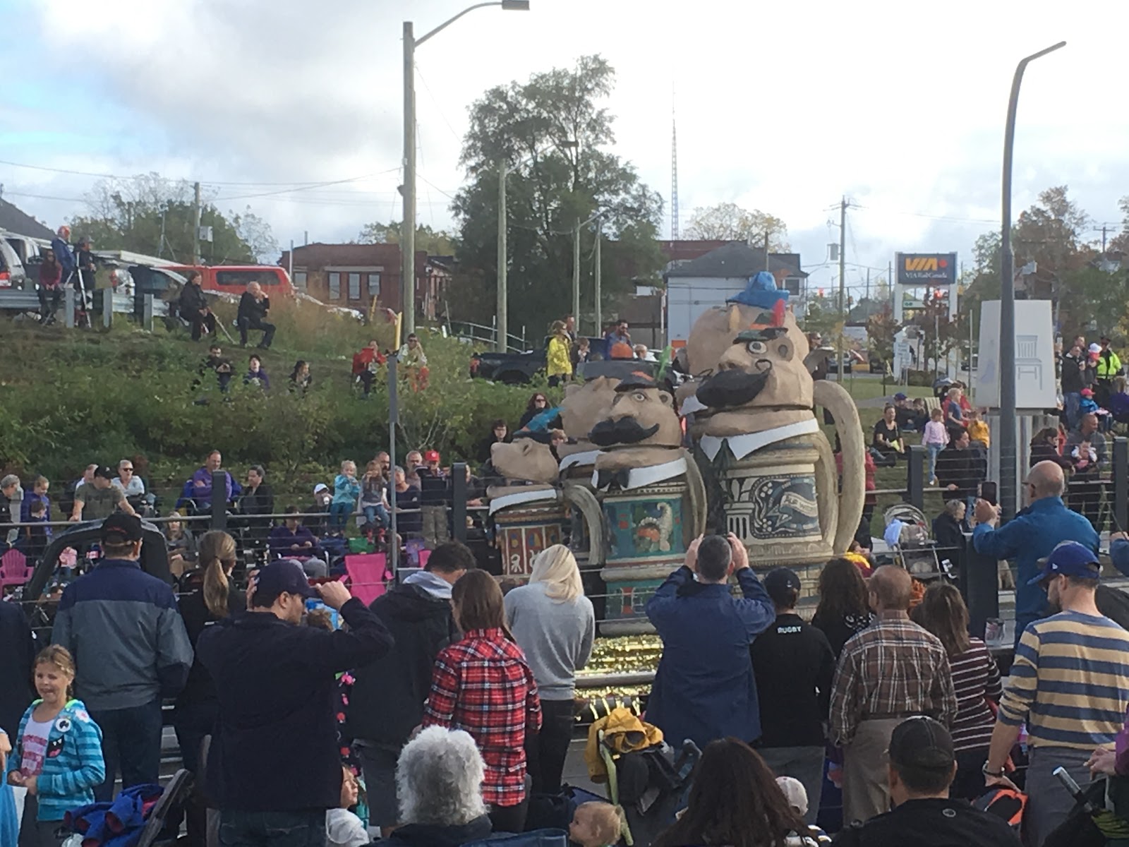
We also watched the Thanksgiving Day Parade which was really quaint and cute.
Kitchener and Waterloo are both really curious places in the midst of much change. There are old buildings from the 70s and older, even a heritage home from the early 1800s, while also huge new glass buildings to coincide with the bustling tech community in Waterloo.
I also need to shoutout that getting there and back was a small feat in itself, using the transit systems of FOUR cities to get from door to door (Toronto, Mississauga, GO, Kitchener) in not less than 2:45. I am extremely good at taking public transit, so I'll also give thanks for everything running smoothly even though I had to load my Presto card at eleventh hour and pray the money would transfer in time.
We are now in the final days before my Bat Mitzvah, so I am prepping for that. I have also acquired all the ingredients I need for my typography project for Swash & Serif.
Goal:
Until Wednesday night, I'll be practicing my speech like a mad person. After that, I'll be packing and researching for my trip to New York at the end of the week, as well as finishing my typography project on Thursday. Hopefully it's accepted!
Random Thought:
It seems to be the order of the day that millennials are constantly blamed for the arguably terrible state we all live in, in many regards. The outcries and upset of modern politics, relationships becoming ever more digital with the onset of social media, laziness, entitlement, I could go on.
I really can't speak for all of it as a whole, but there are some ways of life that I think will see a bit of undue distress and upset throughout the oncoming generation. The era of mass-production and something as ubiquitous as a shopping mall, are all coming to an end. I became acutely aware of this over the past week, as I noticed three separate instances of coming in contact with the concept of “dead malls”, which I'll explain further later this week in a different blog post.
I honestly don't think buying things online is such a terrible thing, especially compared to the outdated concept of brick-and-mortar stores as we know them. They both probably have a large carbon footprint, but at least we can cap over-production and waste by keeping stock in a centralized warehouse.
I've talked about this concept before, thinking about how models like Clearly Contacts or Oak and Fort have one brick-and-mortar store in each major city, with most of their stock online. They're gateway concepts to what I see happening in the near future: these 'stores' will not sell a single thing. You can check out/try on/test the items in-store but the stock is 100% shipped.
All of this until we figure out how to scan our bodies and have a computer algorithm choose the best clothing for us. All praise our future robot overlords!
Inspiration: 404s
I love the colloquialism of the 404 page. Every internet user comes across this page once in a while, and I think most of us know that 404 means the link is broken or the page is missing in a specific website (though I doubt many people outside the engineering world know that it relates to the error code thrown by the broken link). Better websites will design this page to help the user navigate to something more helpful, but your browser has a backup version as well.
I really like well-designed 404 pages, especially since their appearance is inherently met with a negative feeling from the user. The page is never a place the user intends to go, and usually can't explain the problem well to the user, causing more frustration for them.
404 page designs have been worked from all angles, from funny to sarcastic to whimsical to sad, but I think the best ones will:
- tell the user what might be the problem (reason why they are seeing the page)
- guide the user in what they can do to get what they want
- be generally pleasant to look at (but not overly so)
- not taunt or mock the user, on purpose or otherwise (perhaps by poking too much fun at the problem to lighten it)
- reflect the brand of the website (this is actually a great place to inject a strong dosage of your brand voice)
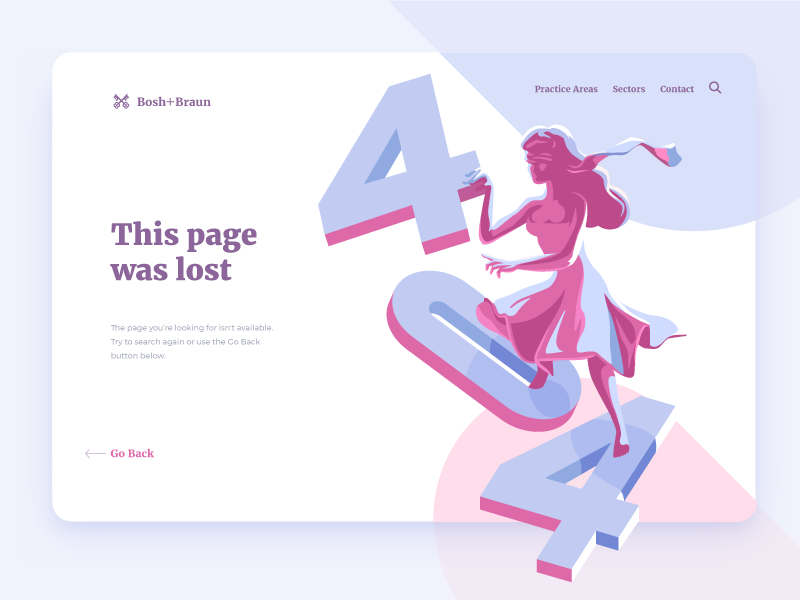
By Mike Piechota on Dribbble.
It's hard to say how this would fare in real use since it's only a Dribbble mock and I didn't come across it in true practice, but I think it would be successful. It guides the user backward, but I think a search bar down there wouldn't go amiss. I know there's a search icon on the top right, but context is impotant and you could argue that the browser also has a back button. Sometimes redundancy is necessary in design.
Next up is a 404 I came across in real life, and chuckled a little before I navigated away to fix my error. I was looking for a specific item on the Lululemon website, but elected to use Google to search the site because I prefer its interface to that of Lululemon's native search.
Unfortunately I believe Google had cached the page incorrectly and it came up as a 404:

I enjoyed reading the message “This is our way of getting you outside” because it's clever but not aloof, and matches the brand and target audience's sensibilities. Unfortunately the thoughtful addition of a search bar is hidden under the scroll break or “below the fold” as we might borrow such a term from newspaper printing. Can't win 'em all.
No comments:
Post a Comment