


I am constantly reminded of the joy I once took in buying, collecting and playing CDs. It might have to do with the fact that my boyfriend's car doesn't have an auxiliary port or a cassette player, so we listen to a lot of CDs. I must have mentioned my undying love of Graham Van Pelt, the genius behind Miracle Fortress' dreamy waves of sound to said boyfriend at some point. Lo and behold I found myself transported back to 2005, listening to a copy of Five Roses (the first album) in the car on our way to some burrito restaurant or something.
Five Roses, 2005's dreamy, beachy wonder of synth pop was a masterpiece. One of the first indie albums upon which I stumbled, I was hooked by the second song. If you want an album to doze off to while swinging in your macraméd porch hammock by the bay, this is it.
At a harsh contrast, 2011's Was I The Wave? explores a slow-burner dance party at which you might have woken from your slumber and decided to wear that same macraméd hammock as some sort of hipster cloak. I definitely suggest starting with Five Roses, because hey, I am a slave to order, but get hooked on this song off Was I The Wave? first.
Accomplishment:
I have now successfully printed both my thesis book and a new (much better quality) version of Upfront Mag from last semester. I am at once excited and terrified for the binding process, because I am assuredly going to mess up these beautiful sheets of paper in some way or another. But as it stands, I am feeling pretty good about it. The website for my thesis is also coming along nicely. As per last week's goal, all of the D3 visualizations are finished, and the data pages are responsive as well! (Somewhat!) I also got the navigation working the way I want it, so self-induced pats on the back for everyone (or just me).
Goal:
Now that school is back on the front burner, I realized I have been neglecting my data visualization projects. By next week, I want to have this done:
- beer data fully collected
- start working on the skeleton of the D3
- all ten icons for causes of death created
- various colour schemes developed
- select all possible variables and how they will be shown
Random Thought:
Since I got an iPad last year, I have been noticing some interesting things regarding notifications and user experience across my Apple device family (iPad, iPhone 5, and MacBook Pro). For example, I really enjoy the way notifications (mostly texts, emails and Facebook messages) are handled between my phone and tablet. A notification of a text will appear on both devices, but as soon as I swipe to view it one one of the devices, it disappears from the other device. Same goes with Facebook messages between my computer and my phone. All around, the phone is doing a good job. But there are some weird discrepancies, like when using Messages on my computer. There is definitely some room for improvement here. Why do I get a notification of three texts from the same person as separate events? Group them up, guys! And Messages runs so incredibly slow on my (forgiveably old) computer, which I just can't seem to understand. While I would of course prefer that my life not be run by the little ding of the notification bell, I can't deny that this is where an Apple watch would certainly shine, if you'll excuse the pun. I'll probably never get one unless it had previously fallen off the back of a truck, but I truly understand the desire to have a quick way to view notifications, and how having them at wrist's length would be useful.
That said, maybe all of these devices are connecting us and at the same time pushing us away from a real human connection. I know this argument is getting old, but as I sit in a restaurant and watch all of these people instagramming their food instead of eating it, it makes me a little sad. I sincerely hope that we learn to keep technology at arm's length in future as it develops further. Technology can make our lives easier and fuller, but it can also begin to do the opposite without our realization.
Inspiration: Hansje van Halem
My new favourite typographer, and based out of the beautiful Netherlands at that (which is no surprise to me – I love everything Dutch. She makes these wonderful letterforms out of optical illusions, perfectly placed lines, and that gorgeous play between light and dark we call notan. Check it out:
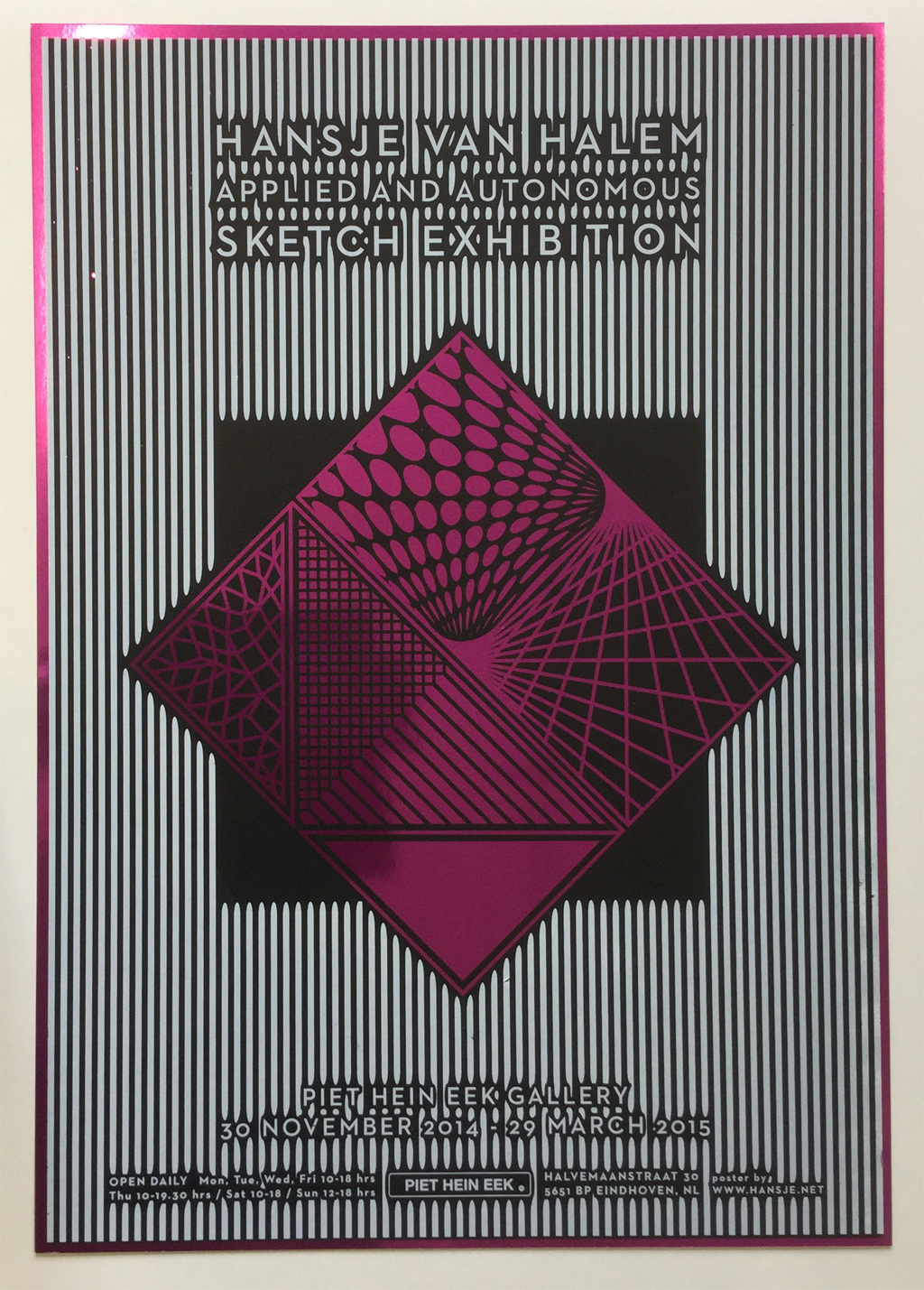

I absolutely love the way that the pieces seem to vibrate with energy, even in this watered down experience through my computer screen. Imagine one of these actually printed out and resting in your hands! I highly suggest you go to her website for more beautiful work.
No comments:
Post a Comment